State of Compose 2023 results are in! Click here to learn more

Changelog

Stay up to date with Composables. New components we release, new Compose tools we build, new features we add.

September 25, 2023

Product Hunt launch, Social Share components and Dialog when Large

Composables will be live on Product Hunt this Wednesday. If you would like to be notified about the launch and show your support, make sure to join the mailing list above.

New Social Share components

There is now a new 'Social Share' category added.

These new components can be used to share content with contacts or other apps.

Check them out on Composables.com

New 'Dialog when Large' component

There is now a new 'Dialog when Large' component in the 'Responsive Layouts' category.

This component will automatically change itself to a Dialog when there is extra space on the screen. When in mobile, it will be displayed as a full sized screen.

September 13, 2023

New Expandable Lists & Card components

There is now a new category added to the Composables collection: Expandable Lists.

This is a common pattern found in many apps to display Frequently asked questions, offer the user additional options or provide a set of filtering options.

There are three variations which you can explore. Check out the Expandable Lists section.

Expandable List

There is also a new Expandable Card added in the Cards section

Expandable List

New components are a free update to all existing Composables customers.

New Jetpack Compose Tool – Material Colors

There is now a Material Colors section on the website, so that you can quickly add any color from the original Material Color pallete to your project.

Just go through all the colors, click the one you need and drop it (paste it) to your code!

Check it out here

Material Colors

Public Roadmap available – Vote for the next Composables

The Composables Roadmap public for everyone. Go ahead and check what components are coming next, vote for the ones you want to see, or request your own.

Checkout the Composables Roadmap

Roadmap

Composable Tools & AndroidX components now require a license

I decided to put all tools I have published on the website, along with the Androidx section behind a paywall. For those that might not be aware, Composables is a single person business. I build all the components you see on the website, along with the site itself, most content (thanks to the community contributors!) and all the Jetpack Compose tools, such as the SVG to Compose converter or the Material Symbols Compose.

Even though I love building stuff, I need to be able to pay my bills so that I can continue building more stuff for you.

tl;dr What changes for you:

  • if you have already purchased a Composables license, you are good!. You can continue receiving new free updates, components, new tools free of charge forever.
  • if you have not purchased a Composables license yet, you will be asked to purchase a license to continue using the site. Luckily, all licenses are one time purchases, without any subscriptions or hidden fees and are very affordable for the value you get. Buy your license by clicking here.

Keep in mind there are team licenses available if you are interested in purchasing access to the website for your entire team.

PS: Your employer would be super happy for you to expense a license using your training budget. Invoices are available after purchase.

Cheers, – Alex

August 31, 2023

Live Previews available on Composables.com

You probably already know that Compose is a Multiplatform framework. This means that all components can be used on multiple platforms other than Android, such as Desktop, Web or even iOS.

From now on, all components and screens available on Composables UI come with Live Preview. This means you can click and scroll on all components as if they were used in your own apps!

Check them out at Composables.com

Try out a Free Component

There is now a dedicated section in the website with premium components and screen you can use in your apps, for free.

Use these components as is, or use them as a base to build your own components. Try them out by clicking here.

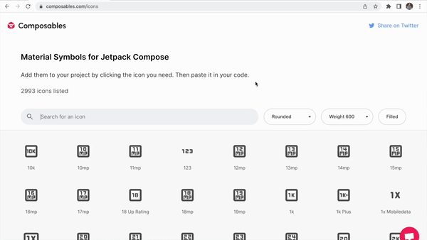
Find AndroidX components easier

Preview of search functionality on composables.com. Showcases how each result includes the library it belongs in.

I keep getting comments from you folks on how much you use the AndroidX section of the site to learn more about the Compose Foundation components or the ones built by Google in Material 2 and 3.

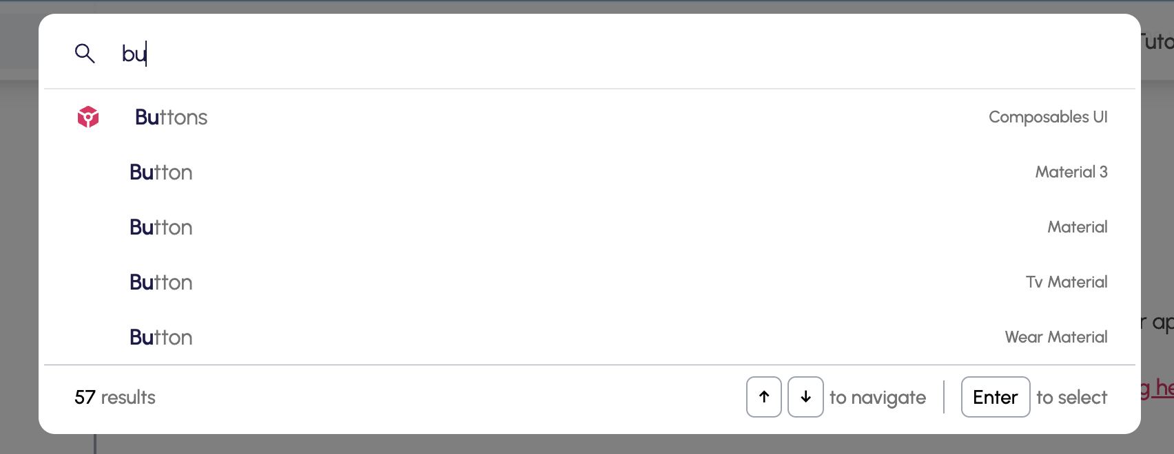
I wanted to make it even simpler to find the components you need, so I improved the search functionality.

You can now search from any part of the website by clicking on the search bar on top, or by pressing / on your keyboard while at the website.

As you type, you will quickly realize that all results include the library they come from. You can use the or keys to navigate the results. Hit Enter to quickly jump to the component you need.

'Added in' for Compose Multiplatform components

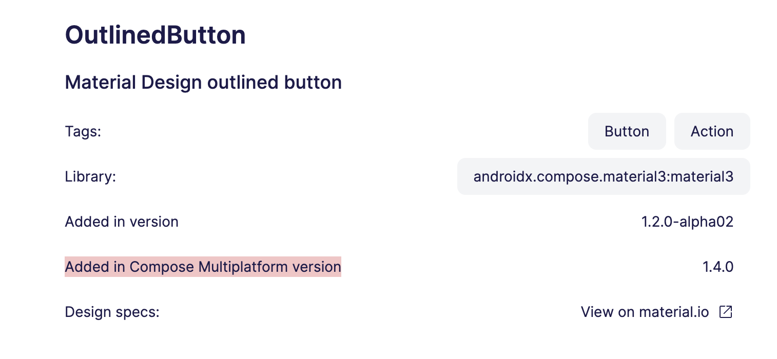
Compose Multiplatform is growing fast and Jetbrains has been given us some massive upgrades lately. To celebrate this and to make it simpler for people to jump to Compose Multiplatform, I have included the Multiplatform version the component can be found in.

This way you now know if a component you are looking for can be used in Multiplatform.

Head over to the AndroidX section of the site to try it out.

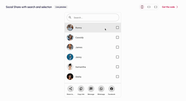
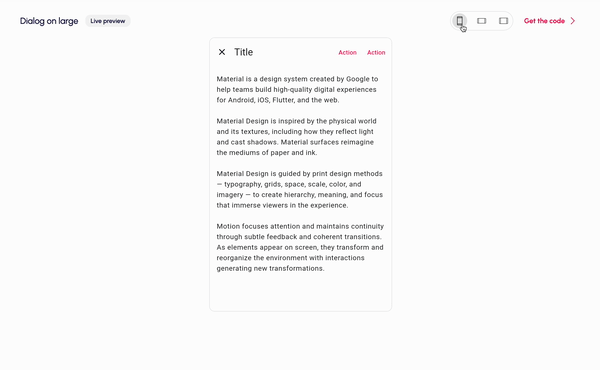
Magically adapt to phones and tablets

From now on all components and screens found in Composables UI are now fully responsive. This means that the components will automatically adapt to the screen configuration they are used in.

This will help you build tablet rich experiences in no time.

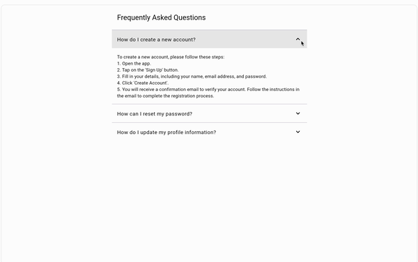
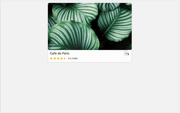
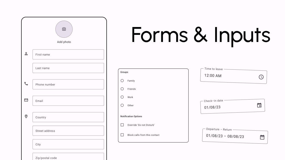
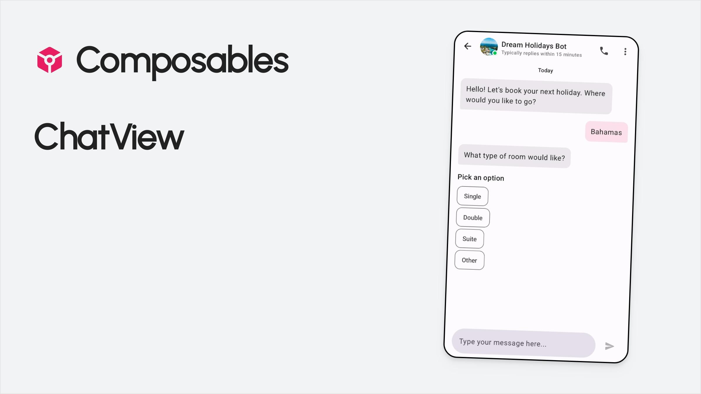
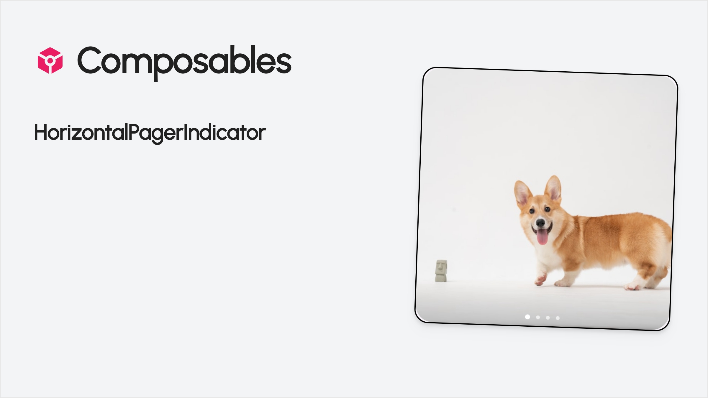
New Components added

Forms and inputs

Last but not least, more than 30 new components were added to the Composables UI collection in month, included in the following categories:

Click on each category to see each component live in action. Way more fun than showing you in a simple screenshot.

This is a free update to existing customers.

Almost 100 components!

We this close to reaching the 100 component milestone! I would like to thank everyone who have supported this journey so far and made the most out of the 50% discount of the components.

There are many more components to come, and the next update will be probably in a couple of days.

Save 50% by purchasing your access before the 100th component.

Discord Community is now open for all

The Composables Discord community is now available for everyone. There are currently more than 130+ members in the Discord.

Click here to join, or find the link on Composables.com.

July 31, 2023
  • 18 new shiny components added: Lists, Music Playback, Autocomplete & Modal Bottom Sheets related components.
  • Private Community Access to all existing and new customers
  • Two new free Compose tools: Convert your SVG icons to Composables & convert your colors to Color().

New components

18 new components added to the Composables UI collection:

List components

  • With image, title and subtitle
  • With image, title and subtitle and dropdown menu
  • With image, title and subtitle and sticky headers
  • With image, title and content truncated to two lines
  • With icon, title and subtitle
  • With image, title and content with swipe to dismiss

Music playback components

  • Play button
  • Music player controls with forward, backward, and shuffle buttons
  • Music player with album cover, title and music controls and seekbar
  • Mini music player with album cover play/pause button and an animated display of current timestamp.

Auto complete components

  • Autocomplete
  • Autocomplete with Icons
  • Autocomplete with Images
  • Multiselect Autocomplete
  • Modal Bottom Sheet with Vertical Actions
  • Modal Bottom Sheet with checkboxes
  • Modal Bottom Sheet with Horizontal Actions
  • Modal Bottom Sheet with Call to Action
  • Modal Bottom Sheet with Vertical Actions and Sticky Header

Private Community invite to all Composables customers

I have created a private Discord server to discuss all things Compose with other developers building their own apps.

People have already started using the server for troubleshooting their apps, or help each other with Compose related issues.

New Free Jetpack Compose tools

I have released a SVG to Compose converter tool, which you can access it here. You can use it to convert your assets to Compose (functions or vals) and keep all your assets to kotlin, easily accessible from Compose.

I have also released a small tool (access it here) that converts Hex and RGB colors to Compose Color() values and Android colors. This is particularly useful for design hand-offs and quickly converting colors from design tools and assets to a format you can use in Compose.

June 30, 2023

New Chat, SocialLogins, Settings & Review components

ChatView preview

The Composables UI collection is growing. Here are all new components added in June

  • SocialLoginsButtons: Includes "Continue with ..." buttons with the respective branding color, such as Google, Apple, Github, Twitter, Linkedin and more.
  • SettingsScreen: Top level settings screen
  • ToggleSettingsScreen: Settings screen with a toggle
  • PickerDialog: A dialog with a list of options.
  • ChatView: A ready made screen with chat bubbles to support messaging, bots and customer support.
  • PlaceDetailsScreen: A details screen of a place Google Maps style.
  • Rating Bar: Display ratings component.
  • Review: A customer review with rating.

As always, existing customers get them for free by clicking here.

Oh, I also noticed there is no HorizontalPagerIndicator component in Material 3 yet, so I made one:

HorizontalPagerIndicator preview

You can use it for free in your projects. Add it to your project by clicking here.

Composables UI documentation added

Documentation preview

There is now a Documentation section for Composables UI. You can find information on how to add the components in your project, along with information about the resources and high res images used in all PRO components on the website.

Change the weight, shape and filled of icons in Material Symbols Compose

Icons preview

I added a few more customization options on the Material Symbols Compose page.

You can now choose the weight, shape and fill (or no fill) out of 2992 icons and add them to your project straight away.

No extra dependencies are required. Just click on an icon, and then paste it to your project.

Use any Material Color in your Jetpack Compose app

I published a little open-source utility library that includes all colors from the old school 2014 Material Pallet.

The Color class that comes with Jetpack Compose provides a few default colors but they are limited and not very exciting. I got tired of browsing the web for nice colors, and I believe the original colors look great, so now it's a library.

Here is a quick example of how to use any color in your project:

Text("Hello world!", color = MaterialColors.Gray[900])
Box(modifier = Modifier.background(MaterialColors.Amber[400]).clip(CircleShape))

PS: You might be tempted to use this for your app theme. Keep in mind that in modern versions of Android, you can let the system pick your theme colors out of the user's wallpaper using Material You, using the dynamicLightColorScheme() and dynamicDarkColorScheme() schemes.