← Back to Material 3 Compose
AlertDialog
Component
in
Material 3
. Since 1.0.0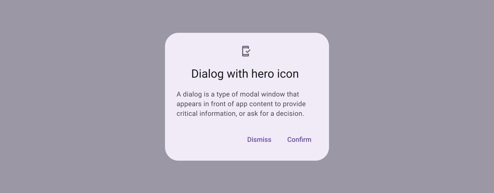
Overview
Code Examples
Video
<a href="https://m3.material.io/components/dialogs/overview" class="external" target="_blank">Material Design basic dialog</a>.
Dialogs provide important prompts in a user flow. They can require an action, communicate information, or help users accomplish a task.
!Basic dialog image(https://developer.android.com/images/reference/androidx/compose/material3/basic-dialog.png)
The dialog will position its buttons, typically TextButtons, based on the available space. By default it will try to place them horizontally next to each other and fallback to horizontal placement if not enough space is available.
Simple usage:
Overloads
AlertDialog
@OptIn(ExperimentalMaterial3Api::class)
@Composable
fun AlertDialog(
    onDismissRequest: () -> Unit,
    confirmButton: @Composable () -> Unit,
    modifier: Modifier = Modifier,
    dismissButton: @Composable (() -> Unit)? = null,
    icon: @Composable (() -> Unit)? = null,
    title: @Composable (() -> Unit)? = null,
    text: @Composable (() -> Unit)? = null,
    shape: Shape = AlertDialogDefaults.shape,
    containerColor: Color = AlertDialogDefaults.containerColor,
    iconContentColor: Color = AlertDialogDefaults.iconContentColor,
    titleContentColor: Color = AlertDialogDefaults.titleContentColor,
    textContentColor: Color = AlertDialogDefaults.textContentColor,
    tonalElevation: Dp = AlertDialogDefaults.TonalElevation,
    properties: DialogProperties = DialogProperties()
)
Parameters
| Name | Description |
|---|---|
onDismissRequest | called when the user tries to dismiss the Dialog by clicking outside or pressing the back button. This is not called when the dismiss button is clicked. |
confirmButton | button which is meant to confirm a proposed action, thus resolving what triggered the dialog. The dialog does not set up any events for this button so they need to be set up by the caller. |
modifier | the Modifier to be applied to this dialog |
dismissButton | button which is meant to dismiss the dialog. The dialog does not set up any events for this button so they need to be set up by the caller. |
icon | optional icon that will appear above the title or above the text, in case a title was not provided. |
title | title which should specify the purpose of the dialog. The title is not mandatory, because there may be sufficient information inside the text. |
text | text which presents the details regarding the dialog's purpose. |
shape | defines the shape of this dialog's container |
containerColor | the color used for the background of this dialog. Use Color.Transparent to have no color. |
iconContentColor | the content color used for the icon. |
titleContentColor | the content color used for the title. |
textContentColor | the content color used for the text. |
tonalElevation | when containerColor is ColorScheme.surface, a translucent primary color overlay is applied on top of the container. A higher tonal elevation value will result in a darker color in light theme and lighter color in dark theme. See also: Surface. |
properties | typically platform specific properties to further configure the dialog |
AlertDialog
@ExperimentalMaterial3Api
@Composable
fun AlertDialog(
    onDismissRequest: () -> Unit,
    modifier: Modifier = Modifier,
    properties: DialogProperties = DialogProperties(),
    content: @Composable () -> Unit
)
Parameters
| Name | Description |
|---|---|
onDismissRequest | called when the user tries to dismiss the Dialog by clicking outside or pressing the back button. This is not called when the dismiss button is clicked. |
modifier | the Modifier to be applied to this dialog's content. |
properties | typically platform specific properties to further configure the dialog. |
content | the content of the dialo |