
← Back to Material 3 Compose
AssistChip
Overview
Code Examples
<a href="https://m3.material.io/components/chips/overview" class="external" target="_blank">Material Design assist chip</a>.
Chips help people enter information, make selections, filter content, or trigger actions. Chips can show multiple interactive elements together in the same area, such as a list of selectable movie times, or a series of email contacts.
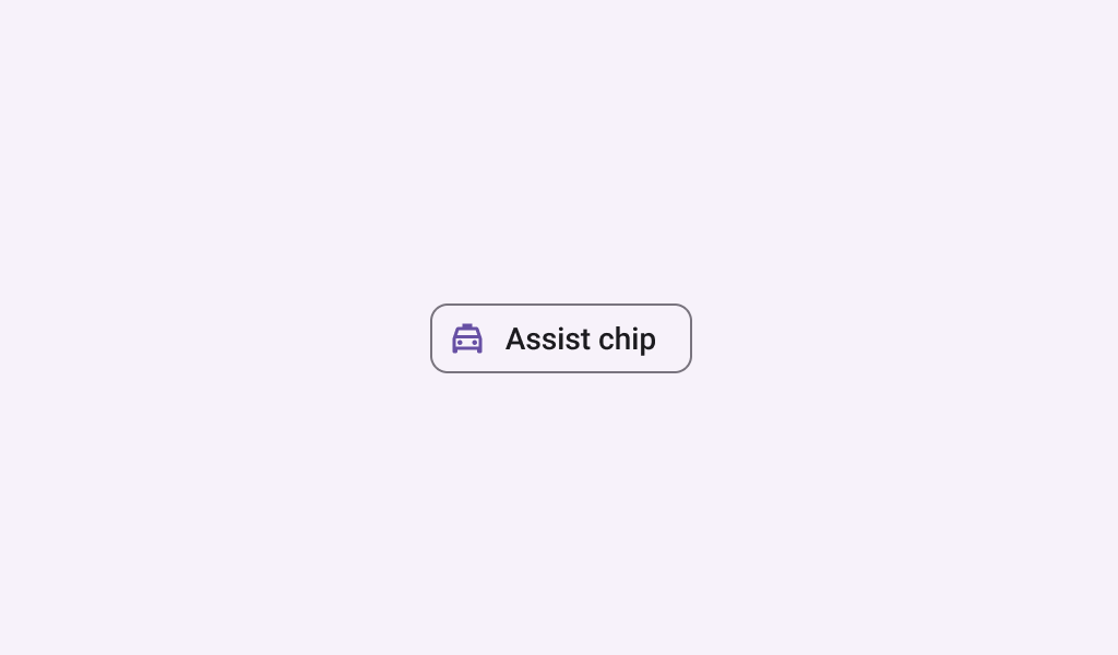
Assist chips represent smart or automated actions that can span multiple apps, such as opening a calendar event from the home screen. Assist chips function as though the user asked an assistant to complete the action. They should appear dynamically and contextually in a UI.
!Assist chip image(https://developer.android.com/images/reference/androidx/compose/material3/assist-chip.png)
This assist chip is applied with a flat style. If you want an elevated style, use the ElevatedAssistChip.
Example of a flat AssistChip:
Overloads
AssistChip
@Composable
fun AssistChip(
    onClick: () -> Unit,
    label: @Composable () -> Unit,
    modifier: Modifier = Modifier,
    enabled: Boolean = true,
    leadingIcon: @Composable (() -> Unit)? = null,
    trailingIcon: @Composable (() -> Unit)? = null,
    shape: Shape = AssistChipDefaults.shape,
    colors: ChipColors = AssistChipDefaults.assistChipColors(),
    elevation: ChipElevation? = AssistChipDefaults.assistChipElevation(),
    border: ChipBorder? = AssistChipDefaults.assistChipBorder(),
    interactionSource: MutableInteractionSource = remember { MutableInteractionSource() },
)
Parameters
| Name | Description |
|---|---|
onClick | called when this chip is clicked |
label | text label for this chip |
modifier | the Modifier to be applied to this chip |
enabled | controls the enabled state of this chip. When false, this component will not respond to user input, and it will appear visually disabled and disabled to accessibility services. |
leadingIcon | optional icon at the start of the chip, preceding the label text |
trailingIcon | optional icon at the end of the chip |
shape | defines the shape of this chip's container, border (when border is not null), and shadow (when using elevation) |
colors | ChipColors that will be used to resolve the colors used for this chip in different states. See AssistChipDefaults.assistChipColors. |
elevation | ChipElevation used to resolve the elevation for this chip in different states. This controls the size of the shadow below the chip. Additionally, when the container color is ColorScheme.surface, this controls the amount of primary color applied as an overlay. See AssistChipDefaults.assistChipElevation. |
border | the border to draw around the container of this chip. Pass null for no border. See AssistChipDefaults.assistChipBorder. |
interactionSource | the MutableInteractionSource representing the stream of Interactions for this chip. You can create and pass in your own remembered instance to observe Interactions and customize the appearance / behavior of this chip in different states |
