← Back to Material 3 Compose
Badge
Overview
Code Examples
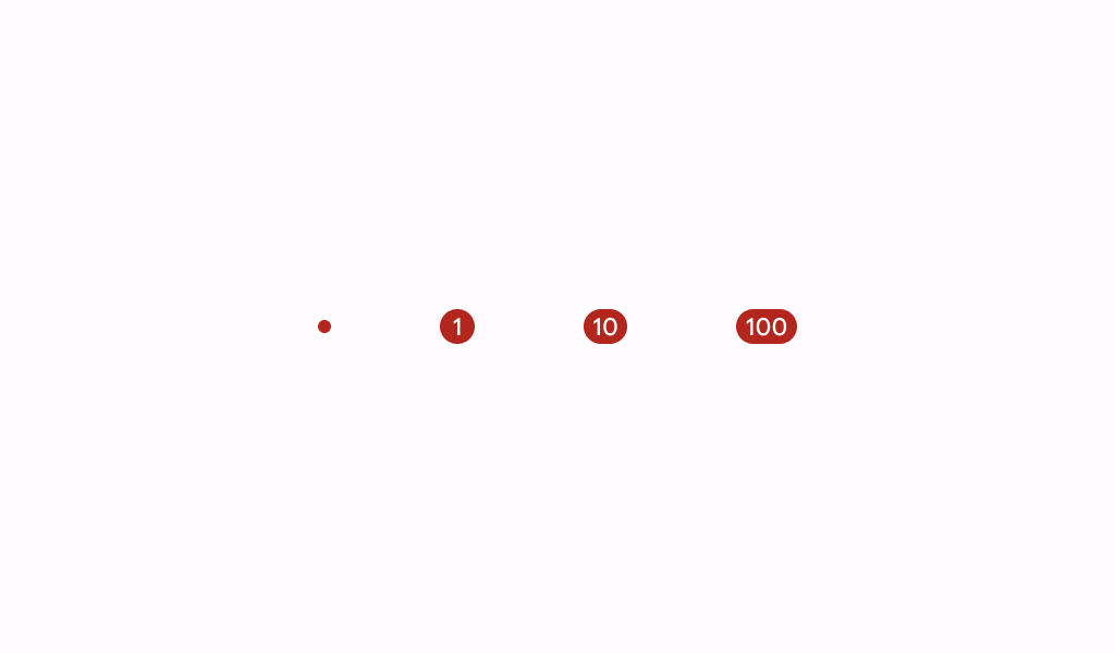
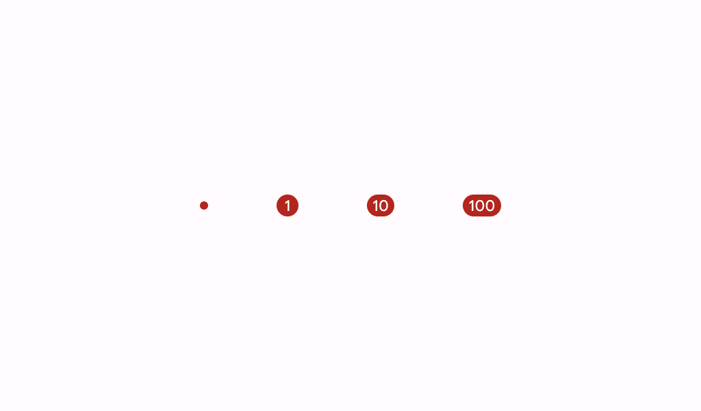
A badge represents dynamic information such as a number of pending requests in a navigation bar.
Badges can be icon only or contain short text.
!Badge image(https://developer.android.com/images/reference/androidx/compose/material3/badge.png)
See BadgedBox for a top level layout that will properly place the badge relative to content such as text or an icon.
@param modifier the Modifier to be applied to this badge @param containerColor the color used for the background of this badge @param contentColor the preferred color for content inside this badge. Defaults to either the matching content color for containerColor, or to the current LocalContentColor if containerColor is not a color from the theme. @param content optional content to be rendered inside this badge
Overloads
Badge
@ExperimentalMaterial3Api
@Composable
fun Badge(
    modifier: Modifier = Modifier,
    containerColor: Color = BadgeDefaults.containerColor,
    contentColor: Color = contentColorFor(containerColor),
    content: @Composable (RowScope.() -> Unit)? = null,
)
Parameters
| Name | Description |
|---|---|
modifier | the Modifier to be applied to this badge |
containerColor | the color used for the background of this badge |
contentColor | the preferred color for content inside this badge. Defaults to either the matching content color for containerColor, or to the current LocalContentColor if containerColor is not a color from the theme. |
content | optional content to be rendered inside this badg |