← Back to Material 3 Compose
BottomSheetScaffold
Overview
Code Examples
Video
<a href="https://m3.material.io/components/bottom-sheets/overview" class="external" target="_blank">Material Design standard bottom sheet scaffold</a>.
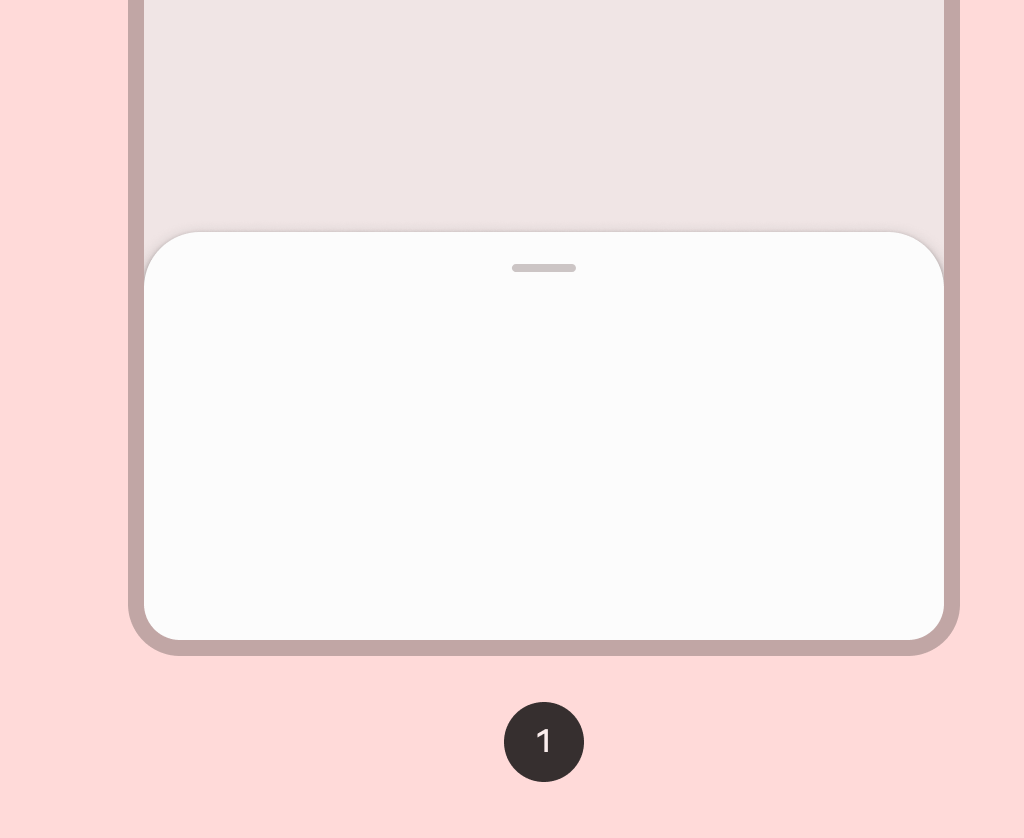
Standard bottom sheets co-exist with the screen’s main UI region and allow for simultaneously viewing and interacting with both regions. They are commonly used to keep a feature or secondary content visible on screen when content in main UI region is frequently scrolled or panned.
!Bottom sheet image(https://developer.android.com/images/reference/androidx/compose/material3/bottom_sheet.png)
This component provides API to put together several material components to construct your screen, by ensuring proper layout strategy for them and collecting necessary data so these components will work together correctly.
A simple example of a standard bottom sheet looks like this:
Overloads
BottomSheetScaffold
@Composable
@ExperimentalMaterial3Api
fun BottomSheetScaffold(
    sheetContent: @Composable ColumnScope.() -> Unit,
    modifier: Modifier = Modifier,
    scaffoldState: BottomSheetScaffoldState = rememberBottomSheetScaffoldState(),
    sheetPeekHeight: Dp = BottomSheetDefaults.SheetPeekHeight,
    sheetShape: Shape = BottomSheetDefaults.ExpandedShape,
    sheetContainerColor: Color = BottomSheetDefaults.ContainerColor,
    sheetContentColor: Color = contentColorFor(sheetContainerColor),
    sheetTonalElevation: Dp = BottomSheetDefaults.Elevation,
    sheetShadowElevation: Dp = BottomSheetDefaults.Elevation,
    sheetDragHandle: @Composable (() -> Unit)? = { BottomSheetDefaults.DragHandle() },
    sheetSwipeEnabled: Boolean = true,
    topBar: @Composable (() -> Unit)? = null,
    snackbarHost: @Composable (SnackbarHostState) -> Unit = { SnackbarHost(it) },
    containerColor: Color = MaterialTheme.colorScheme.surface,
    contentColor: Color = contentColorFor(containerColor),
    content: @Composable (PaddingValues) -> Unit
)
Parameters
| Name | Description |
|---|---|
sheetContent | the content of the bottom sheet |
modifier | the Modifier to be applied to this scaffold |
scaffoldState | the state of the bottom sheet scaffold |
sheetPeekHeight | the height of the bottom sheet when it is collapsed |
sheetShape | the shape of the bottom sheet |
sheetContainerColor | the background color of the bottom sheet |
sheetContentColor | the preferred content color provided by the bottom sheet to its children. Defaults to the matching content color for sheetContainerColor, or if that is not a color from the theme, this will keep the same content color set above the bottom sheet. |
sheetTonalElevation | the tonal elevation of the bottom sheet |
sheetShadowElevation | the shadow elevation of the bottom sheet |
sheetDragHandle | optional visual marker to pull the scaffold's bottom sheet |
sheetSwipeEnabled | whether the sheet swiping is enabled and should react to the user's input |
topBar | top app bar of the screen, typically a SmallTopAppBar |
snackbarHost | component to host Snackbars that are pushed to be shown via SnackbarHostState.showSnackbar, typically a SnackbarHost |
containerColor | the color used for the background of this scaffold. Use Color.Transparent to have no color. |
contentColor | the preferred color for content inside this scaffold. Defaults to either the matching content color for containerColor, or to the current LocalContentColor if containerColor is not a color from the theme. |
content | content of the screen. The lambda receives a PaddingValues that should be applied to the content root via Modifier.padding and Modifier.consumeWindowInsets to properly offset top and bottom bars. If using Modifier.verticalScroll, apply this modifier to the child of the scroll, and not on the scroll itself |