← Back to Material 3 Compose
Card
Component
in
Material 3
. Since 1.0.0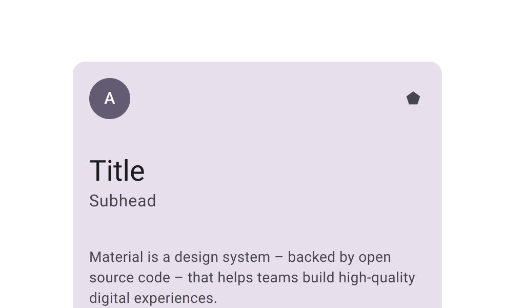
Overview
Code Examples
<a href="https://m3.material.io/components/cards/overview" class="external" target="_blank">Material Design filled card</a>.
Cards contain contain content and actions that relate information about a subject. Filled cards provide subtle separation from the background. This has less emphasis than elevated or outlined cards.
This Card does not handle input events - see the other Card overloads if you want a clickable or selectable Card.
!Filled card image(https://developer.android.com/images/reference/androidx/compose/material3/filled-card.png)
Card sample:
Overloads
Card
@Composable
fun Card(
    modifier: Modifier = Modifier,
    shape: Shape = CardDefaults.shape,
    colors: CardColors = CardDefaults.cardColors(),
    elevation: CardElevation = CardDefaults.cardElevation(),
    border: BorderStroke? = null,
    content: @Composable ColumnScope.() -> Unit
)
Parameters
| Name | Description |
|---|---|
modifier | the Modifier to be applied to this card |
shape | defines the shape of this card's container, border (when border is not null), and shadow (when using elevation) |
colors | CardColors that will be used to resolve the colors used for this card in different states. See CardDefaults.cardColors. |
elevation | CardElevation used to resolve the elevation for this card in different states. This controls the size of the shadow below the card. Additionally, when the container color is ColorScheme.surface, this controls the amount of primary color applied as an overlay. See also: Surface. |
border | the border to draw around the container of this car |
Card
@ExperimentalMaterial3Api
@Composable
fun Card(
    onClick: () -> Unit,
    modifier: Modifier = Modifier,
    enabled: Boolean = true,
    shape: Shape = CardDefaults.shape,
    colors: CardColors = CardDefaults.cardColors(),
    elevation: CardElevation = CardDefaults.cardElevation(),
    border: BorderStroke? = null,
    interactionSource: MutableInteractionSource = remember { MutableInteractionSource() },
    content: @Composable ColumnScope.() -> Unit
)
Parameters
| Name | Description |
|---|---|
onClick | called when this card is clicked |
modifier | the Modifier to be applied to this card |
enabled | controls the enabled state of this card. When false, this component will not respond to user input, and it will appear visually disabled and disabled to accessibility services. |
shape | defines the shape of this card's container, border (when border is not null), and shadow (when using elevation) |
colors | CardColors that will be used to resolve the color(s) used for this card in different states. See CardDefaults.cardColors. |
elevation | CardElevation used to resolve the elevation for this card in different states. This controls the size of the shadow below the card. Additionally, when the container color is ColorScheme.surface, this controls the amount of primary color applied as an overlay. See also: Surface. |
border | the border to draw around the container of this card |
interactionSource | the MutableInteractionSource representing the stream of Interactions for this card. You can create and pass in your own remembered instance to observe Interactions and customize the appearance / behavior of this card in different states |