← Back to Material 3 Compose
FilledTonalIconButton
Overview
Code Examples
Video
<a href="https://m3.material.io/components/icon-button/overview" class="external" target="_blank">Material Design filled tonal icon button</a>.
Icon buttons help people take supplementary actions with a single tap. They’re used when a compact button is required, such as in a toolbar or image list.
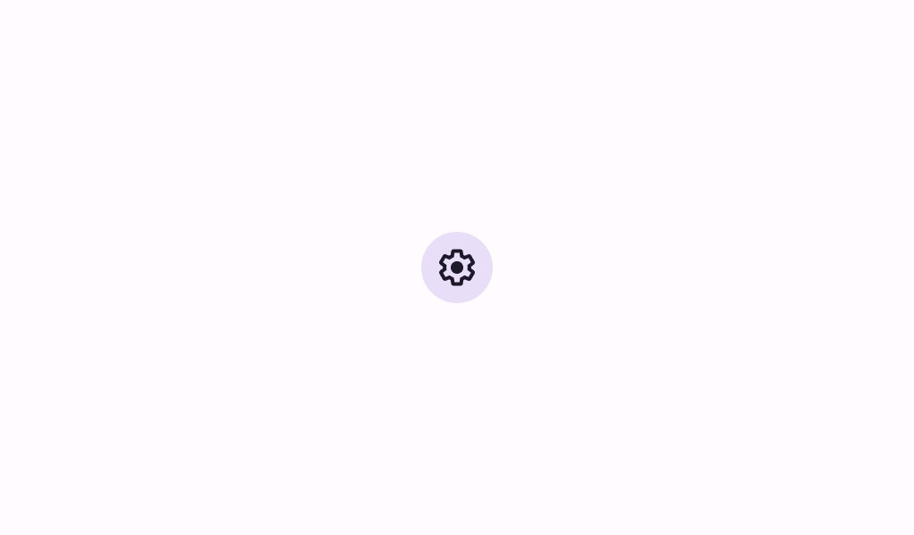
!Filled tonal icon button image(https://developer.android.com/images/reference/androidx/compose/material3/filled-tonal-icon-button.png)
A filled tonal icon button is a medium-emphasis icon button that is an alternative middle ground between the default FilledIconButton and OutlinedIconButton. They can be used in contexts where the lower-priority icon button requires slightly more emphasis than an outline would give.
content should typically be an Icon (see androidx.compose.material.icons.Icons). If using a custom icon, note that the typical size for the internal icon is 24 x 24 dp. This icon button has an overall minimum touch target size of 48 x 48dp, to meet accessibility guidelines.
Filled tonal icon button sample:
Overloads
FilledTonalIconButton
@Composable
fun FilledTonalIconButton(
    onClick: () -> Unit,
    modifier: Modifier = Modifier,
    enabled: Boolean = true,
    shape: Shape = IconButtonDefaults.filledShape,
    colors: IconButtonColors = IconButtonDefaults.filledTonalIconButtonColors(),
    interactionSource: MutableInteractionSource = remember { MutableInteractionSource() },
    content: @Composable () -> Unit
)
Parameters
| Name | Description |
|---|---|
onClick | called when this icon button is clicked |
modifier | the Modifier to be applied to this icon button |
enabled | controls the enabled state of this icon button. When false, this component will not respond to user input, and it will appear visually disabled and disabled to accessibility services. |
shape | defines the shape of this icon button's container |
colors | IconButtonColors that will be used to resolve the colors used for this icon button in different states. See IconButtonDefaults.filledIconButtonColors. |
interactionSource | the MutableInteractionSource representing the stream of Interactions for this icon button. You can create and pass in your own remembered instance to observe Interactions and customize the appearance / behavior of this icon button in different states. |
content | the content of this icon button, typically an Icon |