← Back to Material 3 Compose
MediumTopAppBar
Component
in
Material 3
. Since 1.0.0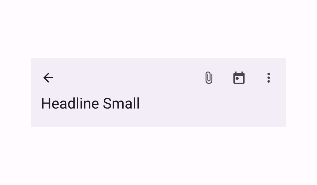
Overview
Code Examples
Video
<a href="https://m3.material.io/components/top-app-bar/overview" class="external" target="_blank">Material Design medium top app bar</a>.
Top app bars display information and actions at the top of a screen.
!Medium top app bar image(https://developer.android.com/images/reference/androidx/compose/material3/medium-top-app-bar.png)
This MediumTopAppBar has slots for a title, navigation icon, and actions. In its default expanded state, the title is displayed in a second row under the navigation and actions.
A medium top app bar that uses a scrollBehavior to customize its nested scrolling behavior when working in conjunction with scrolling content looks like:
Overloads
MediumTopAppBar
@ExperimentalMaterial3Api
@Composable
fun MediumTopAppBar(
    title: @Composable () -> Unit,
    modifier: Modifier = Modifier,
    navigationIcon: @Composable () -> Unit = {},
    actions: @Composable RowScope.() -> Unit = {},
    windowInsets: WindowInsets = TopAppBarDefaults.windowInsets,
    colors: TopAppBarColors = TopAppBarDefaults.mediumTopAppBarColors(),
    scrollBehavior: TopAppBarScrollBehavior? = null
)
Parameters
| Name | Description |
|---|---|
title | the title to be displayed in the top app bar. This title will be used in the app bar's expanded and collapsed states, although in its collapsed state it will be composed with a smaller sized TextStyle |
modifier | the Modifier to be applied to this top app bar |
navigationIcon | the navigation icon displayed at the start of the top app bar. This should typically be an IconButton or IconToggleButton. |
actions | the actions displayed at the end of the top app bar. This should typically be IconButtons. The default layout here is a Row, so icons inside will be placed horizontally. |
windowInsets | a window insets that app bar will respect. |
colors | TopAppBarColors that will be used to resolve the colors used for this top app bar in different states. See TopAppBarDefaults.mediumTopAppBarColors. |
scrollBehavior | a TopAppBarScrollBehavior which holds various offset values that will be applied by this top app bar to set up its height and colors. A scroll behavior is designed to work in conjunction with a scrolled content to change the top app bar appearance as the content scrolls. See TopAppBarScrollBehavior.nestedScrollConnection |