OutlinedIconButton
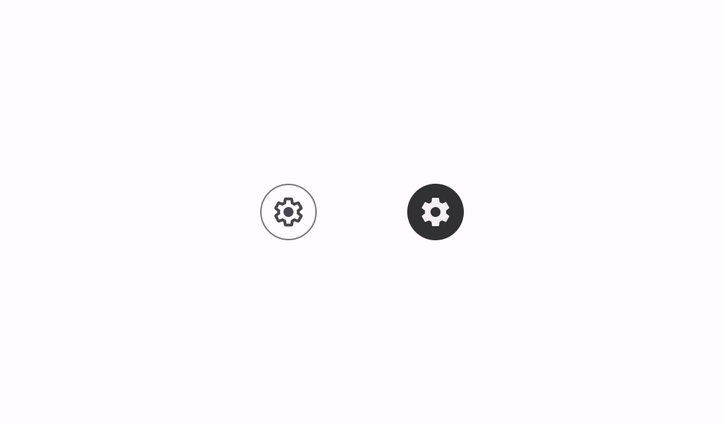
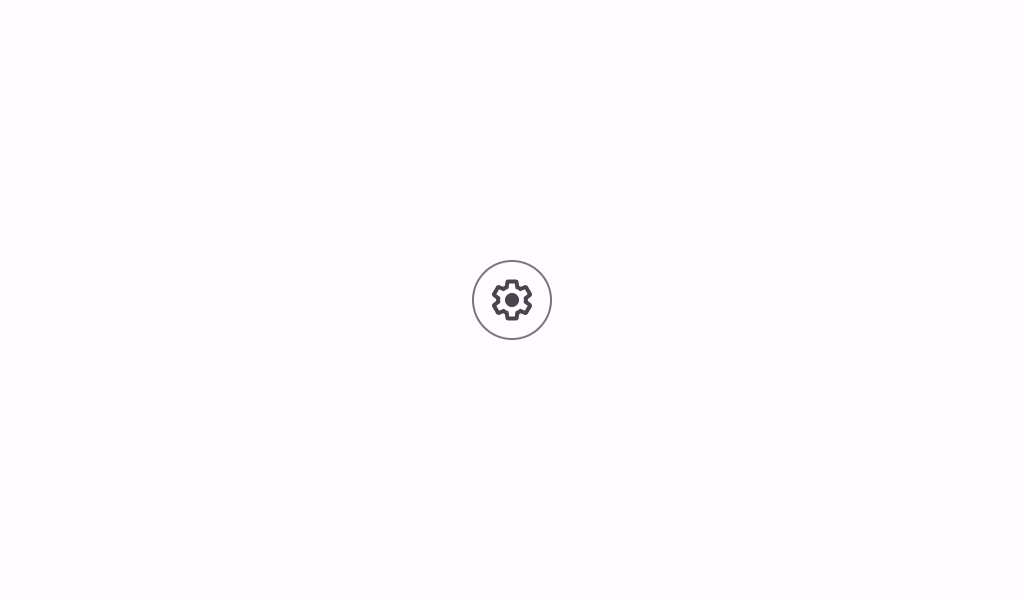
Icon buttons help people take supplementary actions with a single tap. They’re used when a compact button is required, such as in a toolbar or image list.
Installation
This component is available for Jetpack Compose (Android) and Compose Desktop
dependencies {
   implementation("androidx.compose.material3:material3:1.3.0-alpha06")
}
Overloads
@Composable
fun OutlinedIconButton(
    onClick: () -> Unit,
    modifier: Modifier = Modifier,
    enabled: Boolean = true,
    shape: Shape = IconButtonDefaults.outlinedShape,
    colors: IconButtonColors = IconButtonDefaults.outlinedIconButtonColors(),
    border: BorderStroke? = IconButtonDefaults.outlinedIconButtonBorder(enabled),
    interactionSource: MutableInteractionSource? = null,
    content: @Composable () -> Unit
)
Parameters
| name | description |
|---|---|
onClick | called when this icon button is clicked |
modifier | the [Modifier] to be applied to this icon button |
enabled | controls the enabled state of this icon button. When false, this component will not respond to user input, and it will appear visually disabled and disabled to accessibility services. |
shape | defines the shape of this icon button's container and border (when [border] is not null) |
colors | [IconButtonColors] that will be used to resolve the colors used for this icon button in different states. See [IconButtonDefaults.outlinedIconButtonColors]. |
border | the border to draw around the container of this icon button. Pass null for no border. See [IconButtonDefaults.outlinedIconButtonBorder]. |
interactionSource | an optional hoisted [MutableInteractionSource] for observing and emitting [Interaction]s for this icon button. You can use this to change the icon button's appearance or preview the icon button in different states. Note that if null is provided, interactions will still happen internally. |
content | the content of this icon button, typically an [Icon] |
Code Example
OutlinedIconButtonSample
@Composable
fun OutlinedIconButtonSample() {
    OutlinedIconButton(onClick = { /* doSomething() */ }) {
        Icon(Icons.Outlined.Lock, contentDescription = "Localized description")
    }
}