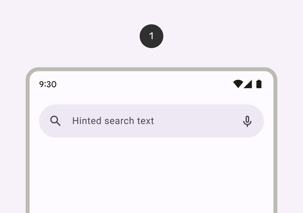
SearchBar
Source set: Common
@ExperimentalMaterial3Api
@Composable
fun SearchBar(
    state: SearchBarState,
    inputField: @Composable () -> Unit,
    modifier: Modifier = Modifier,
    shape: Shape = SearchBarDefaults.inputFieldShape,
    colors: SearchBarColors = SearchBarDefaults.colors(),
    tonalElevation: Dp = SearchBarDefaults.TonalElevation,
    shadowElevation: Dp = SearchBarDefaults.ShadowElevation,
)
Parameters
| state | the state of the search bar. This state should also be passed to the inputField and the expanded search bar. |
| inputField | the input field of this search bar that allows entering a query, typically a SearchBarDefaults.InputField. |
| modifier | the Modifier to be applied to this search bar when collapsed. |
| shape | the shape of this search bar when collapsed. |
| colors | SearchBarColors that will be used to resolve the colors used for this search bar in different states. See SearchBarDefaults.colors. |
| tonalElevation | when SearchBarColors.containerColor is ColorScheme.surface, a translucent primary color overlay is applied on top of the container. A higher tonal elevation value will result in a darker color in light theme and lighter color in dark theme. See also: Surface. |
| shadowElevation | the elevation for the shadow below this search bar. |
SearchBar
Source set: Common
@ExperimentalMaterial3Api
@Composable
fun SearchBar(
    inputField: @Composable () -> Unit,
    expanded: Boolean,
    onExpandedChange: (Boolean) -> Unit,
    modifier: Modifier = Modifier,
    shape: Shape = SearchBarDefaults.inputFieldShape,
    colors: SearchBarColors = SearchBarDefaults.colors(),
    tonalElevation: Dp = SearchBarDefaults.TonalElevation,
    shadowElevation: Dp = SearchBarDefaults.ShadowElevation,
    windowInsets: WindowInsets = SearchBarDefaults.windowInsets,
    content: @Composable ColumnScope.() -> Unit,
)
Parameters
| inputField | the input field of this search bar that allows entering a query, typically a SearchBarDefaults.InputField. |
| expanded | whether this search bar is expanded and showing search results. |
| onExpandedChange | the callback to be invoked when this search bar's expanded state is changed. |
| modifier | the Modifier to be applied to this search bar. |
| shape | the shape of this search bar when it is not expanded. When expanded, the shape will always be SearchBarDefaults.fullScreenShape. |
| colors | SearchBarColors that will be used to resolve the colors used for this search bar in different states. See SearchBarDefaults.colors. |
| tonalElevation | when SearchBarColors.containerColor is ColorScheme.surface, a translucent primary color overlay is applied on top of the container. A higher tonal elevation value will result in a darker color in light theme and lighter color in dark theme. See also: Surface. |
| shadowElevation | the elevation for the shadow below this search bar |
| windowInsets | the window insets that this search bar will respect |
| content | the content of this search bar to display search results below the inputField. |
SearchBar
Deprecated
Use overload which takes inputField as a parameter
Source set: Common
@ExperimentalMaterial3Api
@Composable
fun SearchBar(
    query: String,
    onQueryChange: (String) -> Unit,
    onSearch: (String) -> Unit,
    active: Boolean,
    onActiveChange: (Boolean) -> Unit,
    modifier: Modifier = Modifier,
    enabled: Boolean = true,
    placeholder: @Composable (() -> Unit)? = null,
    leadingIcon: @Composable (() -> Unit)? = null,
    trailingIcon: @Composable (() -> Unit)? = null,
    shape: Shape = SearchBarDefaults.inputFieldShape,
    colors: SearchBarColors = SearchBarDefaults.colors(),
    tonalElevation: Dp = SearchBarDefaults.TonalElevation,
    shadowElevation: Dp = SearchBarDefaults.ShadowElevation,
    windowInsets: WindowInsets = SearchBarDefaults.windowInsets,
    interactionSource: MutableInteractionSource? = null,
    content: @Composable ColumnScope.() -> Unit,
) =
    SearchBar(
        inputField = {
            InputField(
                modifier = Modifier.fillMaxWidth(),
                query = query,
                onQueryChange = onQueryChange,
                onSearch = onSearch,
                expanded = active,
                onExpandedChange = onActiveChange,
                enabled = enabled,
                placeholder = placeholder,
                leadingIcon = leadingIcon,
                trailingIcon = trailingIcon,
                colors = colors.inputFieldColors,
                interactionSource = interactionSource,
            )
        },
        expanded = active,
        onExpandedChange = onActiveChange,
        modifier = modifier,
        shape = shape,
        colors = colors,
        tonalElevation = tonalElevation,
        shadowElevation = shadowElevation,
        windowInsets = windowInsets,
        content = content,
    )