← Back to Material 3 Compose
Tab
Overview
Code Examples
<a href="https://m3.material.io/components/tabs/overview" class="external" target="_blank">Material Design tab.</a>
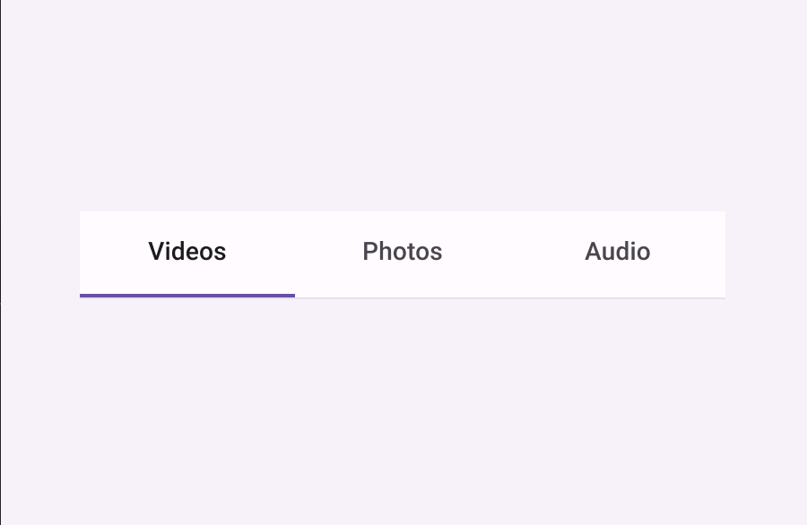
A default Tab, also known as a Primary Navigation Tab. Tabs organize content across different screens, data sets, and other interactions.
!Tabs image(https://developer.android.com/images/reference/androidx/compose/material3/secondary-tabs.png)
A Tab represents a single page of content using a text label and/or icon. It represents its selected state by tinting the text label and/or image with selectedContentColor.
This should typically be used inside of a TabRow, see the corresponding documentation for example usage.
This Tab has slots for text and/or icon - see the other Tab overload for a generic Tab that is not opinionated about its content.
@param selected whether this tab is selected or not @param onClick called when this tab is clicked @param modifier the Modifier to be applied to this tab @param enabled controls the enabled state of this tab. When false, this component will not respond to user input, and it will appear visually disabled and disabled to accessibility services. @param text the text label displayed in this tab @param icon the icon displayed in this tab @param selectedContentColor the color for the content of this tab when selected, and the color of the ripple. @param unselectedContentColor the color for the content of this tab when not selected @param interactionSource the MutableInteractionSource representing the stream of Interactions for this tab. You can create and pass in your own remembered instance to observe Interactions and customize the appearance / behavior of this tab in different states.
@see LeadingIconTab
Overloads
Tab
@Composable
fun Tab(
    selected: Boolean,
    onClick: () -> Unit,
    modifier: Modifier = Modifier,
    enabled: Boolean = true,
    text: @Composable (() -> Unit)? = null,
    icon: @Composable (() -> Unit)? = null,
    selectedContentColor: Color = LocalContentColor.current,
    unselectedContentColor: Color = selectedContentColor,
    interactionSource: MutableInteractionSource = remember { MutableInteractionSource() }
)
Parameters
| Name | Description |
|---|---|
selected | whether this tab is selected or not |
onClick | called when this tab is clicked |
modifier | the Modifier to be applied to this tab |
enabled | controls the enabled state of this tab. When false, this component will not respond to user input, and it will appear visually disabled and disabled to accessibility services. |
text | the text label displayed in this tab |
icon | the icon displayed in this tab |
selectedContentColor | the color for the content of this tab when selected, and the color of the ripple. |
unselectedContentColor | the color for the content of this tab when not selected |
interactionSource | the MutableInteractionSource representing the stream of Interactions for this tab. You can create and pass in your own remembered instance to observe Interactions and customize the appearance / behavior of this tab in different states. @see LeadingIconTa |
Tab
@Composable
fun Tab(
    selected: Boolean,
    onClick: () -> Unit,
    modifier: Modifier = Modifier,
    enabled: Boolean = true,
    selectedContentColor: Color = LocalContentColor.current,
    unselectedContentColor: Color = selectedContentColor,
    interactionSource: MutableInteractionSource = remember { MutableInteractionSource() },
    content: @Composable ColumnScope.() -> Unit
)
Parameters
| Name | Description |
|---|---|
selected | whether this tab is selected or not |
onClick | called when this tab is clicked |
modifier | the Modifier to be applied to this tab |
enabled | controls the enabled state of this tab. When false, this component will not respond to user input, and it will appear visually disabled and disabled to accessibility services. |
selectedContentColor | the color for the content of this tab when selected, and the color of the ripple. |
unselectedContentColor | the color for the content of this tab when not selected |
interactionSource | the MutableInteractionSource representing the stream of Interactions for this tab. You can create and pass in your own remembered instance to observe Interactions and customize the appearance / behavior of this tab in different states. |
content | the content of this ta |