← Back to Material Compose
BackdropScaffold
Overview
Code Examples
Video
<a href="https://material.io/components/backdrop" class="external" target="_blank">Material Design backdrop</a>.
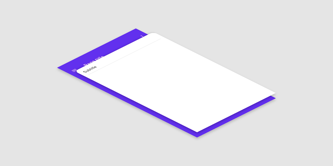
A backdrop appears behind all other surfaces in an app, displaying contextual and actionable content.
!Backdrop image(https://developer.android.com/images/reference/androidx/compose/material/backdrop.png)
This component provides an API to put together several material components to construct your screen. For a similar component which implements the basic material design layout strategy with app bars, floating action buttons and navigation drawers, use the standard Scaffold. For similar component that uses a bottom sheet as the centerpiece of the screen, use BottomSheetScaffold.
Either the back layer or front layer can be active at a time. When the front layer is active, it sits at an offset below the top of the screen. This is the peekHeight and defaults to 56dp which is the default app bar height. When the front layer is inactive, it sticks to the height of the back layer's content if stickyFrontLayer is set to true and the height of the front layer exceeds the headerHeight, and otherwise it minimizes to the headerHeight. To switch between the back layer and front layer, you can either swipe on the front layer if gesturesEnabled is set to true or use any of the methods in BackdropScaffoldState.
The scaffold also contains an app bar, which by default is placed above the back layer's content. If persistentAppBar is set to false, then the backdrop will not show the app bar when the back layer is revealed; instead it will switch between the app bar and the provided content with an animation. For best results, the peekHeight should match the app bar height. To show a snackbar, use the method showSnackbar of BackdropScaffoldState.snackbarHostState.
A simple example of a backdrop scaffold looks like this:
Overloads
BackdropScaffold
@Composable
@ExperimentalMaterialApi
fun BackdropScaffold(
    appBar: @Composable () -> Unit,
    backLayerContent: @Composable () -> Unit,
    frontLayerContent: @Composable () -> Unit,
    modifier: Modifier = Modifier,
    scaffoldState: BackdropScaffoldState = rememberBackdropScaffoldState(Concealed),
    gesturesEnabled: Boolean = true,
    peekHeight: Dp = BackdropScaffoldDefaults.PeekHeight,
    headerHeight: Dp = BackdropScaffoldDefaults.HeaderHeight,
    persistentAppBar: Boolean = true,
    stickyFrontLayer: Boolean = true,
    backLayerBackgroundColor: Color = MaterialTheme.colors.primary,
    backLayerContentColor: Color = contentColorFor(backLayerBackgroundColor),
    frontLayerShape: Shape = BackdropScaffoldDefaults.frontLayerShape,
    frontLayerElevation: Dp = BackdropScaffoldDefaults.FrontLayerElevation,
    frontLayerBackgroundColor: Color = MaterialTheme.colors.surface,
    frontLayerContentColor: Color = contentColorFor(frontLayerBackgroundColor),
    frontLayerScrimColor: Color = BackdropScaffoldDefaults.frontLayerScrimColor,
    snackbarHost: @Composable (SnackbarHostState) -> Unit = { SnackbarHost(it) }
)
Parameters
| Name | Description |
|---|---|
appBar | App bar for the back layer. Make sure that the peekHeight is equal to the height of the app bar, so that the app bar is fully visible. Consider using TopAppBar but set the elevation to 0dp and background color to transparent as a surface is already provided. |
backLayerContent | The content of the back layer. |
frontLayerContent | The content of the front layer. |
modifier | Optional Modifier for the root of the scaffold. |
scaffoldState | The state of the scaffold. |
gesturesEnabled | Whether or not the backdrop can be interacted with by gestures. |
peekHeight | The height of the visible part of the back layer when it is concealed. |
headerHeight | The minimum height of the front layer when it is inactive. |
persistentAppBar | Whether the app bar should be shown when the back layer is revealed. By default, it will always be shown above the back layer's content. If this is set to false, the back layer will automatically switch between the app bar and its content with an animation. |
stickyFrontLayer | Whether the front layer should stick to the height of the back layer. |
backLayerBackgroundColor | The background color of the back layer. |
backLayerContentColor | The preferred content color provided by the back layer to its children. Defaults to the matching content color for backLayerBackgroundColor, or if that is not a color from the theme, this will keep the same content color set above the back layer. |
frontLayerShape | The shape of the front layer. |
frontLayerElevation | The elevation of the front layer. |
frontLayerBackgroundColor | The background color of the front layer. |
frontLayerContentColor | The preferred content color provided by the back front to its children. Defaults to the matching content color for frontLayerBackgroundColor, or if that is not a color from the theme, this will keep the same content color set above the front layer. |
frontLayerScrimColor | The color of the scrim applied to the front layer when the back layer is revealed. If the color passed is Color.Unspecified, then a scrim will not be applied and interaction with the front layer will not be blocked when the back layer is revealed. |
snackbarHost | The component hosting the snackbars shown inside the scaffold |