← Back to Material Compose
BottomAppBar
Overview
Code Examples
<a href="https://material.io/components/app-bars-bottom" class="external" target="_blank">Material Design bottom app bar</a>.
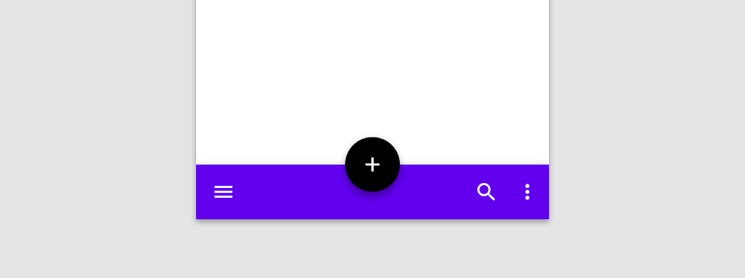
A bottom app bar displays navigation and key actions at the bottom of screens.
!App bars: bottom image(https://developer.android.com/images/reference/androidx/compose/material/app-bars-bottom.png)
This particular overload provides ability to specify WindowInsets. Recommended value can be found in AppBarDefaults.bottomAppBarWindowInsets.
It can also optionally display a FloatingActionButton, which is either overlaid on top of the BottomAppBar, or inset, carving a cutout in the BottomAppBar.
See BottomAppBar anatomy(https://material.io/components/app-bars-bottom/#anatomy) for the recommended content depending on the FloatingActionButton position.
Note that when you pass a non-null cutoutShape this makes the AppBar shape concave. The shadows for such shapes will not be drawn on Android versions less than 10.
The LocalContentAlpha inside a BottomAppBar is ContentAlpha.medium - this is the default for trailing and overflow icons. It is recommended that any leading icons at the start of the BottomAppBar, such as a menu icon, use ContentAlpha.high instead. This is demonstrated in the sample below.
Also see BottomNavigation.
Overloads
BottomAppBar
@Composable
fun BottomAppBar(
    windowInsets: WindowInsets,
    modifier: Modifier = Modifier,
    backgroundColor: Color = MaterialTheme.colors.primarySurface,
    contentColor: Color = contentColorFor(backgroundColor),
    cutoutShape: Shape? = null,
    elevation: Dp = AppBarDefaults.BottomAppBarElevation,
    contentPadding: PaddingValues = AppBarDefaults.ContentPadding,
    content: @Composable RowScope.() -> Unit
)
Parameters
| Name | Description |
|---|---|
windowInsets | a window insets that app bar will respect. |
modifier | The Modifier to be applied to this BottomAppBar |
backgroundColor | The background color for the BottomAppBar. Use Color.Transparent to have no color. |
contentColor | The preferred content color provided by this BottomAppBar to its children. Defaults to either the matching content color for backgroundColor, or if backgroundColor is not a color from the theme, this will keep the same value set above this BottomAppBar. |
cutoutShape | the shape of the cutout that will be added to the BottomAppBar - this should typically be the same shape used inside the FloatingActionButton, when BottomAppBar and FloatingActionButton are being used together in Scaffold. This shape will be drawn with an offset around all sides. If null, where will be no cutout. |
elevation | the elevation of this BottomAppBar. |
contentPadding | the padding applied to the content of this BottomAppBar |
content | the content of this BottomAppBar. The default layout here is a Row, so content inside will be placed horizontally |
BottomAppBar
@Composable
fun BottomAppBar(
    modifier: Modifier = Modifier,
    backgroundColor: Color = MaterialTheme.colors.primarySurface,
    contentColor: Color = contentColorFor(backgroundColor),
    cutoutShape: Shape? = null,
    elevation: Dp = AppBarDefaults.BottomAppBarElevation,
    contentPadding: PaddingValues = AppBarDefaults.ContentPadding,
    content: @Composable RowScope.() -> Unit
)
Parameters
| Name | Description |
|---|---|
modifier | The Modifier to be applied to this BottomAppBar |
backgroundColor | The background color for the BottomAppBar. Use Color.Transparent to have no color. |
contentColor | The preferred content color provided by this BottomAppBar to its children. Defaults to either the matching content color for backgroundColor, or if backgroundColor is not a color from the theme, this will keep the same value set above this BottomAppBar. |
cutoutShape | the shape of the cutout that will be added to the BottomAppBar - this should typically be the same shape used inside the FloatingActionButton, when BottomAppBar and FloatingActionButton are being used together in Scaffold. This shape will be drawn with an offset around all sides. If null, where will be no cutout. |
elevation | the elevation of this BottomAppBar. |
contentPadding | the padding applied to the content of this BottomAppBar |
content | the content of this BottomAppBar. The default layout here is a Row, so content inside will be placed horizontally |