← Back to Material Compose
Divider
Component
in
Material
. Since 0.1.0-dev15
Overview
Code Examples
<a href="https://material.io/components/dividers" class="external" target="_blank">Material Design divider</a>.
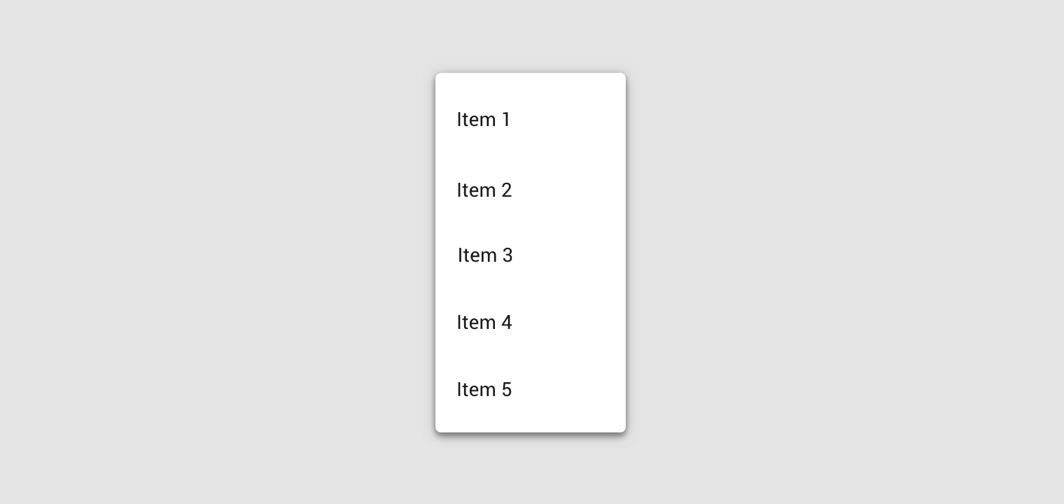
A divider is a thin line that groups content in lists and layouts.
!Dividers image(https://developer.android.com/images/reference/androidx/compose/material/dividers.png)
@param color color of the divider line @param thickness thickness of the divider line, 1 dp is used by default. Using Dp.Hairline will produce a single pixel divider regardless of screen density. @param startIndent start offset of this line, no offset by default
Overloads
Divider
@Composable
fun Divider(
    modifier: Modifier = Modifier,
    color: Color = MaterialTheme.colors.onSurface.copy(alpha = DividerAlpha),
    thickness: Dp = 1.dp,
    startIndent: Dp = 0.dp
)
Parameters
| Name | Description |
|---|---|
color | color of the divider line |
thickness | thickness of the divider line, 1 dp is used by default. Using Dp.Hairline will produce a single pixel divider regardless of screen density. |
startIndent | start offset of this line, no offset by defaul |
Divider
object TabRowDefaults {
    /**
     * Default [Divider], which will be positioned at the bottom of the [TabRow], underneath the
     * indicator.
     *
     * @param modifier modifier for the divider's layout
     * @param thickness thickness of the divider
     * @param color color of the divider
     */
    @Composable
    fun Divider(
        modifier: Modifier = Modifier,
        thickness: Dp = DividerThickness,
        color: Color = LocalContentColor.current.copy(alpha = DividerOpacity)
    )