← Back to Material Compose
IconToggleButton
Component
in
Material
. Since 0.1.0-dev15Overview
Code Examples
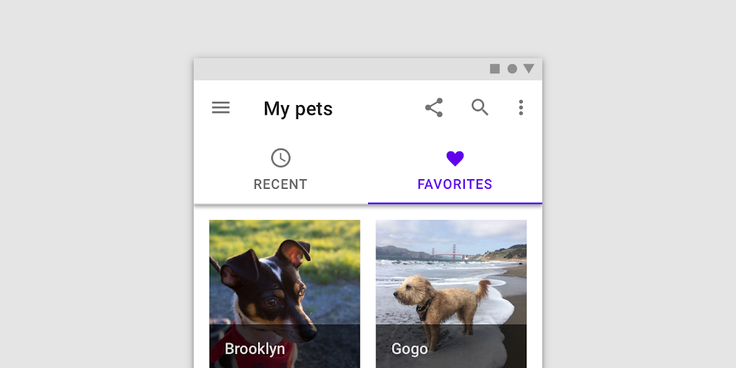
An IconButton with two states, for icons that can be toggled 'on' and 'off', such as a bookmark icon, or a navigation icon that opens a drawer.
Overloads
IconToggleButton
@Composable
fun IconToggleButton(
    checked: Boolean,
    onCheckedChange: (Boolean) -> Unit,
    modifier: Modifier = Modifier,
    enabled: Boolean = true,
    interactionSource: MutableInteractionSource = remember { MutableInteractionSource() },
    content: @Composable () -> Unit
)
Parameters
| Name | Description |
|---|---|
checked | whether this IconToggleButton is currently checked |
onCheckedChange | callback to be invoked when this icon is selected |
modifier | optional Modifier for this IconToggleButton |
enabled | enabled whether or not this IconToggleButton will handle input events and appear enabled for semantics purposes |
interactionSource | the MutableInteractionSource representing the stream of Interactions for this IconToggleButton. You can create and pass in your own remembered MutableInteractionSource if you want to observe Interactions and customize the appearance / behavior of this IconToggleButton in different Interactions. |
content | the content (icon) to be drawn inside the IconToggleButton. This is typically an Icon |