← Back to Material Compose
NavigationRail

Overview
Code Examples
<a href="https://material.io/components/navigation-rail" class="external" target="_blank">Material Design navigation rail</a>.
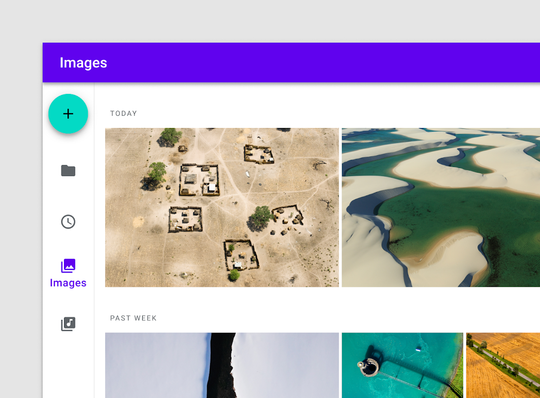
A Navigation Rail is a side navigation component that allows movement between primary destinations in an app. A navigation rail should be used to display three to seven app destinations and, optionally, a FloatingActionButton or a logo inside header. Each destination is typically represented by an icon and an optional text label.
!Navigation rail image(https://developer.android.com/images/reference/androidx/compose/material/navigation-rail.png)
This particular overload provides ability to specify WindowInsets. Recommended value can be found in NavigationRailDefaults.windowInsets.
NavigationRail should contain multiple NavigationRailItems, each representing a singular destination.
A simple example looks like:
Overloads
NavigationRail
@Composable
fun NavigationRail(
    windowInsets: WindowInsets,
    modifier: Modifier = Modifier,
    backgroundColor: Color = MaterialTheme.colors.surface,
    contentColor: Color = contentColorFor(backgroundColor),
    elevation: Dp = NavigationRailDefaults.Elevation,
    header: @Composable (ColumnScope.() -> Unit)? = null,
    content: @Composable ColumnScope.() -> Unit
)
Parameters
| Name | Description |
|---|---|
windowInsets | a window insets that navigation rail will respect |
modifier | optional Modifier for this NavigationRail |
backgroundColor | The background color for this NavigationRail |
contentColor | The preferred content color provided by this NavigationRail to its children. Defaults to either the matching content color for backgroundColor, or if backgroundColor is not a color from the theme, this will keep the same value set above this NavigationRail. |
elevation | elevation for this NavigationRail |
header | an optional header that may hold a FloatingActionButton or a logo |
content | destinations inside this NavigationRail, this should contain multiple NavigationRailItem |
NavigationRail
@Composable
fun NavigationRail(
    modifier: Modifier = Modifier,
    backgroundColor: Color = MaterialTheme.colors.surface,
    contentColor: Color = contentColorFor(backgroundColor),
    elevation: Dp = NavigationRailDefaults.Elevation,
    header: @Composable (ColumnScope.() -> Unit)? = null,
    content: @Composable ColumnScope.() -> Unit
)
Parameters
| Name | Description |
|---|---|
modifier | optional Modifier for this NavigationRail |
backgroundColor | The background color for this NavigationRail |
contentColor | The preferred content color provided by this NavigationRail to its children. Defaults to either the matching content color for backgroundColor, or if backgroundColor is not a color from the theme, this will keep the same value set above this NavigationRail. |
elevation | elevation for this NavigationRail |
header | an optional header that may hold a FloatingActionButton or a logo |
content | destinations inside this NavigationRail, this should contain multiple NavigationRailItem |
