← Back to Material Compose
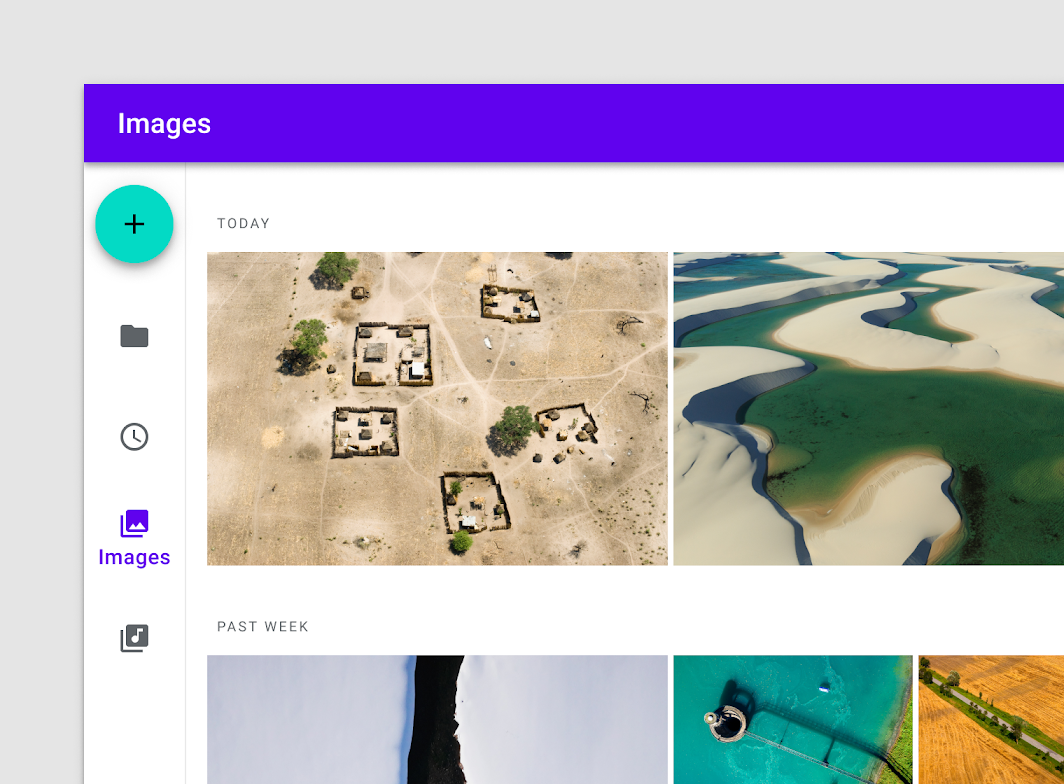
NavigationRailItem
Overview
Code Examples
<a href="https://material.io/components/navigation-rail" class="external" target="_blank">Material Design navigation rail</a> item.
A NavigationRailItem always shows text labels (if it exists) when selected. Showing text labels if not selected is controlled by alwaysShowLabel.
@param selected whether this item is selected (active) @param onClick the callback to be invoked when this item is selected @param icon icon for this item, typically this will be an Icon @param modifier optional Modifier for this item @param enabled controls the enabled state of this item. When false, this item will not be clickable and will appear disabled to accessibility services. @param label optional text label for this item @param alwaysShowLabel whether to always show the label for this item. If false, the label will only be shown when this item is selected. @param interactionSource the MutableInteractionSource representing the stream of Interactions for this NavigationRailItem. You can create and pass in your own remembered MutableInteractionSource if you want to observe Interactions and customize the appearance / behavior of this NavigationRailItem in different Interactions. @param selectedContentColor the color of the text label and icon when this item is selected, and the color of the ripple. @param unselectedContentColor the color of the text label and icon when this item is not selected
Overloads
NavigationRailItem
@Composable
fun NavigationRailItem(
    selected: Boolean,
    onClick: () -> Unit,
    icon: @Composable () -> Unit,
    modifier: Modifier = Modifier,
    enabled: Boolean = true,
    label: @Composable (() -> Unit)? = null,
    alwaysShowLabel: Boolean = true,
    interactionSource: MutableInteractionSource = remember { MutableInteractionSource() },
    selectedContentColor: Color = MaterialTheme.colors.primary,
    unselectedContentColor: Color = LocalContentColor.current.copy(alpha = ContentAlpha.medium)
)
Parameters
| Name | Description |
|---|---|
selected | whether this item is selected (active) |
onClick | the callback to be invoked when this item is selected |
icon | icon for this item, typically this will be an Icon |
modifier | optional Modifier for this item |
enabled | controls the enabled state of this item. When false, this item will not be clickable and will appear disabled to accessibility services. |
label | optional text label for this item |
alwaysShowLabel | whether to always show the label for this item. If false, the label will only be shown when this item is selected. |
interactionSource | the MutableInteractionSource representing the stream of Interactions for this NavigationRailItem. You can create and pass in your own remembered MutableInteractionSource if you want to observe Interactions and customize the appearance / behavior of this NavigationRailItem in different Interactions. |
selectedContentColor | the color of the text label and icon when this item is selected, and the color of the ripple. |
unselectedContentColor | the color of the text label and icon when this item is not selecte |