
← Back to Material Compose
RadioButton
Component
in
Material
. Since 0.1.0-dev15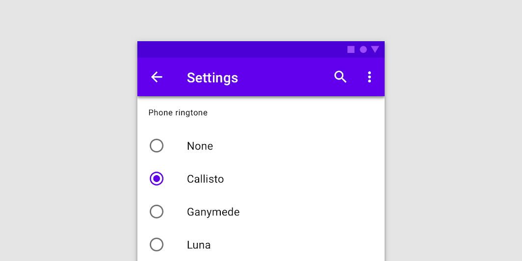
Overview
Code Examples
<a href="https://material.io/components/radio-buttons" class="external" target="_blank">Material Design radio button</a>.
Radio buttons allow users to select one option from a set.
!Radio buttons image(https://developer.android.com/images/reference/androidx/compose/material/radio-buttons.png)
Overloads
RadioButton
@Composable
fun RadioButton(
    selected: Boolean,
    onClick: (() -> Unit)?,
    modifier: Modifier = Modifier,
    enabled: Boolean = true,
    interactionSource: MutableInteractionSource = remember { MutableInteractionSource() },
    colors: RadioButtonColors = RadioButtonDefaults.colors()
)
Parameters
| Name | Description |
|---|---|
selected | whether this radio button is selected or not |
onClick | callback to be invoked when the RadioButton is clicked. If null, then this RadioButton will not handle input events, and only act as a visual indicator of selected state |
modifier | Modifier to be applied to the radio button |
enabled | Controls the enabled state of the RadioButton. When false, this button will not be selectable and appears disabled |
interactionSource | the MutableInteractionSource representing the stream of Interactions for this RadioButton. You can create and pass in your own remembered MutableInteractionSource if you want to observe Interactions and customize the appearance / behavior of this RadioButton in different Interactions. |
colors | RadioButtonColors that will be used to resolve the color used for this RadioButton in different states. See RadioButtonDefaults.colors |
