← Back to Material Compose
Scaffold
Overview
Code Examples
Video
<a href="https://material.io/design/layout/understanding-layout.html" class="external" target="_blank">Material Design layout</a>.
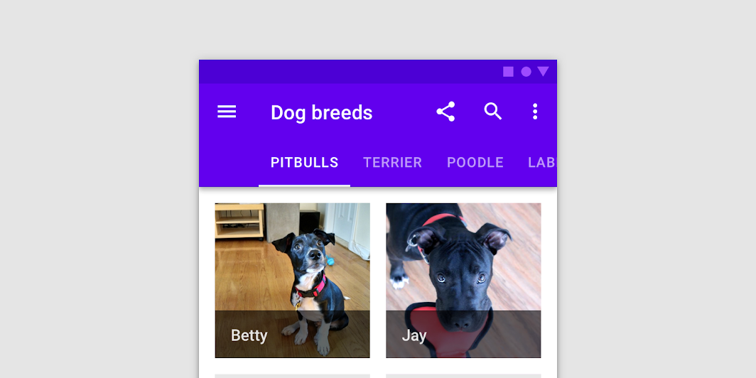
Scaffold implements the basic material design visual layout structure.
This component provides API to put together several material components to construct your screen, by ensuring proper layout strategy for them and collecting necessary data so these components will work together correctly.
For similar components that implement different layout structures, see BackdropScaffold, which uses a backdrop as the centerpiece of the screen, and BottomSheetScaffold, which uses a persistent bottom sheet as the centerpiece of the screen.
This particular overload provides ability to specify WindowInsets. Recommended value can be found in ScaffoldDefaults.contentWindowInsets.
Simple example of a Scaffold with TopAppBar, FloatingActionButton and drawer:
Overloads
Scaffold
@Composable
fun Scaffold(
    contentWindowInsets: WindowInsets,
    modifier: Modifier = Modifier,
    scaffoldState: ScaffoldState = rememberScaffoldState(),
    topBar: @Composable () -> Unit = {},
    bottomBar: @Composable () -> Unit = {},
    snackbarHost: @Composable (SnackbarHostState) -> Unit = { SnackbarHost(it) },
    floatingActionButton: @Composable () -> Unit = {},
    floatingActionButtonPosition: FabPosition = FabPosition.End,
    isFloatingActionButtonDocked: Boolean = false,
    drawerContent: @Composable (ColumnScope.() -> Unit)? = null,
    drawerGesturesEnabled: Boolean = true,
    drawerShape: Shape = MaterialTheme.shapes.large,
    drawerElevation: Dp = DrawerDefaults.Elevation,
    drawerBackgroundColor: Color = MaterialTheme.colors.surface,
    drawerContentColor: Color = contentColorFor(drawerBackgroundColor),
    drawerScrimColor: Color = DrawerDefaults.scrimColor,
    backgroundColor: Color = MaterialTheme.colors.background,
    contentColor: Color = contentColorFor(backgroundColor),
    content: @Composable (PaddingValues) -> Unit
)
Parameters
| Name | Description |
|---|---|
contentWindowInsets | window insets to be passed to content slot via PaddingValues params. Scaffold will take the insets into account from the top/bottom only if the topBar/ bottomBar are not present, as the scaffold expect topBar/bottomBar to handle insets instead. Any insets consumed by other insets padding modifiers or consumeWindowInsets on a parent layout will be excluded from contentWindowInsets. |
modifier | optional Modifier for the root of the Scaffold |
scaffoldState | state of this scaffold widget. It contains the state of the screen, e.g. variables to provide manual control over the drawer behavior, sizes of components, etc |
topBar | top app bar of the screen. Consider using TopAppBar. |
bottomBar | bottom bar of the screen. Consider using BottomAppBar. |
snackbarHost | component to host Snackbars that are pushed to be shown via SnackbarHostState.showSnackbar. Usually it's a SnackbarHost |
floatingActionButton | Main action button of your screen. Consider using FloatingActionButton for this slot. |
floatingActionButtonPosition | position of the FAB on the screen. See FabPosition for possible options available. |
isFloatingActionButtonDocked | whether floatingActionButton should overlap with bottomBar for half a height, if bottomBar exists. Ignored if there's no bottomBar or no floatingActionButton. |
drawerContent | content of the Drawer sheet that can be pulled from the left side (right for RTL). |
drawerGesturesEnabled | whether or not drawer (if set) can be interacted with via gestures |
drawerShape | shape of the drawer sheet (if set) |
drawerElevation | drawer sheet elevation. This controls the size of the shadow below the drawer sheet (if set) |
drawerBackgroundColor | background color to be used for the drawer sheet |
drawerContentColor | color of the content to use inside the drawer sheet. Defaults to either the matching content color for drawerBackgroundColor, or, if it is not a color from the theme, this will keep the same value set above this Surface. |
drawerScrimColor | color of the scrim that obscures content when the drawer is open |
backgroundColor | background of the scaffold body |
contentColor | color of the content in scaffold body. Defaults to either the matching content color for backgroundColor, or, if it is not a color from the theme, this will keep the same value set above this Surface. |
content | content of your screen. The lambda receives an PaddingValues that should be applied to the content root via Modifier.padding to properly offset top and bottom bars. If you're using VerticalScroller, apply this modifier to the child of the scroller, and not on the scroller itself |
Scaffold
@Composable
fun Scaffold(
    modifier: Modifier = Modifier,
    scaffoldState: ScaffoldState = rememberScaffoldState(),
    topBar: @Composable () -> Unit = {},
    bottomBar: @Composable () -> Unit = {},
    snackbarHost: @Composable (SnackbarHostState) -> Unit = { SnackbarHost(it) },
    floatingActionButton: @Composable () -> Unit = {},
    floatingActionButtonPosition: FabPosition = FabPosition.End,
    isFloatingActionButtonDocked: Boolean = false,
    drawerContent: @Composable (ColumnScope.() -> Unit)? = null,
    drawerGesturesEnabled: Boolean = true,
    drawerShape: Shape = MaterialTheme.shapes.large,
    drawerElevation: Dp = DrawerDefaults.Elevation,
    drawerBackgroundColor: Color = MaterialTheme.colors.surface,
    drawerContentColor: Color = contentColorFor(drawerBackgroundColor),
    drawerScrimColor: Color = DrawerDefaults.scrimColor,
    backgroundColor: Color = MaterialTheme.colors.background,
    contentColor: Color = contentColorFor(backgroundColor),
    content: @Composable (PaddingValues) -> Unit
)
Parameters
| Name | Description |
|---|---|
modifier | optional Modifier for the root of the Scaffold |
scaffoldState | state of this scaffold widget. It contains the state of the screen, e.g. variables to provide manual control over the drawer behavior, sizes of components, etc |
topBar | top app bar of the screen. Consider using TopAppBar. |
bottomBar | bottom bar of the screen. Consider using BottomAppBar. |
snackbarHost | component to host Snackbars that are pushed to be shown via SnackbarHostState.showSnackbar. Usually it's a SnackbarHost |
floatingActionButton | Main action button of your screen. Consider using FloatingActionButton for this slot. |
floatingActionButtonPosition | position of the FAB on the screen. See FabPosition for possible options available. |
isFloatingActionButtonDocked | whether floatingActionButton should overlap with bottomBar for half a height, if bottomBar exists. Ignored if there's no bottomBar or no floatingActionButton. |
drawerContent | content of the Drawer sheet that can be pulled from the left side (right for RTL). |
drawerGesturesEnabled | whether or not drawer (if set) can be interacted with via gestures |
drawerShape | shape of the drawer sheet (if set) |
drawerElevation | drawer sheet elevation. This controls the size of the shadow below the drawer sheet (if set) |
drawerBackgroundColor | background color to be used for the drawer sheet |
drawerContentColor | color of the content to use inside the drawer sheet. Defaults to either the matching content color for drawerBackgroundColor, or, if it is not a color from the theme, this will keep the same value set above this Surface. |
drawerScrimColor | color of the scrim that obscures content when the drawer is open |
backgroundColor | background of the scaffold body |
contentColor | color of the content in scaffold body. Defaults to either the matching content color for backgroundColor, or, if it is not a color from the theme, this will keep the same value set above this Surface. |
content | content of your screen. The lambda receives an PaddingValues that should be applied to the content root via Modifier.padding to properly offset top and bottom bars. If you're using VerticalScroller, apply this modifier to the child of the scroller, and not on the scroller itself |