← Back to Material Compose
ScrollableTabRow
Overview
Code Examples
<a href="https://material.io/components/tabs#scrollable-tabs" class="external" target="_blank">Material Design scrollable tabs</a>.
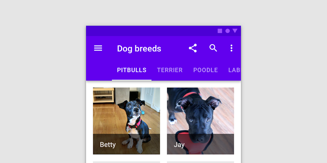
When a set of tabs cannot fit on screen, use scrollable tabs. Scrollable tabs can use longer text labels and a larger number of tabs. They are best used for browsing on touch interfaces.
!Scrollable tabs image(https://developer.android.com/images/reference/androidx/compose/material/scrollable-tabs.png)
A ScrollableTabRow contains a row of Tabs, and displays an indicator underneath the currently selected tab. A ScrollableTabRow places its tabs offset from the starting edge, and allows scrolling to tabs that are placed off screen. For a fixed tab row that does not allow scrolling, and evenly places its tabs, see TabRow.
@param selectedTabIndex the index of the currently selected tab @param modifier optional Modifier for this ScrollableTabRow @param backgroundColor The background color for the ScrollableTabRow. Use Color.Transparent to have no color. @param contentColor The preferred content color provided by this ScrollableTabRow to its children. Defaults to either the matching content color for backgroundColor, or if backgroundColor is not a color from the theme, this will keep the same value set above this ScrollableTabRow. @param edgePadding the padding between the starting and ending edge of ScrollableTabRow, and the tabs inside the ScrollableTabRow. This padding helps inform the user that this tab row can be scrolled, unlike a TabRow. @param indicator the indicator that represents which tab is currently selected. By default this will be a TabRowDefaults.Indicator, using a TabRowDefaults.tabIndicatorOffset modifier to animate its position. Note that this indicator will be forced to fill up the entire ScrollableTabRow, so you should use TabRowDefaults.tabIndicatorOffset or similar to animate the actual drawn indicator inside this space, and provide an offset from the start. @param divider the divider displayed at the bottom of the ScrollableTabRow. This provides a layer of separation between the ScrollableTabRow and the content displayed underneath. @param tabs the tabs inside this ScrollableTabRow. Typically this will be multiple Tabs. Each element inside this lambda will be measured and placed evenly across the TabRow, each taking up equal space.
Overloads
ScrollableTabRow
@Composable
@UiComposable
fun ScrollableTabRow(
    selectedTabIndex: Int,
    modifier: Modifier = Modifier,
    backgroundColor: Color = MaterialTheme.colors.primarySurface,
    contentColor: Color = contentColorFor(backgroundColor),
    edgePadding: Dp = TabRowDefaults.ScrollableTabRowPadding,
    indicator: @Composable @UiComposable
        (tabPositions: List<TabPosition>) -> Unit = @Composable { tabPositions ->
        TabRowDefaults.Indicator(
            Modifier.tabIndicatorOffset(tabPositions[selectedTabIndex])
        )
    },
    divider: @Composable @UiComposable () -> Unit =
        @Composable {
            TabRowDefaults.Divider()
        },
    tabs: @Composable @UiComposable () -> Unit
)
Parameters
| Name | Description |
|---|---|
selectedTabIndex | the index of the currently selected tab |
modifier | optional Modifier for this ScrollableTabRow |
backgroundColor | The background color for the ScrollableTabRow. Use Color.Transparent to have no color. |
contentColor | The preferred content color provided by this ScrollableTabRow to its children. Defaults to either the matching content color for backgroundColor, or if backgroundColor is not a color from the theme, this will keep the same value set above this ScrollableTabRow. |
edgePadding | the padding between the starting and ending edge of ScrollableTabRow, and the tabs inside the ScrollableTabRow. This padding helps inform the user that this tab row can be scrolled, unlike a TabRow. |
indicator | the indicator that represents which tab is currently selected. By default this will be a TabRowDefaults.Indicator, using a TabRowDefaults.tabIndicatorOffset modifier to animate its position. Note that this indicator will be forced to fill up the entire ScrollableTabRow, so you should use TabRowDefaults.tabIndicatorOffset or similar to animate the actual drawn indicator inside this space, and provide an offset from the start. |
divider | the divider displayed at the bottom of the ScrollableTabRow. This provides a layer of separation between the ScrollableTabRow and the content displayed underneath. |
tabs | the tabs inside this ScrollableTabRow. Typically this will be multiple Tabs. Each element inside this lambda will be measured and placed evenly across the TabRow, each taking up equal space |