← Back to Material Compose
Slider
Component
in
Material
. Since 0.1.0-dev15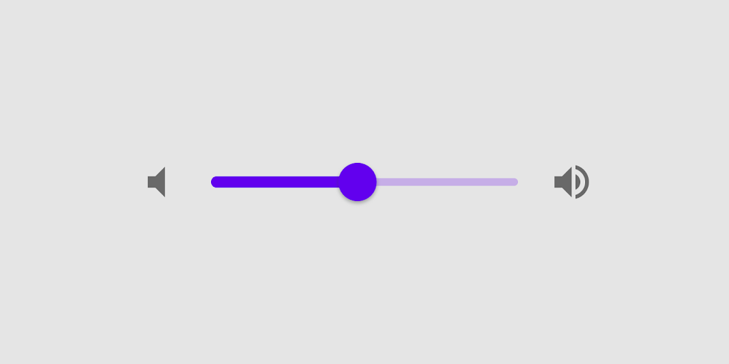
Overview
Code Examples
<a href="https://material.io/components/sliders" class="external" target="_blank">Material Design slider</a>.
Sliders allow users to make selections from a range of values.
Sliders reflect a range of values along a bar, from which users may select a single value. They are ideal for adjusting settings such as volume, brightness, or applying image filters.
!Sliders image(https://developer.android.com/images/reference/androidx/compose/material/sliders.png)
Use continuous sliders to allow users to make meaningful selections that don’t require a specific value:
Overloads
Slider
@Composable
fun Slider(
    value: Float,
    onValueChange: (Float) -> Unit,
    modifier: Modifier = Modifier,
    enabled: Boolean = true,
    valueRange: ClosedFloatingPointRange<Float> = 0f..1f,
    @IntRange(from = 0)
    steps: Int = 0,
    onValueChangeFinished: (() -> Unit)? = null,
    interactionSource: MutableInteractionSource = remember { MutableInteractionSource() },
    colors: SliderColors = SliderDefaults.colors()
)
Parameters
| Name | Description |
|---|---|
value | current value of the Slider. If outside of valueRange provided, value will be coerced to this range. |
onValueChange | lambda in which value should be updated |
modifier | modifiers for the Slider layout |
enabled | whether or not component is enabled and can be interacted with or not |
valueRange | range of values that Slider value can take. Passed value will be coerced to this range |
steps | if greater than 0, specifies the amounts of discrete values, evenly distributed between across the whole value range. If 0, slider will behave as a continuous slider and allow to choose any value from the range specified. Must not be negative. |
onValueChangeFinished | lambda to be invoked when value change has ended. This callback shouldn't be used to update the slider value (use onValueChange for that), but rather to know when the user has completed selecting a new value by ending a drag or a click. |
interactionSource | the MutableInteractionSource representing the stream of Interactions for this Slider. You can create and pass in your own remembered MutableInteractionSource if you want to observe Interactions and customize the appearance / behavior of this Slider in different Interactions. |
colors | SliderColors that will be used to determine the color of the Slider parts in different state. See SliderDefaults.colors to customize |