← Back to Material Compose
Snackbar
Overview
Code Examples
<a href="https://material.io/components/snackbars" class="external" target="_blank">Material Design snackbar</a>.
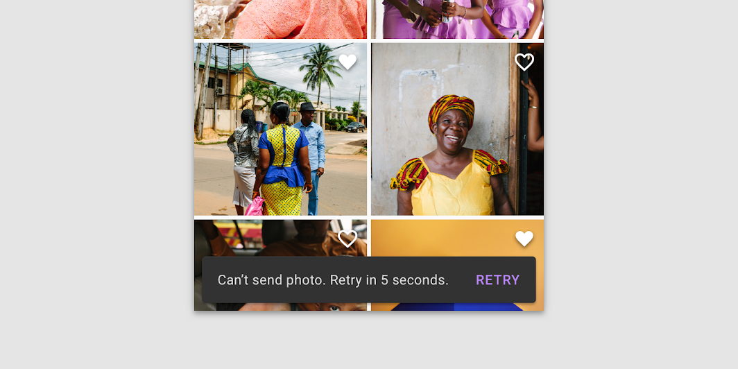
Snackbars provide brief messages about app processes at the bottom of the screen.
Snackbars inform users of a process that an app has performed or will perform. They appear temporarily, towards the bottom of the screen. They shouldn’t interrupt the user experience, and they don’t require user input to disappear.
A Snackbar can contain a single action. Because Snackbar disappears automatically, the action shouldn't be "Dismiss" or "Cancel".
!Snackbars image(https://developer.android.com/images/reference/androidx/compose/material/snackbars.png)
This components provides only the visuals of the Snackbar. If you need to show a Snackbar with defaults on the screen, use ScaffoldState.snackbarHostState and SnackbarHostState.showSnackbar:
Overloads
Snackbar
@Composable
fun Snackbar(
    modifier: Modifier = Modifier,
    action: @Composable (() -> Unit)? = null,
    actionOnNewLine: Boolean = false,
    shape: Shape = MaterialTheme.shapes.small,
    backgroundColor: Color = SnackbarDefaults.backgroundColor,
    contentColor: Color = MaterialTheme.colors.surface,
    elevation: Dp = 6.dp,
    content: @Composable () -> Unit
)
Parameters
| Name | Description |
|---|---|
modifier | modifiers for the Snackbar layout |
action | action / button component to add as an action to the snackbar. Consider using SnackbarDefaults.primaryActionColor as the color for the action, if you do not have a predefined color you wish to use instead. |
actionOnNewLine | whether or not action should be put on the separate line. Recommended for action with long action text |
shape | Defines the Snackbar's shape as well as its shadow |
backgroundColor | background color of the Snackbar |
contentColor | color of the content to use inside the snackbar. Defaults to either the matching content color for backgroundColor, or, if it is not a color from the theme, this will keep the same value set above this Surface. |
elevation | The z-coordinate at which to place the SnackBar. This controls the size of the shadow below the SnackBar |
content | content to show information about a process that an app has performed or will perfor |
Snackbar
@Composable
fun Snackbar(
    snackbarData: SnackbarData,
    modifier: Modifier = Modifier,
    actionOnNewLine: Boolean = false,
    shape: Shape = MaterialTheme.shapes.small,
    backgroundColor: Color = SnackbarDefaults.backgroundColor,
    contentColor: Color = MaterialTheme.colors.surface,
    actionColor: Color = SnackbarDefaults.primaryActionColor,
    elevation: Dp = 6.dp
)
Parameters
| Name | Description |
|---|---|
snackbarData | data about the current snackbar showing via SnackbarHostState |
modifier | modifiers for the Snackbar layout |
actionOnNewLine | whether or not action should be put on the separate line. Recommended for action with long action text |
shape | Defines the Snackbar's shape as well as its shadow |
backgroundColor | background color of the Snackbar |
contentColor | color of the content to use inside the snackbar. Defaults to either the matching content color for backgroundColor, or, if it is not a color from the theme, this will keep the same value set above this Surface. |
actionColor | color of the action |
elevation | The z-coordinate at which to place the SnackBar. This controls the size of the shadow below the SnackBa |