← Back to Material Compose
Tab
Overview
Code Examples
<a href="https://material.io/components/tabs" class="external" target="_blank">Material Design tab</a>.
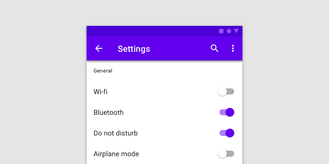
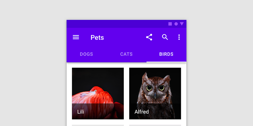
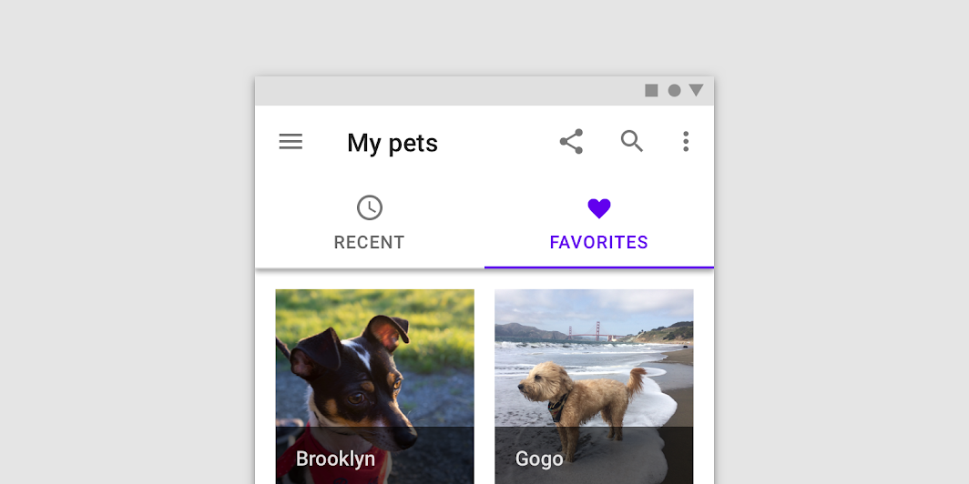
Tabs organize content across different screens, data sets, and other interactions.
!Tab image(https://developer.android.com/images/reference/androidx/compose/material/tab.png)
A Tab represents a single page of content using a text label and/or icon. It represents its selected state by tinting the text label and/or image with selectedContentColor.
This should typically be used inside of a TabRow, see the corresponding documentation for example usage.
This Tab has slots for text and/or icon - see the other Tab overload for a generic Tab that is not opinionated about its content.
@param selected whether this tab is selected or not @param onClick the callback to be invoked when this tab is selected @param modifier optional Modifier for this tab @param enabled controls the enabled state of this tab. When false, this tab will not be clickable and will appear disabled to accessibility services. @param text the text label displayed in this tab @param icon the icon displayed in this tab @param interactionSource the MutableInteractionSource representing the stream of Interactions for this Tab. You can create and pass in your own remembered MutableInteractionSource if you want to observe Interactions and customize the appearance / behavior of this Tab in different Interactions. @param selectedContentColor the color for the content of this tab when selected, and the color of the ripple. @param unselectedContentColor the color for the content of this tab when not selected
@see LeadingIconTab
Overloads
Tab
@Composable
fun Tab(
    selected: Boolean,
    onClick: () -> Unit,
    modifier: Modifier = Modifier,
    enabled: Boolean = true,
    text: @Composable (() -> Unit)? = null,
    icon: @Composable (() -> Unit)? = null,
    interactionSource: MutableInteractionSource = remember { MutableInteractionSource() },
    selectedContentColor: Color = LocalContentColor.current,
    unselectedContentColor: Color = selectedContentColor.copy(alpha = ContentAlpha.medium)
)
Parameters
| Name | Description |
|---|---|
selected | whether this tab is selected or not |
onClick | the callback to be invoked when this tab is selected |
modifier | optional Modifier for this tab |
enabled | controls the enabled state of this tab. When false, this tab will not be clickable and will appear disabled to accessibility services. |
text | the text label displayed in this tab |
icon | the icon displayed in this tab |
interactionSource | the MutableInteractionSource representing the stream of Interactions for this Tab. You can create and pass in your own remembered MutableInteractionSource if you want to observe Interactions and customize the appearance / behavior of this Tab in different Interactions. |
selectedContentColor | the color for the content of this tab when selected, and the color of the ripple. |
unselectedContentColor | the color for the content of this tab when not selected @see LeadingIconTa |
Tab
@Composable
fun Tab(
    selected: Boolean,
    onClick: () -> Unit,
    modifier: Modifier = Modifier,
    enabled: Boolean = true,
    interactionSource: MutableInteractionSource = remember { MutableInteractionSource() },
    selectedContentColor: Color = LocalContentColor.current,
    unselectedContentColor: Color = selectedContentColor.copy(alpha = ContentAlpha.medium),
    content: @Composable ColumnScope.() -> Unit
)
Parameters
| Name | Description |
|---|---|
selected | whether this tab is selected or not |
onClick | the callback to be invoked when this tab is selected |
modifier | optional Modifier for this tab |
enabled | controls the enabled state of this tab. When false, this tab will not be clickable and will appear disabled to accessibility services. |
interactionSource | the MutableInteractionSource representing the stream of Interactions for this Tab. You can create and pass in your own remembered MutableInteractionSource if you want to observe Interactions and customize the appearance / behavior of this Tab in different Interactions. |
selectedContentColor | the color for the content of this tab when selected, and the color of the ripple. |
unselectedContentColor | the color for the content of this tab when not selected |
content | the content of this ta |