← Back to Material Compose
TabRow
Overview
Code Examples
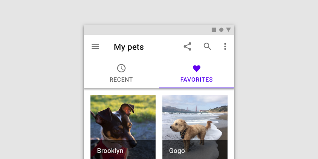
<a href="https://material.io/components/tabs#fixed-tabs" class="external" target="_blank">Material Design fixed tabs</a>.
Fixed tabs display all tabs in a set simultaneously. They are best for switching between related content quickly, such as between transportation methods in a map. To navigate between fixed tabs, tap an individual tab, or swipe left or right in the content area.
!Fixed tabs image(https://developer.android.com/images/reference/androidx/compose/material/fixed-tabs.png)
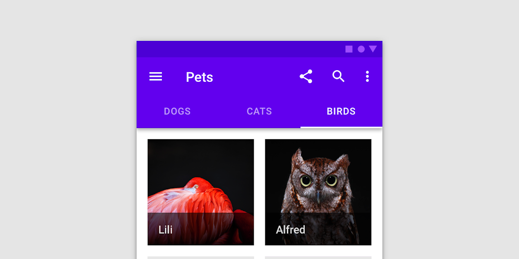
A TabRow contains a row of Tabs, and displays an indicator underneath the currently selected tab. A TabRow places its tabs evenly spaced along the entire row, with each tab taking up an equal amount of space. See ScrollableTabRow for a tab row that does not enforce equal size, and allows scrolling to tabs that do not fit on screen.
A simple example with text tabs looks like:
Overloads
TabRow
@Composable
@UiComposable
fun TabRow(
    selectedTabIndex: Int,
    modifier: Modifier = Modifier,
    backgroundColor: Color = MaterialTheme.colors.primarySurface,
    contentColor: Color = contentColorFor(backgroundColor),
    indicator: @Composable @UiComposable
        (tabPositions: List<TabPosition>) -> Unit = @Composable { tabPositions ->
        TabRowDefaults.Indicator(
            Modifier.tabIndicatorOffset(tabPositions[selectedTabIndex])
        )
    },
    divider: @Composable @UiComposable () -> Unit =
        @Composable {
            TabRowDefaults.Divider()
        },
    tabs: @Composable @UiComposable () -> Unit
)
Parameters
| Name | Description |
|---|---|
selectedTabIndex | the index of the currently selected tab |
modifier | optional Modifier for this TabRow |
backgroundColor | The background color for the TabRow. Use Color.Transparent to have no color. |
contentColor | The preferred content color provided by this TabRow to its children. Defaults to either the matching content color for backgroundColor, or if backgroundColor is not a color from the theme, this will keep the same value set above this TabRow. |
indicator | the indicator that represents which tab is currently selected. By default this will be a TabRowDefaults.Indicator, using a TabRowDefaults.tabIndicatorOffset modifier to animate its position. Note that this indicator will be forced to fill up the entire TabRow, so you should use TabRowDefaults.tabIndicatorOffset or similar to animate the actual drawn indicator inside this space, and provide an offset from the start. |
divider | the divider displayed at the bottom of the TabRow. This provides a layer of separation between the TabRow and the content displayed underneath. |
tabs | the tabs inside this TabRow. Typically this will be multiple Tabs. Each element inside this lambda will be measured and placed evenly across the TabRow, each taking up equal space |