← Back to Material Compose
TextField
Component
in
Material
. Since 0.1.0-dev16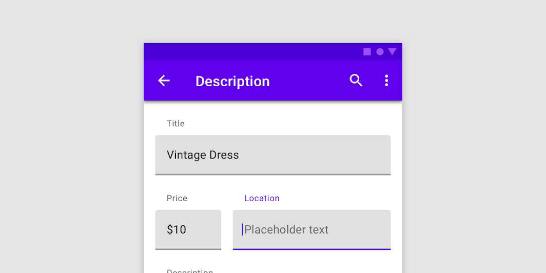
Overview
Code Examples
Video
<a href="https://material.io/components/text-fields#filled-text-field" class="external" target="_blank">Material Design filled text field</a>.
Filled text fields have more visual emphasis than outlined text fields, making them stand out when surrounded by other content and components.
!Filled text field image(https://developer.android.com/images/reference/androidx/compose/material/filled-text-field.png)
If you are looking for an outlined version, see OutlinedTextField.
A simple single line text field looks like:
Overloads
TextField
@Composable
fun TextField(
    value: String,
    onValueChange: (String) -> Unit,
    modifier: Modifier = Modifier,
    enabled: Boolean = true,
    readOnly: Boolean = false,
    textStyle: TextStyle = LocalTextStyle.current,
    label: @Composable (() -> Unit)? = null,
    placeholder: @Composable (() -> Unit)? = null,
    leadingIcon: @Composable (() -> Unit)? = null,
    trailingIcon: @Composable (() -> Unit)? = null,
    isError: Boolean = false,
    visualTransformation: VisualTransformation = VisualTransformation.None,
    keyboardOptions: KeyboardOptions = KeyboardOptions.Default,
    keyboardActions: KeyboardActions = KeyboardActions(),
    singleLine: Boolean = false,
    maxLines: Int = if (singleLine) 1 else Int.MAX_VALUE,
    minLines: Int = 1,
    interactionSource: MutableInteractionSource = remember { MutableInteractionSource() },
    shape: Shape =
        MaterialTheme.shapes.small.copy(bottomEnd = ZeroCornerSize, bottomStart = ZeroCornerSize),
    colors: TextFieldColors = TextFieldDefaults.textFieldColors()
)
Parameters
| Name | Description |
|---|---|
value | the input text to be shown in the text field |
onValueChange | the callback that is triggered when the input service updates the text. An updated text comes as a parameter of the callback |
modifier | a Modifier for this text field |
enabled | controls the enabled state of the TextField. When false, the text field will be neither editable nor focusable, the input of the text field will not be selectable, visually text field will appear in the disabled UI state |
readOnly | controls the editable state of the TextField. When true, the text field can not be modified, however, a user can focus it and copy text from it. Read-only text fields are usually used to display pre-filled forms that user can not edit |
textStyle | the style to be applied to the input text. The default textStyle uses the LocalTextStyle defined by the theme |
label | the optional label to be displayed inside the text field container. The default text style for internal Text is Typography.caption when the text field is in focus and Typography.subtitle1 when the text field is not in focus |
placeholder | the optional placeholder to be displayed when the text field is in focus and the input text is empty. The default text style for internal Text is Typography.subtitle1 |
leadingIcon | the optional leading icon to be displayed at the beginning of the text field container |
trailingIcon | the optional trailing icon to be displayed at the end of the text field container |
isError | indicates if the text field's current value is in error. If set to true, the label, bottom indicator and trailing icon by default will be displayed in error color |
visualTransformation | transforms the visual representation of the input value For example, you can use PasswordVisualTransformationandroidx.compose.ui.text.input.PasswordVisualTransformation to create a password text field. By default no visual transformation is applied |
keyboardOptions | software keyboard options that contains configuration such as KeyboardType and ImeAction. |
keyboardActions | when the input service emits an IME action, the corresponding callback is called. Note that this IME action may be different from what you specified in KeyboardOptions.imeAction. |
singleLine | when set to true, this text field becomes a single horizontally scrolling text field instead of wrapping onto multiple lines. The keyboard will be informed to not show the return key as the ImeAction. Note that maxLines parameter will be ignored as the maxLines attribute will be automatically set to 1. |
maxLines | the maximum height in terms of maximum number of visible lines. It is required that 1 <= minLines <= maxLines. This parameter is ignored when singleLine is true. |
minLines | the minimum height in terms of minimum number of visible lines. It is required that 1 <= minLines <= maxLines. This parameter is ignored when singleLine is true. |
interactionSource | the MutableInteractionSource representing the stream of Interactions for this TextField. You can create and pass in your own remembered MutableInteractionSource if you want to observe Interactions and customize the appearance / behavior of this TextField in different Interactions. |
shape | the shape of the text field's container |
colors | TextFieldColors that will be used to resolve color of the text, content (including label, placeholder, leading and trailing icons, indicator line) and background for this text field in different states. See TextFieldDefaults.textFieldColors |
TextField
@Composable
fun TextField(
    value: TextFieldValue,
    onValueChange: (TextFieldValue) -> Unit,
    modifier: Modifier = Modifier,
    enabled: Boolean = true,
    readOnly: Boolean = false,
    textStyle: TextStyle = LocalTextStyle.current,
    label: @Composable (() -> Unit)? = null,
    placeholder: @Composable (() -> Unit)? = null,
    leadingIcon: @Composable (() -> Unit)? = null,
    trailingIcon: @Composable (() -> Unit)? = null,
    isError: Boolean = false,
    visualTransformation: VisualTransformation = VisualTransformation.None,
    keyboardOptions: KeyboardOptions = KeyboardOptions.Default,
    keyboardActions: KeyboardActions = KeyboardActions(),
    singleLine: Boolean = false,
    maxLines: Int = if (singleLine) 1 else Int.MAX_VALUE,
    minLines: Int = 1,
    interactionSource: MutableInteractionSource = remember { MutableInteractionSource() },
    shape: Shape = TextFieldDefaults.TextFieldShape,
    colors: TextFieldColors = TextFieldDefaults.textFieldColors()
)
Parameters
| Name | Description |
|---|---|
value | the input TextFieldValue to be shown in the text field |
onValueChange | the callback that is triggered when the input service updates values in TextFieldValue. An updated TextFieldValue comes as a parameter of the callback |
modifier | a Modifier for this text field |
enabled | controls the enabled state of the TextField. When false, the text field will be neither editable nor focusable, the input of the text field will not be selectable, visually text field will appear in the disabled UI state |
readOnly | controls the editable state of the TextField. When true, the text field can not be modified, however, a user can focus it and copy text from it. Read-only text fields are usually used to display pre-filled forms that user can not edit |
textStyle | the style to be applied to the input text. The default textStyle uses the LocalTextStyle defined by the theme |
label | the optional label to be displayed inside the text field container. The default text style for internal Text is Typography.caption when the text field is in focus and Typography.subtitle1 when the text field is not in focus |
placeholder | the optional placeholder to be displayed when the text field is in focus and the input text is empty. The default text style for internal Text is Typography.subtitle1 |
leadingIcon | the optional leading icon to be displayed at the beginning of the text field container |
trailingIcon | the optional trailing icon to be displayed at the end of the text field container |
isError | indicates if the text field's current value is in error state. If set to true, the label, bottom indicator and trailing icon by default will be displayed in error color |
visualTransformation | transforms the visual representation of the input value. For example, you can use PasswordVisualTransformationandroidx.compose.ui.text.input.PasswordVisualTransformation to create a password text field. By default no visual transformation is applied |
keyboardOptions | software keyboard options that contains configuration such as KeyboardType and ImeAction. |
keyboardActions | when the input service emits an IME action, the corresponding callback is called. Note that this IME action may be different from what you specified in KeyboardOptions.imeAction. |
singleLine | when set to true, this text field becomes a single horizontally scrolling text field instead of wrapping onto multiple lines. The keyboard will be informed to not show the return key as the ImeAction. Note that maxLines parameter will be ignored as the maxLines attribute will be automatically set to 1. |
maxLines | the maximum height in terms of maximum number of visible lines. It is required that 1 <= minLines <= maxLines. This parameter is ignored when singleLine is true. |
minLines | the minimum height in terms of minimum number of visible lines. It is required that 1 <= minLines <= maxLines. This parameter is ignored when singleLine is true. |
interactionSource | the MutableInteractionSource representing the stream of Interactions for this TextField. You can create and pass in your own remembered MutableInteractionSource if you want to observe Interactions and customize the appearance / behavior of this TextField in different Interactions. |
shape | the shape of the text field's container |
colors | TextFieldColors that will be used to resolve color of the text, content (including label, placeholder, leading and trailing icons, indicator line) and background for this text field in different states. See TextFieldDefaults.textFieldColors |