← Back to Material Compose
TopAppBar
Overview
Code Examples
Video
<a href="https://material.io/components/app-bars-top" class="external" target="_blank">Material Design top app bar</a>.
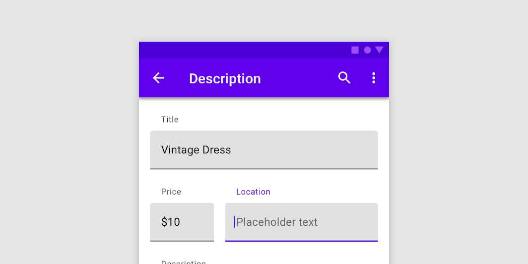
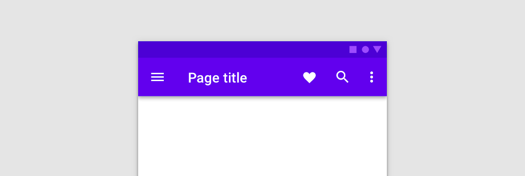
The top app bar displays information and actions relating to the current screen.
!App bars: top image(https://developer.android.com/images/reference/androidx/compose/material/app-bars-top.png)
This particular overload provides ability to specify WindowInsets. Recommended value can be found in AppBarDefaults.topAppBarWindowInsets.
This TopAppBar has slots for a title, navigation icon, and actions. Note that the title slot is inset from the start according to spec - for custom use cases such as horizontally centering the title, use the other TopAppBar overload for a generic TopAppBar with no restriction on content.
Overloads
TopAppBar
@Composable
fun TopAppBar(
    title: @Composable () -> Unit,
    windowInsets: WindowInsets,
    modifier: Modifier = Modifier,
    navigationIcon: @Composable (() -> Unit)? = null,
    actions: @Composable RowScope.() -> Unit = {},
    backgroundColor: Color = MaterialTheme.colors.primarySurface,
    contentColor: Color = contentColorFor(backgroundColor),
    elevation: Dp = AppBarDefaults.TopAppBarElevation,
)
Parameters
| Name | Description |
|---|---|
title | The title to be displayed in the center of the TopAppBar |
windowInsets | a window insets that app bar will respect. |
modifier | The Modifier to be applied to this TopAppBar |
navigationIcon | The navigation icon displayed at the start of the TopAppBar. This should typically be an IconButton or IconToggleButton. |
actions | The actions displayed at the end of the TopAppBar. This should typically be IconButtons. The default layout here is a Row, so icons inside will be placed horizontally. |
backgroundColor | The background color for the TopAppBar. Use Color.Transparent to have no color. |
contentColor | The preferred content color provided by this TopAppBar to its children. Defaults to either the matching content color for backgroundColor, or if backgroundColor is not a color from the theme, this will keep the same value set above this TopAppBar. |
elevation | the elevation of this TopAppBar |
TopAppBar
@Composable
fun TopAppBar(
    title: @Composable () -> Unit,
    modifier: Modifier = Modifier,
    navigationIcon: @Composable (() -> Unit)? = null,
    actions: @Composable RowScope.() -> Unit = {},
    backgroundColor: Color = MaterialTheme.colors.primarySurface,
    contentColor: Color = contentColorFor(backgroundColor),
    elevation: Dp = AppBarDefaults.TopAppBarElevation
)
Parameters
| Name | Description |
|---|---|
title | The title to be displayed in the center of the TopAppBar |
modifier | The Modifier to be applied to this TopAppBar |
navigationIcon | The navigation icon displayed at the start of the TopAppBar. This should typically be an IconButton or IconToggleButton. |
actions | The actions displayed at the end of the TopAppBar. This should typically be IconButtons. The default layout here is a Row, so icons inside will be placed horizontally. |
backgroundColor | The background color for the TopAppBar. Use Color.Transparent to have no color. |
contentColor | The preferred content color provided by this TopAppBar to its children. Defaults to either the matching content color for backgroundColor, or if backgroundColor is not a color from the theme, this will keep the same value set above this TopAppBar. |
elevation | the elevation of this TopAppBar |
TopAppBar
@Composable
fun TopAppBar(
    windowInsets: WindowInsets,
    modifier: Modifier = Modifier,
    backgroundColor: Color = MaterialTheme.colors.primarySurface,
    contentColor: Color = contentColorFor(backgroundColor),
    elevation: Dp = AppBarDefaults.TopAppBarElevation,
    contentPadding: PaddingValues = AppBarDefaults.ContentPadding,
    content: @Composable RowScope.() -> Unit
)
Parameters
| Name | Description |
|---|---|
windowInsets | a window insets that app bar will respect. |
modifier | The Modifier to be applied to this TopAppBar |
backgroundColor | The background color for the TopAppBar. Use Color.Transparent to have no color. |
contentColor | The preferred content color provided by this TopAppBar to its children. Defaults to either the matching content color for backgroundColor, or if backgroundColor is not a color from the theme, this will keep the same value set above this TopAppBar. |
elevation | the elevation of this TopAppBar. |
contentPadding | the padding applied to the content of this TopAppBar |
content | the content of this TopAppBar.The default layout here is a Row, so content inside will be placed horizontally |
TopAppBar
@Composable
fun TopAppBar(
    modifier: Modifier = Modifier,
    backgroundColor: Color = MaterialTheme.colors.primarySurface,
    contentColor: Color = contentColorFor(backgroundColor),
    elevation: Dp = AppBarDefaults.TopAppBarElevation,
    contentPadding: PaddingValues = AppBarDefaults.ContentPadding,
    content: @Composable RowScope.() -> Unit
)
Parameters
| Name | Description |
|---|---|
modifier | The Modifier to be applied to this TopAppBar |
backgroundColor | The background color for the TopAppBar. Use Color.Transparent to have no color. |
contentColor | The preferred content color provided by this TopAppBar to its children. Defaults to either the matching content color for backgroundColor, or if backgroundColor is not a color from the theme, this will keep the same value set above this TopAppBar. |
elevation | the elevation of this TopAppBar. |
contentPadding | the padding applied to the content of this TopAppBar |
content | the content of this TopAppBar.The default layout here is a Row, so content inside will be placed horizontally |