← Back to Tv Material
Surface
Overview
Code Examples
Video
The Surface is a building block component that will be used for any focusable element on TV such as buttons, cards, navigation, etc. This clickable Surface is similar to Compose Material's Surface composable but will have more functionality that will make focus management easier. Surface will automatically apply the relevant modifier(s) based on the current interaction state.
@param onClick callback to be called when the surface is clicked. Note: DPad Enter button won't work if this value is null @param modifier Modifier to be applied to the layout corresponding to the surface @param enabled Controls the enabled state of the surface. When false, this Surface will not be clickable or focusable. @param tonalElevation When color is ColorScheme.surface, a higher the elevation will result in a darker color in light theme and lighter color in dark theme. @param shape Defines the surface's shape. @param color Color to be used on background of the Surface @param contentColor The preferred content color provided by this Surface to its children. @param scale Defines size of the Surface relative to its original size. @param border Defines a border around the Surface. @param glow Diffused shadow to be shown behind the Surface. @param interactionSource the MutableInteractionSource representing the stream of Interactions for this Surface. You can create and pass in your own remembered MutableInteractionSource if you want to observe Interactions and customize the appearance / behavior of this Surface in different Interactions. @param content defines the Composable content inside the surface
Overloads
Surface
@ExperimentalTvMaterial3Api
@Composable
fun Surface(
    onClick: () -> Unit,
    modifier: Modifier = Modifier,
    enabled: Boolean = true,
    tonalElevation: Dp = 0.dp,
    shape: ClickableSurfaceShape = ClickableSurfaceDefaults.shape(),
    color: ClickableSurfaceColor = ClickableSurfaceDefaults.color(),
    contentColor: ClickableSurfaceColor = ClickableSurfaceDefaults.contentColor(),
    scale: ClickableSurfaceScale = ClickableSurfaceDefaults.scale(),
    border: ClickableSurfaceBorder = ClickableSurfaceDefaults.border(),
    glow: ClickableSurfaceGlow = ClickableSurfaceDefaults.glow(),
    interactionSource: MutableInteractionSource = remember { MutableInteractionSource() },
    content: @Composable (BoxScope.() -> Unit)
)
Parameters
| Name | Description |
|---|---|
onClick | callback to be called when the surface is clicked. Note: DPad Enter button won't work if this value is null |
modifier | Modifier to be applied to the layout corresponding to the surface |
enabled | Controls the enabled state of the surface. When false, this Surface will not be clickable or focusable. |
tonalElevation | When color is ColorScheme.surface, a higher the elevation will result in a darker color in light theme and lighter color in dark theme. |
shape | Defines the surface's shape. |
color | Color to be used on background of the Surface |
contentColor | The preferred content color provided by this Surface to its children. |
scale | Defines size of the Surface relative to its original size. |
border | Defines a border around the Surface. |
glow | Diffused shadow to be shown behind the Surface. |
interactionSource | the MutableInteractionSource representing the stream of Interactions for this Surface. You can create and pass in your own remembered MutableInteractionSource if you want to observe Interactions and customize the appearance / behavior of this Surface in different Interactions. |
content | defines the Composable content inside the surfac |
Surface
@ExperimentalTvMaterial3Api
@Composable
fun Surface(
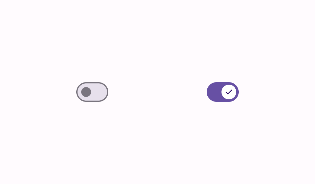
checked: Boolean,
onCheckedChange: (Boolean) -> Unit,
modifier: Modifier = Modifier,
enabled: Boolean = true,
tonalElevation: Dp = Elevation.Level0,
shape: ToggleableSurfaceShape = ToggleableSurfaceDefaults.shape(),
color: ToggleableSurfaceColor = ToggleableSurfaceDefaults.color(),
contentColor: ToggleableSurfaceColor = ToggleableSurfaceDefaults.contentColor(),
scale: ToggleableSurfaceScale = ToggleableSurfaceDefaults.scale(),
border: ToggleableSurfaceBorder = ToggleableSurfaceDefaults.border(),
glow: ToggleableSurfaceGlow = ToggleableSurfaceDefaults.glow(),
interactionSource: MutableInteractionSource = remember { MutableInteractionSource() },
content: @Composable (BoxScope.() -> Unit)
)
Parameters
| Name | Description |
|---|---|
checked | whether or not this Surface is toggled on or off |
onCheckedChange | callback to be invoked when the toggleable Surface is clicked |
modifier | Modifier to be applied to the layout corresponding to the surface |
enabled | Controls the enabled state of the surface. When false, this Surface will not be clickable or focusable. |
tonalElevation | When color is ColorScheme.surface, a higher the elevation will result in a darker color in light theme and lighter color in dark theme. |
shape | Defines the surface's shape. |
color | Color to be used on background of the Surface |
contentColor | The preferred content color provided by this Surface to its children. |
scale | Defines size of the Surface relative to its original size. |
border | Defines a border around the Surface. |
glow | Diffused shadow to be shown behind the Surface. |
interactionSource | the MutableInteractionSource representing the stream of Interactions for this Surface. You can create and pass in your own remembered MutableInteractionSource if you want to observe Interactions and customize the appearance / behavior of this Surface in different Interactions. |
content | defines the Composable content inside the surfac |