← Back to Material Compose
AlertDialog
Component
in
Material
. Since 0.1.0-dev15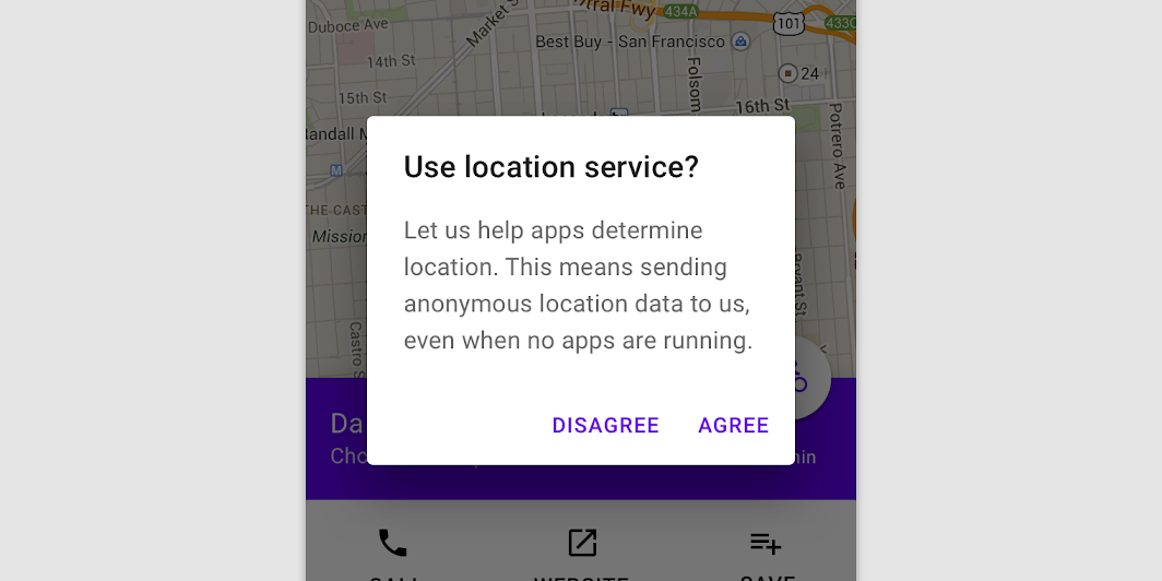
Overview
Code Examples
Video
<a href="https://material.io/components/dialogs#alert-dialog" class="external" target="_blank">Material Design alert dialog</a>.
Alert dialogs interrupt users with urgent information, details, or actions.
!Dialogs image(https://developer.android.com/images/reference/androidx/compose/material/dialogs.png)
The dialog will position its buttons based on the available space. By default it will try to place them horizontally next to each other and fallback to horizontal placement if not enough space is available. There is also another version of this composable that has a slot for buttons to provide custom buttons layout.
Sample of dialog:
Overloads
AlertDialog
@Composable
fun AlertDialog(
    onDismissRequest: () -> Unit,
    confirmButton: @Composable () -> Unit,
    modifier: Modifier = Modifier,
    dismissButton: @Composable (() -> Unit)? = null,
    title: @Composable (() -> Unit)? = null,
    text: @Composable (() -> Unit)? = null,
    shape: Shape = MaterialTheme.shapes.medium,
    backgroundColor: Color = MaterialTheme.colors.surface,
    contentColor: Color = contentColorFor(backgroundColor),
    properties: DialogProperties = DialogProperties()
)
Parameters
| Name | Description |
|---|---|
onDismissRequest | Executes when the user tries to dismiss the Dialog by clicking outside or pressing the back button. This is not called when the dismiss button is clicked. |
confirmButton | A button which is meant to confirm a proposed action, thus resolving what triggered the dialog. The dialog does not set up any events for this button so they need to be set up by the caller. |
modifier | Modifier to be applied to the layout of the dialog. |
dismissButton | A button which is meant to dismiss the dialog. The dialog does not set up any events for this button so they need to be set up by the caller. |
title | The title of the Dialog which should specify the purpose of the Dialog. The title is not mandatory, because there may be sufficient information inside the text. Provided text style will be Typography.subtitle1. |
text | The text which presents the details regarding the Dialog's purpose. Provided text style will be Typography.body2. |
shape | Defines the Dialog's shape |
backgroundColor | The background color of the dialog. |
contentColor | The preferred content color provided by this dialog to its children. |
properties | Typically platform specific properties to further configure the dialog |
AlertDialog
@Composable
fun AlertDialog(
    onDismissRequest: () -> Unit,
    buttons: @Composable () -> Unit,
    modifier: Modifier = Modifier,
    title: (@Composable () -> Unit)? = null,
    text: @Composable (() -> Unit)? = null,
    shape: Shape = MaterialTheme.shapes.medium,
    backgroundColor: Color = MaterialTheme.colors.surface,
    contentColor: Color = contentColorFor(backgroundColor),
    properties: DialogProperties = DialogProperties()
)
Parameters
| Name | Description |
|---|---|
onDismissRequest | Executes when the user tries to dismiss the Dialog by clicking outside or pressing the back button. This is not called when the dismiss button is clicked. |
buttons | Function that emits the layout with the buttons. |
modifier | Modifier to be applied to the layout of the dialog. |
title | The title of the Dialog which should specify the purpose of the Dialog. The title is not mandatory, because there may be sufficient information inside the text. Provided text style will be Typography.subtitle1. |
text | The text which presents the details regarding the Dialog's purpose. Provided text style will be Typography.body2. |
shape | Defines the Dialog's shape. |
backgroundColor | The background color of the dialog. |
contentColor | The preferred content color provided by this dialog to its children. |
properties | Typically platform specific properties to further configure the dialog |