← Back to Material Compose
ModalDrawerLayout
Component
in
Material
. Since 0.1.0-dev15Overview
Code Examples
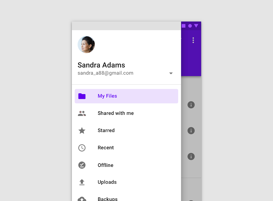
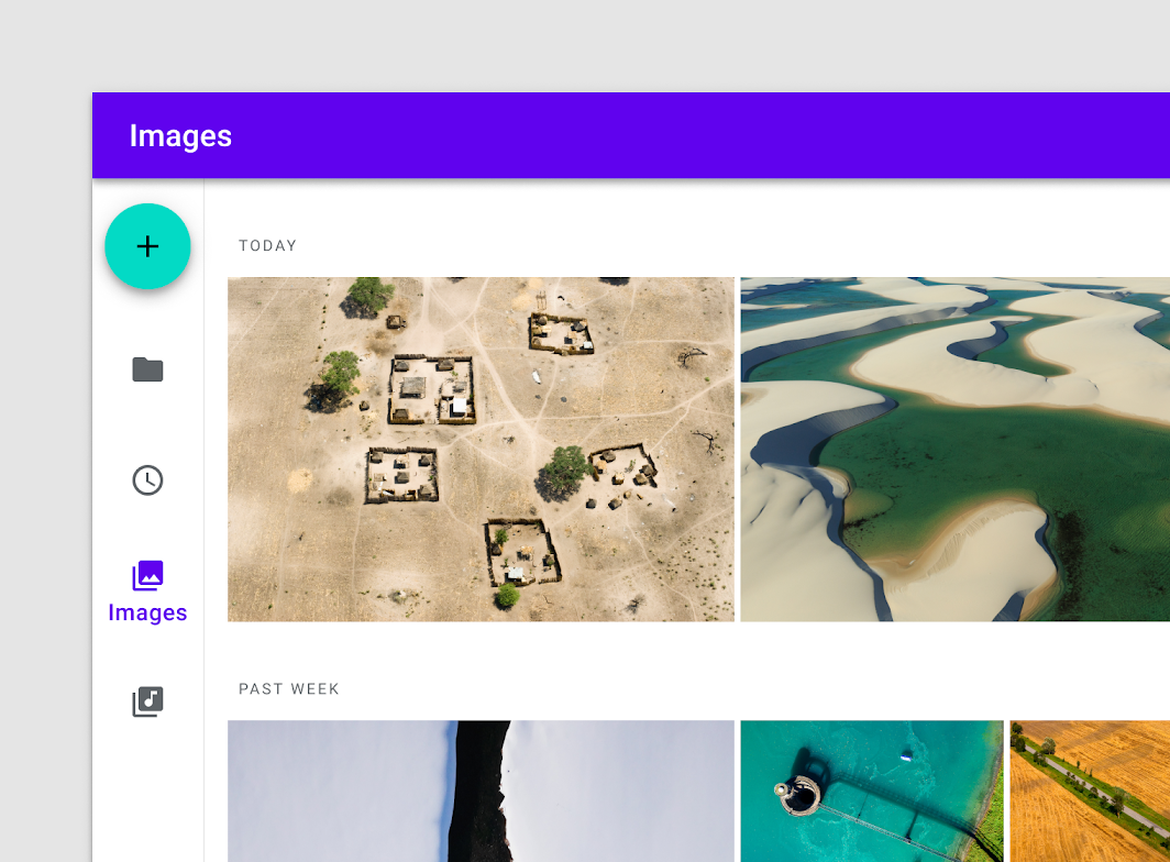
Navigation drawers provide access to destinations in your app.
Modal navigation drawers block interaction with the rest of an app’s content with a scrim. They are elevated above most of the app’s UI and don’t affect the screen’s layout grid.
See BottomDrawerLayout for a layout that introduces a bottom drawer, suitable when using bottom navigation.
Overloads
ModalDrawerLayout
@Composable
@OptIn(ExperimentalMaterialApi::class)
fun ModalDrawerLayout(
    drawerContent: @Composable ColumnScope.() -> Unit,
    modifier: Modifier = Modifier,
    drawerState: DrawerState = rememberDrawerState(DrawerValue.Closed),
    gesturesEnabled: Boolean = true,
    drawerShape: Shape = MaterialTheme.shapes.large,
    drawerElevation: Dp = DrawerDefaults.Elevation,
    drawerBackgroundColor: Color = MaterialTheme.colors.surface,
    drawerContentColor: Color = contentColorFor(drawerBackgroundColor),
    scrimColor: Color = DrawerDefaults.scrimColor,
    bodyContent: @Composable () -> Unit
)
Parameters
| Name | Description |
|---|---|
drawerContent | composable that represents content inside the drawer |
modifier | optional modifier for the drawer |
drawerState | state of the drawer |
gesturesEnabled | whether or not drawer can be interacted by gestures |
drawerShape | shape of the drawer sheet |
drawerElevation | drawer sheet elevation. This controls the size of the shadow below the drawer sheet |
drawerBackgroundColor | background color to be used for the drawer sheet |
drawerContentColor | color of the content to use inside the drawer sheet. Defaults to either the matching content color for drawerBackgroundColor, or, if it is not a color from the theme, this will keep the same value set above this Surface. |
scrimColor | color of the scrim that obscures content when the drawer is open |
bodyContent | content of the rest of the UI @throws IllegalStateException when parent has Float.POSITIVE_INFINITY widt |