Card
Composable Component
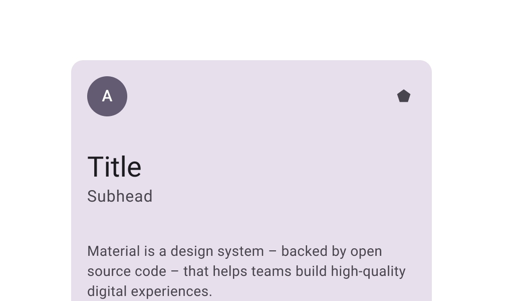
Cards contain contain content and actions that relate information about a subject. Filled cards provide subtle separation from the background. This has less emphasis than elevated or outlined cards.
Common
@Composable
fun Card(
    modifier: Modifier = Modifier,
    shape: Shape = CardDefaults.shape,
    colors: CardColors = CardDefaults.cardColors(),
    elevation: CardElevation = CardDefaults.cardElevation(),
    border: BorderStroke? = null,
    content: @Composable ColumnScope.() -> Unit,
)
Parameters
| modifier | the Modifier to be applied to this card |
| shape | defines the shape of this card's container, border (when border is not null), and shadow (when using elevation) |
| colors | CardColors that will be used to resolve the colors used for this card in different states. See CardDefaults.cardColors. |
| elevation | CardElevation used to resolve the elevation for this card in different states. This controls the size of the shadow below the card. Additionally, when the container color is ColorScheme.surface, this controls the amount of primary color applied as an overlay. See also: Surface. |
| border | the border to draw around the container of this card |
| content | The content displayed on the card |
Common
@Composable
fun Card(
    onClick: () -> Unit,
    modifier: Modifier = Modifier,
    enabled: Boolean = true,
    shape: Shape = CardDefaults.shape,
    colors: CardColors = CardDefaults.cardColors(),
    elevation: CardElevation = CardDefaults.cardElevation(),
    border: BorderStroke? = null,
    interactionSource: MutableInteractionSource? = null,
    content: @Composable ColumnScope.() -> Unit,
)
Parameters
| onClick | called when this card is clicked |
| modifier | the Modifier to be applied to this card |
| enabled | controls the enabled state of this card. When false, this component will not respond to user input, and it will appear visually disabled and disabled to accessibility services. |
| shape | defines the shape of this card's container, border (when border is not null), and shadow (when using elevation) |
| colors | CardColors that will be used to resolve the color(s) used for this card in different states. See CardDefaults.cardColors. |
| elevation | CardElevation used to resolve the elevation for this card in different states. This controls the size of the shadow below the card. Additionally, when the container color is ColorScheme.surface, this controls the amount of primary color applied as an overlay. See also: Surface. |
| border | the border to draw around the container of this card |
| interactionSource | an optional hoisted MutableInteractionSource for observing and emitting Interactions for this card. You can use this to change the card's appearance or preview the card in different states. Note that if null is provided, interactions will still happen internally. |
| content | The content displayed on the card |
Code Examples
CardSample
@Preview
@Composable
fun CardSample() {
    Card(Modifier.size(width = 180.dp, height = 100.dp)) {
        Box(Modifier.fillMaxSize()) { Text("Card content", Modifier.align(Alignment.Center)) }
    }
}
ClickableCardSample
@Preview
@Composable
fun ClickableCardSample() {
    Card(
        onClick = { /* Do something */ },
        modifier = Modifier.size(width = 180.dp, height = 100.dp),
    ) {
        Box(Modifier.fillMaxSize()) { Text("Clickable", Modifier.align(Alignment.Center)) }
    }
}
Create your own Component Library
Material Components are meant to be used as is and they do not allow customizations. To build your own Jetpack Compose component library use Compose Unstyled