
← Compose Multiplatform Component in Material 3 Compose
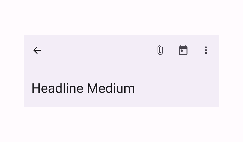
LargeTopAppBar
Common
Top app bars display information and actions at the top of a screen.
Last updated:
Installation
dependencies {
   implementation("androidx.compose.material3:material3:1.3.0-beta04")
}
Overloads
@Composable
@ExperimentalMaterial3Api
@Deprecated(
    message =
        "Deprecated in favor of LargeTopAppBar with collapsedHeight and expandedHeight " +
            "parameters",
    level = DeprecationLevel.HIDDEN

fun LargeTopAppBar(
    title: @Composable () -> Unit,
    modifier: Modifier = Modifier,
    navigationIcon: @Composable () -> Unit = {},
    actions: @Composable RowScope.() -> Unit = {},
    windowInsets: WindowInsets = TopAppBarDefaults.windowInsets,
    colors: TopAppBarColors = TopAppBarDefaults.largeTopAppBarColors(),
    scrollBehavior: TopAppBarScrollBehavior? = null
)
Parameters
| name | description |
|---|---|
title | the title to be displayed in the top app bar. This title will be used in the app bar's expanded and collapsed states, although in its collapsed state it will be composed with a smaller sized [TextStyle] |
modifier | the [Modifier] to be applied to this top app bar |
navigationIcon | the navigation icon displayed at the start of the top app bar. This should typically be an [IconButton] or [IconToggleButton]. |
actions | the actions displayed at the end of the top app bar. This should typically be [IconButton]s. The default layout here is a [Row], so icons inside will be placed horizontally. |
windowInsets | a window insets that app bar will respect. |
colors | [TopAppBarColors] that will be used to resolve the colors used for this top app bar in different states. See [TopAppBarDefaults.largeTopAppBarColors]. |
scrollBehavior | a [TopAppBarScrollBehavior] which holds various offset values that will be applied by this top app bar to set up its height and colors. A scroll behavior is designed to work in conjunction with a scrolled content to change the top app bar appearance as the content scrolls. See [TopAppBarScrollBehavior.nestedScrollConnection]. |
@Composable
@ExperimentalMaterial3Api
fun LargeTopAppBar(
    title: @Composable () -> Unit,
    modifier: Modifier = Modifier,
    navigationIcon: @Composable () -> Unit = {},
    actions: @Composable RowScope.() -> Unit = {},
    collapsedHeight: Dp = TopAppBarDefaults.LargeAppBarCollapsedHeight,
    expandedHeight: Dp = TopAppBarDefaults.LargeAppBarExpandedHeight,
    windowInsets: WindowInsets = TopAppBarDefaults.windowInsets,
    colors: TopAppBarColors = TopAppBarDefaults.largeTopAppBarColors(),
    scrollBehavior: TopAppBarScrollBehavior? = null
)
Parameters
| name | description |
|---|---|
title | the title to be displayed in the top app bar. This title will be used in the app bar's expanded and collapsed states, although in its collapsed state it will be composed with a smaller sized [TextStyle] |
modifier | the [Modifier] to be applied to this top app bar |
navigationIcon | the navigation icon displayed at the start of the top app bar. This should typically be an [IconButton] or [IconToggleButton]. |
actions | the actions displayed at the end of the top app bar. This should typically be [IconButton]s. The default layout here is a [Row], so icons inside will be placed horizontally. |
collapsedHeight | this app bar height when collapsed by a provided [scrollBehavior]. This value must be specified and finite, otherwise it will be ignored and replaced with [TopAppBarDefaults.LargeAppBarCollapsedHeight]. |
expandedHeight | this app bar's maximum height. When a specified [scrollBehavior] causes the app bar to collapse or expand, this value will represent the maximum height that the app-bar will be allowed to expand. The expanded height is expected to be greater or equal to the [collapsedHeight], and the function will throw an [IllegalArgumentException] otherwise. Also, this value must be specified and finite, otherwise it will be ignored and replaced with [TopAppBarDefaults.LargeAppBarExpandedHeight]. |
windowInsets | a window insets that app bar will respect. |
colors | [TopAppBarColors] that will be used to resolve the colors used for this top app bar in different states. See [TopAppBarDefaults.largeTopAppBarColors]. |
scrollBehavior | a [TopAppBarScrollBehavior] which holds various offset values that will be applied by this top app bar to set up its height and colors. A scroll behavior is designed to work in conjunction with a scrolled content to change the top app bar appearance as the content scrolls. See [TopAppBarScrollBehavior.nestedScrollConnection]. @throws IllegalArgumentException if the provided [expandedHeight] is smaller to the [collapsedHeight] |
Code Example
ExitUntilCollapsedLargeTopAppBar
@Composable
@Sampled
@Preview
@OptIn(ExperimentalMaterial3Api::class
fun ExitUntilCollapsedLargeTopAppBar() {
    val scrollBehavior = TopAppBarDefaults.exitUntilCollapsedScrollBehavior()
    Scaffold(
        modifier = Modifier.nestedScroll(scrollBehavior.nestedScrollConnection),
        topBar = {
            LargeTopAppBar(
                title = { Text("Large TopAppBar", maxLines = 1, overflow = TextOverflow.Ellipsis) },
                navigationIcon = {
                    IconButton(onClick = { /* doSomething() */ }) {
                        Icon(
                            imageVector = Icons.Filled.Menu,
                            contentDescription = "Localized description"
                        )
                    }
                },
                actions = {
                    IconButton(onClick = { /* doSomething() */ }) {
                        Icon(
                            imageVector = Icons.Filled.Favorite,
                            contentDescription = "Localized description"
                        )
                    }
                },
                scrollBehavior = scrollBehavior
            )
        },
        content = { innerPadding ->
            LazyColumn(
                contentPadding = innerPadding,
                verticalArrangement = Arrangement.spacedBy(8.dp)
            ) {
                val list = (0..75).map { it.toString() }
                items(count = list.size) {
                    Text(
                        text = list[it],
                        style = MaterialTheme.typography.bodyLarge,
                        modifier = Modifier.fillMaxWidth().padding(horizontal = 16.dp)
                    )
                }
            }
        }
    )
}
