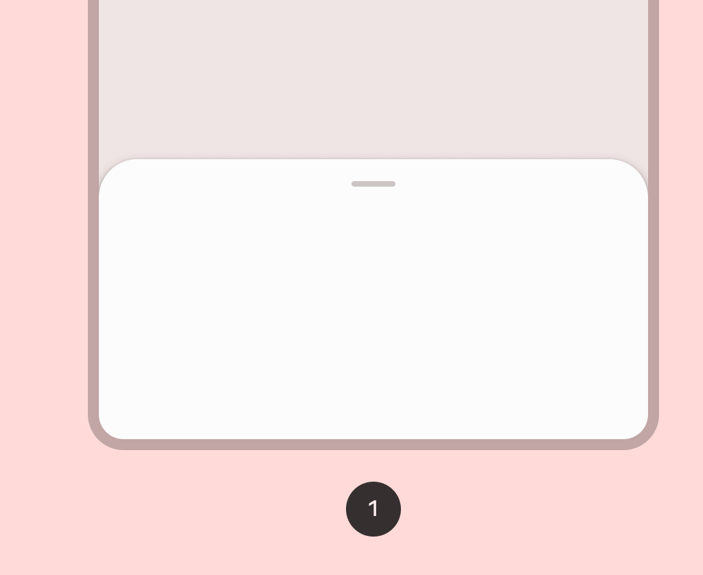
New Compose Multiplatform components arrived on Composables UICheck it out →

Component in Material 3 Compose

ModalBottomSheet

Android
Common

Modal bottom sheets are used as an alternative to inline menus or simple dialogs on mobile, especially when offering a long list of action items, or when items require longer descriptions and icons. Like dialogs, modal bottom sheets appear in front of app content, disabling all other app functionality when they appear, and remaining on screen until confirmed, dismissed, or a required action has been taken.

Bottom sheet
image

Last updated:

Installation

dependencies {
   implementation("androidx.compose.material3:material3:1.3.0-beta04")
}

Overloads

@Deprecated(
    level = DeprecationLevel.HIDDEN,
    message = "Use constructor with contentWindowInsets parameter.",
    replaceWith =
        ReplaceWith(
            "ModalBottomSheet(" +
                "onDismissRequest," +
                "modifier," +
                "sheetState," +
                "sheetMaxWidth," +
                "shape," +
                "containerColor," +
                "contentColor," +
                "tonalElevation," +
                "scrimColor," +
                "dragHandle," +
                "{ windowInsets }," +
                "properties," +
                "content," +
                ")"
        )

@ExperimentalMaterial3Api
@Composable
fun ModalBottomSheet(
    onDismissRequest: () -> Unit,
    modifier: Modifier = Modifier,
    sheetState: SheetState = rememberModalBottomSheetState(),
    sheetMaxWidth: Dp = BottomSheetDefaults.SheetMaxWidth,
    shape: Shape = BottomSheetDefaults.ExpandedShape,
    containerColor: Color = BottomSheetDefaults.ContainerColor,
    contentColor: Color = contentColorFor(containerColor),
    tonalElevation: Dp = 0.dp,
    scrimColor: Color = BottomSheetDefaults.ScrimColor,
    dragHandle: @Composable (() -> Unit)? = { BottomSheetDefaults.DragHandle() },
    windowInsets: WindowInsets = BottomSheetDefaults.windowInsets,
    properties: ModalBottomSheetProperties = ModalBottomSheetDefaults.properties,
    content: @Composable ColumnScope.() -> Unit,
)

Parameters

namedescription
onDismissRequestExecutes when the user clicks outside of the bottom sheet, after sheet animates to [Hidden].
modifierOptional [Modifier] for the bottom sheet.
sheetStateThe state of the bottom sheet.
sheetMaxWidth[Dp] that defines what the maximum width the sheet will take. Pass in [Dp.Unspecified] for a sheet that spans the entire screen width.
shapeThe shape of the bottom sheet.
containerColorThe color used for the background of this bottom sheet
contentColorThe preferred color for content inside this bottom sheet. Defaults to either the matching content color for [containerColor], or to the current [LocalContentColor] if [containerColor] is not a color from the theme.
tonalElevationwhen [containerColor] is [ColorScheme.surface], a translucent primary color overlay is applied on top of the container. A higher tonal elevation value will result in a darker color in light theme and lighter color in dark theme. See also: [Surface].
scrimColorColor of the scrim that obscures content when the bottom sheet is open.
dragHandleOptional visual marker to swipe the bottom sheet.
windowInsetswindow insets to be passed to the bottom sheet content via [PaddingValues] params.
properties[ModalBottomSheetProperties] for further customization of this modal bottom sheet's window behavior.
contentThe content to be displayed inside the bottom sheet.
@ExperimentalMaterial3Api
@Composable
fun ModalBottomSheet(
    onDismissRequest: () -> Unit,
    modifier: Modifier = Modifier,
    sheetState: SheetState = rememberModalBottomSheetState(),
    sheetMaxWidth: Dp = BottomSheetDefaults.SheetMaxWidth,
    shape: Shape = BottomSheetDefaults.ExpandedShape,
    containerColor: Color = BottomSheetDefaults.ContainerColor,
    contentColor: Color = contentColorFor(containerColor),
    tonalElevation: Dp = 0.dp,
    scrimColor: Color = BottomSheetDefaults.ScrimColor,
    dragHandle: @Composable (() -> Unit)? = { BottomSheetDefaults.DragHandle() },
    contentWindowInsets: @Composable () -> WindowInsets = { BottomSheetDefaults.windowInsets },
    properties: ModalBottomSheetProperties = ModalBottomSheetDefaults.properties,
    content: @Composable ColumnScope.() -> Unit,
)

Parameters

namedescription
onDismissRequestExecutes when the user clicks outside of the bottom sheet, after sheet animates to [Hidden].
modifierOptional [Modifier] for the bottom sheet.
sheetStateThe state of the bottom sheet.
sheetMaxWidth[Dp] that defines what the maximum width the sheet will take. Pass in [Dp.Unspecified] for a sheet that spans the entire screen width.
shapeThe shape of the bottom sheet.
containerColorThe color used for the background of this bottom sheet
contentColorThe preferred color for content inside this bottom sheet. Defaults to either the matching content color for [containerColor], or to the current [LocalContentColor] if [containerColor] is not a color from the theme.
tonalElevationwhen [containerColor] is [ColorScheme.surface], a translucent primary color overlay is applied on top of the container. A higher tonal elevation value will result in a darker color in light theme and lighter color in dark theme. See also: [Surface].
scrimColorColor of the scrim that obscures content when the bottom sheet is open.
dragHandleOptional visual marker to swipe the bottom sheet.
contentWindowInsetswindow insets to be passed to the bottom sheet content via [PaddingValues] params.
properties[ModalBottomSheetProperties] for further customization of this modal bottom sheet's window behavior.
contentThe content to be displayed inside the bottom sheet.

Code Example

ModalBottomSheetSample

@Composable
@OptIn(ExperimentalMaterial3Api::class
@Sampled
@Preview
fun ModalBottomSheetSample() {
    var openBottomSheet by rememberSaveable { mutableStateOf(false) }
    var skipPartiallyExpanded by rememberSaveable { mutableStateOf(false) }
    val scope = rememberCoroutineScope()
    val bottomSheetState =
        rememberModalBottomSheetState(skipPartiallyExpanded = skipPartiallyExpanded)

    // App content
    Column(
        horizontalAlignment = Alignment.Start,
        verticalArrangement = Arrangement.spacedBy(4.dp)
    ) {
        Row(
            Modifier.toggleable(
                value = skipPartiallyExpanded,
                role = Role.Checkbox,
                onValueChange = { checked -> skipPartiallyExpanded = checked }
            )
        ) {
            Checkbox(checked = skipPartiallyExpanded, onCheckedChange = null)
            Spacer(Modifier.width(16.dp))
            Text("Skip partially expanded State")
        }
        Button(
            onClick = { openBottomSheet = !openBottomSheet },
            modifier = Modifier.align(Alignment.CenterHorizontally)
        ) {
            Text(text = "Show Bottom Sheet")
        }
    }

    // Sheet content
    if (openBottomSheet) {

        ModalBottomSheet(
            onDismissRequest = { openBottomSheet = false },
            sheetState = bottomSheetState,
        ) {
            Row(Modifier.fillMaxWidth(), horizontalArrangement = Arrangement.Center) {
                Button(
                    // Note: If you provide logic outside of onDismissRequest to remove the sheet,
                    // you must additionally handle intended state cleanup, if any.
                    onClick = {
                        scope
                            .launch { bottomSheetState.hide() }
                            .invokeOnCompletion {
                                if (!bottomSheetState.isVisible) {
                                    openBottomSheet = false
                                }
                            }
                    }
                ) {
                    Text("Hide Bottom Sheet")
                }
            }
            var text by remember { mutableStateOf("") }
            OutlinedTextField(
                value = text,
                onValueChange = { text = it },
                modifier = Modifier.padding(horizontal = 16.dp),
                label = { Text("Text field") }
            )
            LazyColumn {
                items(25) {
                    ListItem(
                        headlineContent = { Text("Item $it") },
                        leadingContent = {
                            Icon(
                                Icons.Default.Favorite,
                                contentDescription = "Localized description"
                            )
                        },
                        colors =
                            ListItemDefaults.colors(
                                containerColor = MaterialTheme.colorScheme.surfaceContainerLow
                            ),
                    )
                }
            }
        }
    }
}