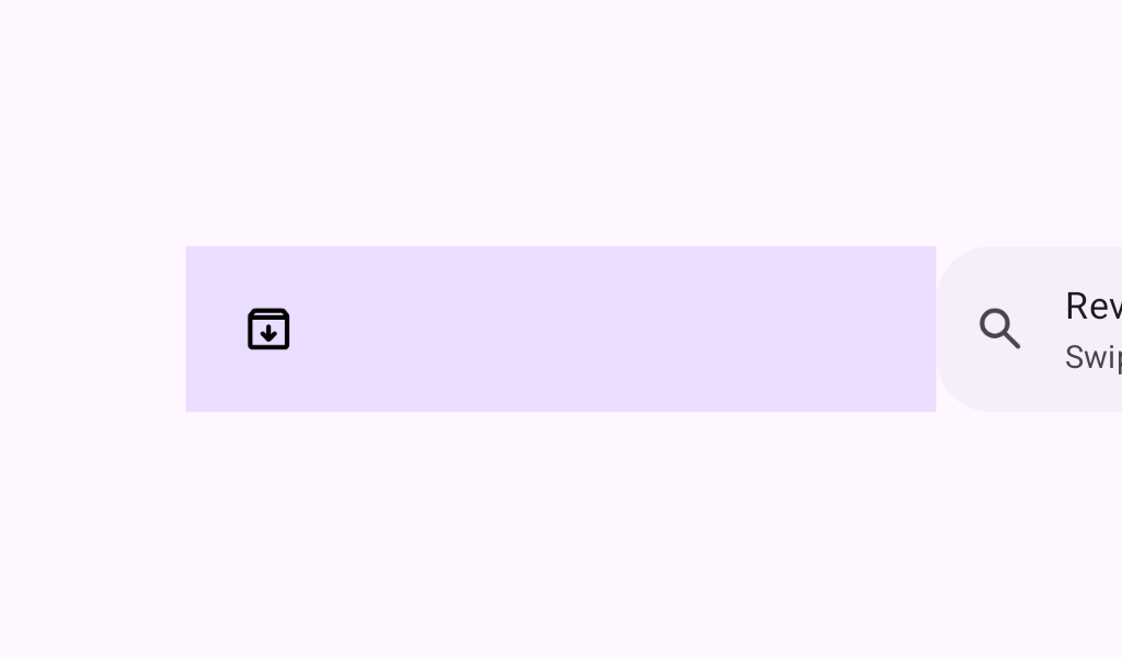

SwipeToDismissBox
Source set: Common
@Composable
public fun SwipeToDismissBox(
    state: SwipeToDismissBoxState,
    backgroundContent: @Composable RowScope.() -> Unit,
    modifier: Modifier = Modifier,
    enableDismissFromStartToEnd: Boolean = true,
    enableDismissFromEndToStart: Boolean = true,
    gesturesEnabled: Boolean = true,
    onDismiss: (SwipeToDismissBoxValue) -> Unit = {},
    content: @Composable RowScope.() -> Unit,
)
Parameters
| state | The state of this component. |
| backgroundContent | A composable that is stacked behind the content and is exposed when the content is swiped. You can/should use the state to have different backgrounds on each side. |
| modifier | Optional Modifier for this component. |
| enableDismissFromStartToEnd | Whether SwipeToDismissBox can be dismissed from start to end. |
| enableDismissFromEndToStart | Whether SwipeToDismissBox can be dismissed from end to start. |
| gesturesEnabled | Whether swipe-to-dismiss can be interacted by gestures. |
| onDismiss | Optional callback to be called when content is dismissed. onDismissed provides the current dismissed direction. |
| content | The content that can be dismissed. |
SwipeToDismissBox
Source set: Common
@Composable
@Deprecated(
    level = DeprecationLevel.HIDDEN,
    message =
        "Maintained for binary compatibility. Use updated signature with onDismissed " +
            "parameter.",
)
public fun SwipeToDismissBox(
    state: SwipeToDismissBoxState,
    backgroundContent: @Composable RowScope.() -> Unit,
    modifier: Modifier = Modifier,
    enableDismissFromStartToEnd: Boolean = true,
    enableDismissFromEndToStart: Boolean = true,
    gesturesEnabled: Boolean = true,
    content: @Composable RowScope.() -> Unit,
): Unit