
Happy Thursday 👋 Alex here.
The year is 2023. People walk around having beautiful huge screens in their pockets.
It is only normal for them to expect your app to look great and take advantage of all the pixels.
Today we are covering how to use the Insets API so that your app can look incredible on every screen.
Insets overview
You can draw edge to edge in three steps:
- tell Android that you want to take advantage of the full screen
- make the status and navigation bars transparent
- update your UI so that it is not covered by system bars or notches.
For the following examples I will be building on top of this snippet:
class BoringActivity : ComponentActivity() {
override fun onCreate(savedInstanceState: Bundle?) {
super.onCreate(savedInstanceState)
setContent {
MyAppTheme {
Column {
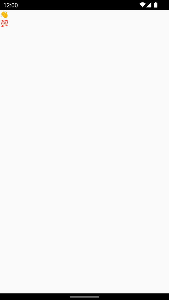
Text("👋")
Text("💯")
}
}
}
}
}Nothing exciting in this snippet. Just displaying two emojis the one below the other, surrounded by some black system bars. Zzz.
Tell Android that you want to draw behind system bars
By default, the contents of an Android app is placed within safe bounds. This is the area below any system bars (status bar, navigation bar).
To do this call WindowCompat.setDecorFitsSystemWindows(window, false) before your setContent {} call.
| Before | After |
|---|---|
 |
 |
This will enable your app to draw in the entire screen.
This also means that we would need to push part of the content so that it is not covered by any system UI.
Keep reading to learn how to use the Inset API to do exactly that.
Make your status and navigation bars transparent
There is no dedicated Jetpack Compose API to update the colors of your status bar (yet). Handling this ourselves using native Android APIs can get complicated. Because of this we will use the Accompanist System UI Controller library instead.
Install Accompanist System UI Controller
Include the following dependency in your app/build.gradle:
// app/build.gradle

repositories {
    mavenCentral()
}

dependencies {
    implementation "com.google.accompanist:accompanist-systemuicontroller:0.31.0-alpha"
}
Make system bars transparent using Accompanist System UI Controller
Create a TransparentSystemBars() composable that will make the system bars transparent as soon as it enters the composition. Include it in your layout to enable transparent bars:
@Composable
fun TransparentSystemBars() {
    val systemUiController = rememberSystemUiController()
    val useDarkIcons = !isSystemInDarkTheme()

    DisposableEffect(systemUiController, useDarkIcons) {
        systemUiController.setSystemBarsColor(
            color = Color.Transparent,
            darkIcons = useDarkIcons
        )

        onDispose {}
    }
}| Before | After |
|---|---|
|
 |
Last but not least we now need to push our text below the system bars, so that it is not covered by the status bars.
Insets in plain English
When you draw edge to edge, by default your UI will be covered by the system bars.
The Insets APIs makes it simple to add paddings to your layouts according to different parts of the screen such as the status bar or the navigation bar.
There are two types of APIs you need to be aware of: Modifiers and WindowInsets.
For example if you are interested in navigation bars you might want to use Modifier.navigationBarsPadding() or WindowInsets.navigationBars.
Depending on the composable you want to use it with, you will have to use the one or the other. Let's have a look.
Apply insets via Modifiers
Say that you have a Box() composable that needs to take the full size of the screen. At the same time you need its contents to be within the system bars. The most straight forward way to do this is by using the respective modifier:
Box(Modifier
        .systemBarsPadding()
        .border(2.dp, Color.Red, RectangleShape)
        .fillMaxSize()
)
This will cause the contents of the Box() to be placed between the system bars (not behind it).
Think about Modifier.systemBarsPadding() like Modifier.padding() where the padding value for each side (left, bottom, top, right) is updated according to any system bar in the respective location of the screen.
The cool thing about it is that the padding values will be automatically updated according to configuration changes.
Apply insets via WindowInsets
You will quickly realize that you cannot use inset Modifiers with every composable.
Using a Modifier with a LazyColumn will not produce the result you want. It will cause the list's contents to be 'cut off' when it reaches the end of the list.
Instead, use the respective WindowInset to apply content padding to the list.
val emojis = (1..100)
    .map { String(Character.toChars(127744 + it)) }
    .toList()

LazyColumn(
    contentPadding = WindowInsets.systemBars.asPaddingValues()
) {
    items(emojis) {
        Text(
            it, modifier = Modifier
                .padding(
                    vertical = 10.dp,
                    horizontal = 16.dp
                )
                .fillMaxWidth()
        )
    }
}| With Modifier | With Insets |
|---|---|
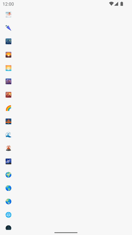 |
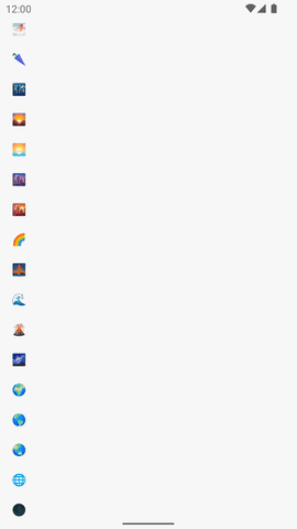 |
Putting it all together
Here is how your Activity will look like putting everything together:
class EdgeToEdgeActivity : ComponentActivity() {
override fun onCreate(savedInstanceState: Bundle?) {
super.onCreate(savedInstanceState)
WindowCompat.setDecorFitsSystemWindows(window, false)
setContent {
MyAppTheme {
TransparentSystemBars()
Column(Modifier.systemBarsPadding()) {
Text("👋")
Text("💯")
}
}
}
}
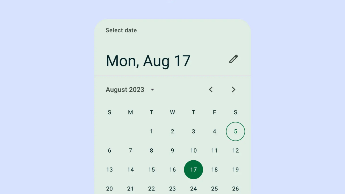
}🏆 Composable of the Week
This week's Composable of the Week is the Material 3 DatePicker!
Review highlight
that's all for this week. Now go build some beautiful apps and see you next week.
– Alex
