← Back to Material 3 Compose
Checkbox
Component
in
Material 3
. Since 1.0.0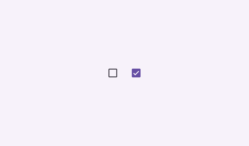
Overview
Code Examples
Video
<a href="https://m3.material.io/components/checkbox/overview" class="external" target="_blank">Material Design checkbox</a>.
Checkboxes allow users to select one or more items from a set. Checkboxes can turn an option on or off.
!Checkbox image(https://developer.android.com/images/reference/androidx/compose/material3/checkbox.png)
Simple Checkbox sample:
Overloads
Checkbox
@Composable
fun Checkbox(
    checked: Boolean,
    onCheckedChange: ((Boolean) -> Unit)?,
    modifier: Modifier = Modifier,
    enabled: Boolean = true,
    colors: CheckboxColors = CheckboxDefaults.colors(),
    interactionSource: MutableInteractionSource = remember { MutableInteractionSource() }
)
Parameters
| Name | Description |
|---|---|
checked | whether this checkbox is checked or unchecked |
onCheckedChange | called when this checkbox is clicked. If null, then this checkbox will not be interactable, unless something else handles its input events and updates its state. |
modifier | the Modifier to be applied to this checkbox |
enabled | controls the enabled state of this checkbox. When false, this component will not respond to user input, and it will appear visually disabled and disabled to accessibility services. |
colors | CheckboxColors that will be used to resolve the colors used for this checkbox in different states. See CheckboxDefaults.colors. |
interactionSource | the MutableInteractionSource representing the stream of Interactions for this checkbox. You can create and pass in your own remembered instance to observe Interactions and customize the appearance / behavior of this checkbox in different states |