
← Compose Multiplatform Component in Material 3 Compose
CircularProgressIndicator
Common
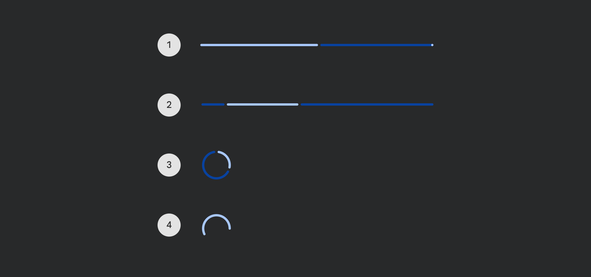
Progress indicators express an unspecified wait time or display the duration of a process.
Last updated:
Installation
dependencies {
   implementation("androidx.compose.material3:material3:1.3.0-beta04")
}
Overloads
@Composable
@OptIn(ExperimentalMaterial3Api::class
@Deprecated(
    message =
        "Use the overload that takes `gapSize`, see " +
            "`LegacyCircularProgressIndicatorSample` on how to restore the previous behavior",
    replaceWith =
        ReplaceWith(
            "CircularProgressIndicator(progress, modifier, color, strokeWidth, trackColor, " +
                "strokeCap, gapSize)"
        ),
    level = DeprecationLevel.HIDDEN

fun CircularProgressIndicator(
    progress: () -> Float,
    modifier: Modifier = Modifier,
    color: Color = ProgressIndicatorDefaults.circularColor,
    strokeWidth: Dp = ProgressIndicatorDefaults.CircularStrokeWidth,
    trackColor: Color = ProgressIndicatorDefaults.circularDeterminateTrackColor,
    strokeCap: StrokeCap = ProgressIndicatorDefaults.CircularDeterminateStrokeCap,
)
Parameters
| name | description |
|---|---|
progress | the progress of this progress indicator, where 0.0 represents no progress and 1.0 represents full progress. Values outside of this range are coerced into the range. |
modifier | the [Modifier] to be applied to this progress indicator |
color | color of this progress indicator |
strokeWidth | stroke width of this progress indicator |
trackColor | color of the track behind the indicator, visible when the progress has not reached the area of the overall indicator yet |
strokeCap | stroke cap to use for the ends of this progress indicator |
@Composable
@OptIn(ExperimentalMaterial3Api::class
fun CircularProgressIndicator(
    progress: () -> Float,
    modifier: Modifier = Modifier,
    color: Color = ProgressIndicatorDefaults.circularColor,
    strokeWidth: Dp = ProgressIndicatorDefaults.CircularStrokeWidth,
    trackColor: Color = ProgressIndicatorDefaults.circularDeterminateTrackColor,
    strokeCap: StrokeCap = ProgressIndicatorDefaults.CircularDeterminateStrokeCap,
    gapSize: Dp = ProgressIndicatorDefaults.CircularIndicatorTrackGapSize,
)
Parameters
| name | description |
|---|---|
progress | the progress of this progress indicator, where 0.0 represents no progress and 1.0 represents full progress. Values outside of this range are coerced into the range. |
modifier | the [Modifier] to be applied to this progress indicator |
color | color of this progress indicator |
strokeWidth | stroke width of this progress indicator |
trackColor | color of the track behind the indicator, visible when the progress has not reached the area of the overall indicator yet |
strokeCap | stroke cap to use for the ends of this progress indicator |
gapSize | size of the gap between the progress indicator and the track |
@Composable
fun CircularProgressIndicator(
    modifier: Modifier = Modifier,
    color: Color = ProgressIndicatorDefaults.circularColor,
    strokeWidth: Dp = ProgressIndicatorDefaults.CircularStrokeWidth,
    trackColor: Color = ProgressIndicatorDefaults.circularIndeterminateTrackColor,
    strokeCap: StrokeCap = ProgressIndicatorDefaults.CircularIndeterminateStrokeCap,
)
Parameters
| name | description |
|---|---|
modifier | the [Modifier] to be applied to this progress indicator |
color | color of this progress indicator |
strokeWidth | stroke width of this progress indicator |
trackColor | color of the track behind the indicator, visible when the progress has not reached the area of the overall indicator yet |
strokeCap | stroke cap to use for the ends of this progress indicator |
@Composable
@Deprecated("Maintained for binary compatibility", level = DeprecationLevel.HIDDEN
@Suppress("DEPRECATION"
fun CircularProgressIndicator(
    modifier: Modifier = Modifier,
    color: Color = ProgressIndicatorDefaults.circularColor,
    strokeWidth: Dp = ProgressIndicatorDefaults.CircularStrokeWidth
)
@Composable
@Deprecated("Maintained for binary compatibility", level = DeprecationLevel.HIDDEN
@Suppress("DEPRECATION"
fun CircularProgressIndicator(
    progress: Float,
    modifier: Modifier = Modifier,
    color: Color = ProgressIndicatorDefaults.circularColor,
    strokeWidth: Dp = ProgressIndicatorDefaults.CircularStrokeWidth
)
@Composable
@Deprecated(
    message = "Use the overload that takes `progress` as a lambda",
    replaceWith =
        ReplaceWith(
            "CircularProgressIndicator(\n" +
                "progress = { progress },\n" +
                "modifier = modifier,\n" +
                "color = color,\n" +
                "strokeWidth = strokeWidth,\n" +
                "trackColor = trackColor,\n" +
                "strokeCap = strokeCap,\n" +
                ")"
        )

@Suppress("DEPRECATION"
fun CircularProgressIndicator(
    progress: Float,
    modifier: Modifier = Modifier,
    color: Color = ProgressIndicatorDefaults.circularColor,
    strokeWidth: Dp = ProgressIndicatorDefaults.CircularStrokeWidth,
    trackColor: Color = ProgressIndicatorDefaults.circularTrackColor,
    strokeCap: StrokeCap = ProgressIndicatorDefaults.CircularDeterminateStrokeCap,
)
Code Examples
CircularProgressIndicatorSample
@Composable
@Sampled
@Preview
fun CircularProgressIndicatorSample() {
    var progress by remember { mutableStateOf(0.1f) }
    val animatedProgress by
        animateFloatAsState(
            targetValue = progress,
            animationSpec = ProgressIndicatorDefaults.ProgressAnimationSpec
        )

    Column(horizontalAlignment = Alignment.CenterHorizontally) {
        CircularProgressIndicator(progress = { animatedProgress })
        Spacer(Modifier.requiredHeight(30.dp))
        Text("Set progress:")
        Slider(
            modifier = Modifier.width(300.dp),
            value = progress,
            valueRange = 0f..1f,
            onValueChange = { progress = it },
        )
    }
}
IndeterminateCircularProgressIndicatorSample
@Composable
@Sampled
@Preview
fun IndeterminateCircularProgressIndicatorSample() {
    Column(horizontalAlignment = Alignment.CenterHorizontally) { CircularProgressIndicator() }
}
