← Back to Material 3 Compose
DatePicker
Component
in
Material 3
. Since 1.1.0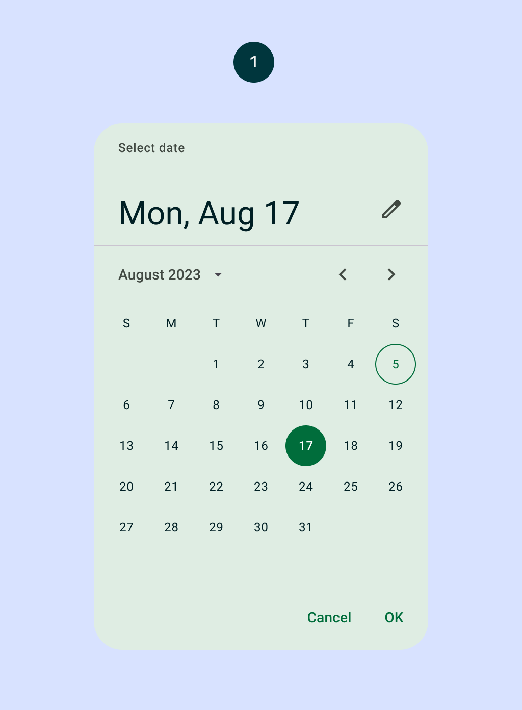
Overview
Code Examples
<a href="https://m3.material.io/components/date-pickers/overview" class="external" target="_blank">Material Design date picker</a>.
Date pickers let people select a date and preferably should be embedded into Dialogs. See DatePickerDialog.
By default, a date picker lets you pick a date via a calendar UI. However, it also allows switching into a date input mode for a manual entry of dates using the numbers on a keyboard.
!Date picker image(https://developer.android.com/images/reference/androidx/compose/material3/date-picker.png)
A simple DatePicker looks like:
Overloads
DatePicker
@ExperimentalMaterial3Api
@Composable
fun DatePicker(
    state: DatePickerState,
    modifier: Modifier = Modifier,
    dateFormatter: DatePickerFormatter = remember { DatePickerDefaults.dateFormatter() },
    title: (@Composable () -> Unit)? = {
        DatePickerDefaults.DatePickerTitle(
            displayMode = state.displayMode,
            modifier = Modifier.padding(DatePickerTitlePadding)
        )
    },
    headline: (@Composable () -> Unit)? = {
        DatePickerDefaults.DatePickerHeadline(
            selectedDateMillis = state.selectedDateMillis,
            displayMode = state.displayMode,
            dateFormatter = dateFormatter,
            modifier = Modifier.padding(DatePickerHeadlinePadding)
        )
    },
    showModeToggle: Boolean = true,
    colors: DatePickerColors = DatePickerDefaults.colors()
)
Parameters
| Name | Description |
|---|---|
state | state of the date picker. See rememberDatePickerState. |
modifier | the Modifier to be applied to this date picker |
dateFormatter | a DatePickerFormatter that provides formatting skeletons for dates display |
title | the title to be displayed in the date picker |
headline | the headline to be displayed in the date picker |
showModeToggle | indicates if this DatePicker should show a mode toggle action that transforms it into a date input |
colors | DatePickerColors that will be used to resolve the colors used for this date picker in different states. See DatePickerDefaults.colors |