← Back to Material Compose
BottomSheetScaffold
Overview
Code Examples
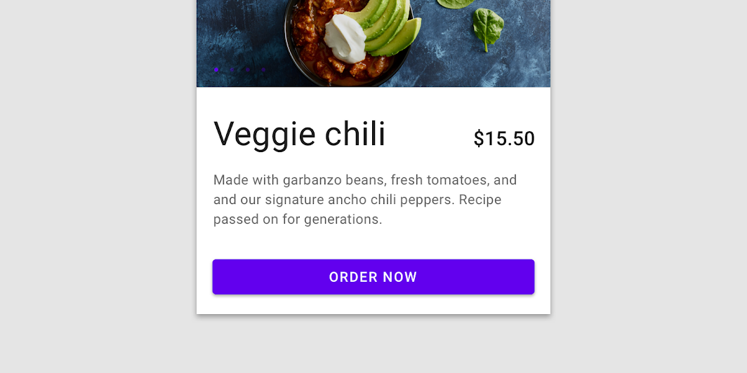
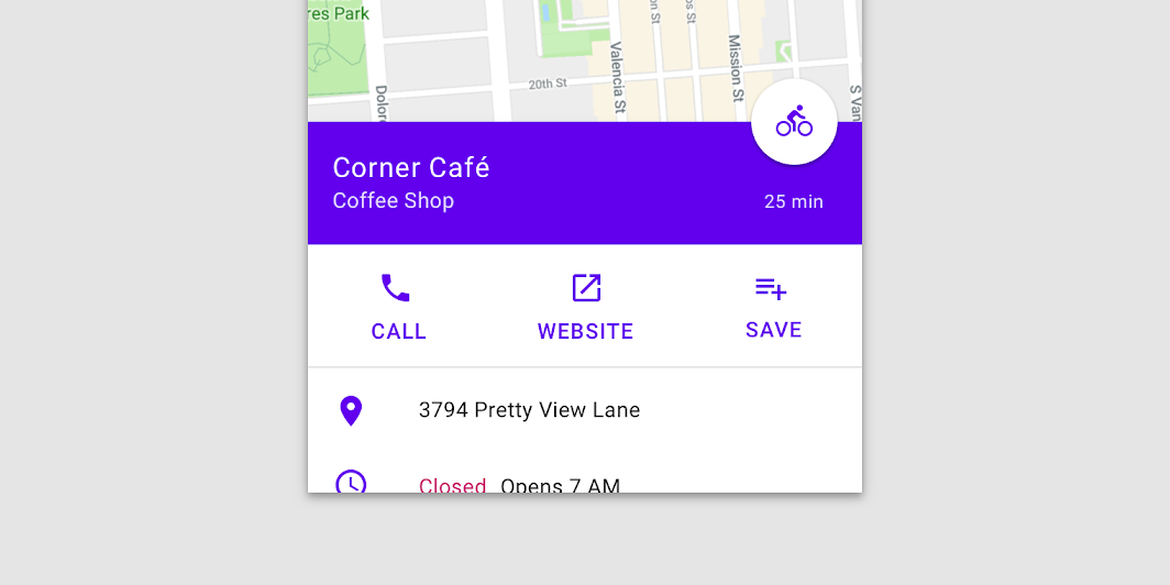
<a href="https://material.io/components/sheets-bottom#standard-bottom-sheet" class="external" target="_blank">Material Design standard bottom sheet</a>.
Standard bottom sheets co-exist with the screen’s main UI region and allow for simultaneously viewing and interacting with both regions. They are commonly used to keep a feature or secondary content visible on screen when content in main UI region is frequently scrolled or panned.
!Standard bottom sheet image(https://developer.android.com/images/reference/androidx/compose/material/standard-bottom-sheet.png)
This component provides an API to put together several material components to construct your screen. For a similar component which implements the basic material design layout strategy with app bars, floating action buttons and navigation drawers, use the standard Scaffold. For similar component that uses a backdrop as the centerpiece of the screen, use BackdropScaffold.
A simple example of a bottom sheet scaffold looks like this:
Overloads
BottomSheetScaffold
@Composable
@ExperimentalMaterialApi
fun BottomSheetScaffold(
    sheetContent: @Composable ColumnScope.() -> Unit,
    modifier: Modifier = Modifier,
    scaffoldState: BottomSheetScaffoldState = rememberBottomSheetScaffoldState(),
    topBar: (@Composable () -> Unit)? = null,
    snackbarHost: @Composable (SnackbarHostState) -> Unit = { SnackbarHost(it) },
    floatingActionButton: (@Composable () -> Unit)? = null,
    floatingActionButtonPosition: FabPosition = FabPosition.End,
    sheetGesturesEnabled: Boolean = true,
    sheetShape: Shape = MaterialTheme.shapes.large,
    sheetElevation: Dp = BottomSheetScaffoldDefaults.SheetElevation,
    sheetBackgroundColor: Color = MaterialTheme.colors.surface,
    sheetContentColor: Color = contentColorFor(sheetBackgroundColor),
    sheetPeekHeight: Dp = BottomSheetScaffoldDefaults.SheetPeekHeight,
    backgroundColor: Color = MaterialTheme.colors.background,
    contentColor: Color = contentColorFor(backgroundColor),
    content: @Composable (PaddingValues) -> Unit
)
Parameters
| Name | Description |
|---|---|
sheetContent | The content of the bottom sheet. |
modifier | An optional Modifier for the root of the scaffold. |
scaffoldState | The state of the scaffold. |
topBar | An optional top app bar. |
snackbarHost | The composable hosting the snackbars shown inside the scaffold. |
floatingActionButton | An optional floating action button. |
floatingActionButtonPosition | The position of the floating action button. |
sheetGesturesEnabled | Whether the bottom sheet can be interacted with by gestures. |
sheetShape | The shape of the bottom sheet. |
sheetElevation | The elevation of the bottom sheet. |
sheetBackgroundColor | The background color of the bottom sheet. |
sheetContentColor | The preferred content color provided by the bottom sheet to its children. Defaults to the matching content color for sheetBackgroundColor, or if that is not a color from the theme, this will keep the same content color set above the bottom sheet. |
sheetPeekHeight | The height of the bottom sheet when it is collapsed. If the peek height equals the sheet's full height, the sheet will only have a collapsed state. |
backgroundColor | The background color of the scaffold body. |
contentColor | The color of the content in scaffold body. Defaults to either the matching content color for backgroundColor, or, if it is not a color from the theme, this will keep the same value set above this Surface. |
content | The main content of the screen. You should use the provided PaddingValues to properly offset the content, so that it is not obstructed by the bottom sheet when collapsed |
BottomSheetScaffold
@Suppress("UNUSED_PARAMETER")
@Deprecated(message = BottomSheetScaffoldWithDrawerDeprecated, level = DeprecationLevel.ERROR)
@Composable
@ExperimentalMaterialApi
fun BottomSheetScaffold(
    sheetContent: @Composable ColumnScope.() -> Unit,
    modifier: Modifier = Modifier,
    scaffoldState: BottomSheetScaffoldState = rememberBottomSheetScaffoldState(),
    topBar: (@Composable () -> Unit)? = null,
    snackbarHost: @Composable (SnackbarHostState) -> Unit = { SnackbarHost(it) },
    floatingActionButton: (@Composable () -> Unit)? = null,
    floatingActionButtonPosition: FabPosition = FabPosition.End,
    sheetGesturesEnabled: Boolean = true,
    sheetShape: Shape = MaterialTheme.shapes.large,
    sheetElevation: Dp = BottomSheetScaffoldDefaults.SheetElevation,
    sheetBackgroundColor: Color = MaterialTheme.colors.surface,
    sheetContentColor: Color = contentColorFor(sheetBackgroundColor),
    sheetPeekHeight: Dp = BottomSheetScaffoldDefaults.SheetPeekHeight,
    drawerContent: @Composable (ColumnScope.() -> Unit)? = null,
    drawerGesturesEnabled: Boolean = true,
    drawerShape: Shape = MaterialTheme.shapes.large,
    drawerElevation: Dp = DrawerDefaults.Elevation,
    drawerBackgroundColor: Color = MaterialTheme.colors.surface,
    drawerContentColor: Color = contentColorFor(drawerBackgroundColor),
    drawerScrimColor: Color = DrawerDefaults.scrimColor,
    backgroundColor: Color = MaterialTheme.colors.background,
    contentColor: Color = contentColorFor(backgroundColor),
    content: @Composable (PaddingValues) -> Unit
)
Parameters
| Name | Description |
|---|---|
sheetContent | The content of the bottom sheet. |
modifier | An optional Modifier for the root of the scaffold. |
scaffoldState | The state of the scaffold. |
topBar | An optional top app bar. |
snackbarHost | The composable hosting the snackbars shown inside the scaffold. |
floatingActionButton | An optional floating action button. |
floatingActionButtonPosition | The position of the floating action button. |
sheetGesturesEnabled | Whether the bottom sheet can be interacted with by gestures. |
sheetShape | The shape of the bottom sheet. |
sheetElevation | The elevation of the bottom sheet. |
sheetBackgroundColor | The background color of the bottom sheet. |
sheetContentColor | The preferred content color provided by the bottom sheet to its children. Defaults to the matching content color for sheetBackgroundColor, or if that is not a color from the theme, this will keep the same content color set above the bottom sheet. |
sheetPeekHeight | The height of the bottom sheet when it is collapsed. If the peek height equals the sheet's full height, the sheet will only have a collapsed state. |
drawerContent | The content of the drawer sheet. |
drawerGesturesEnabled | Whether the drawer sheet can be interacted with by gestures. |
drawerShape | The shape of the drawer sheet. |
drawerElevation | The elevation of the drawer sheet. |
drawerBackgroundColor | The background color of the drawer sheet. |
drawerContentColor | The preferred content color provided by the drawer sheet to its children. Defaults to the matching content color for drawerBackgroundColor, or if that is not a color from the theme, this will keep the same content color set above the drawer sheet. |
drawerScrimColor | The color of the scrim that is applied when the drawer is open. |
backgroundColor | The background color of the scaffold body. |
contentColor | The color of the content in scaffold body. Defaults to either the matching content color for backgroundColor, or, if it is not a color from the theme, this will keep the same value set above this Surface. |
content | The main content of the screen. You should use the provided PaddingValues to properly offset the content, so that it is not obstructed by the bottom sheet when collapsed |