← Compose Multiplatform Component in Material Compose
Button
Common
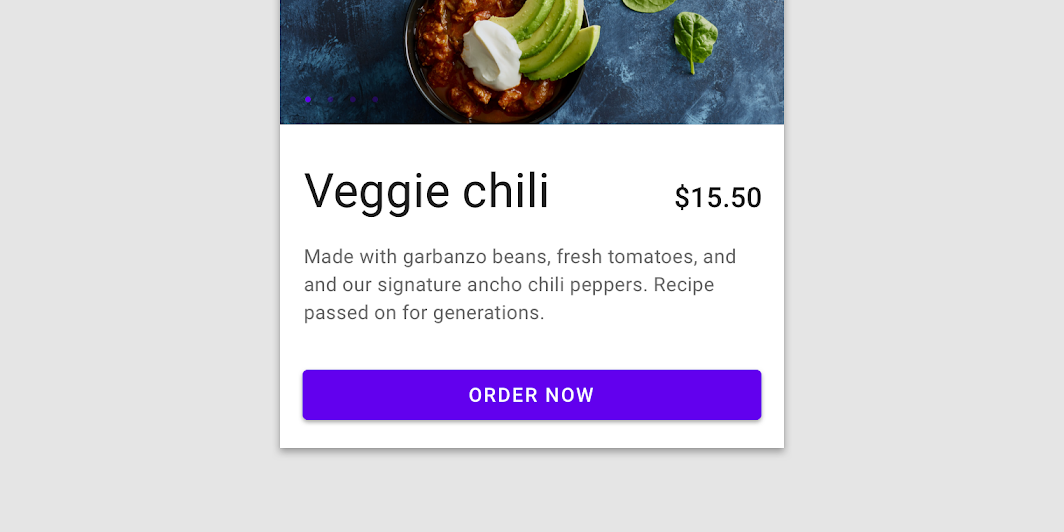
Contained buttons are high-emphasis, distinguished by their use of elevation and fill. They contain actions that are primary to your app.

Last updated:
Installation
dependencies {
   implementation("androidx.compose.material:material:1.7.0-beta04")
}
Overloads
@Composable
@OptIn(ExperimentalMaterialApi::class
fun Button(
    onClick: () -> Unit,
    modifier: Modifier = Modifier,
    enabled: Boolean = true,
    interactionSource: MutableInteractionSource? = null,
    elevation: ButtonElevation? = ButtonDefaults.elevation(),
    shape: Shape = MaterialTheme.shapes.small,
    border: BorderStroke? = null,
    colors: ButtonColors = ButtonDefaults.buttonColors(),
    contentPadding: PaddingValues = ButtonDefaults.ContentPadding,
    content: @Composable RowScope.() -> Unit
)
Parameters
| name | description |
|---|---|
onClick | Will be called when the user clicks the button |
modifier | Modifier to be applied to the button |
enabled | Controls the enabled state of the button. When false, this button will not be clickable |
interactionSource | an optional hoisted [MutableInteractionSource] for observing and emitting [Interaction]s for this button. You can use this to change the button's appearance or preview the button in different states. Note that if null is provided, interactions will still happen internally. |
elevation | [ButtonElevation] used to resolve the elevation for this button in different states. This controls the size of the shadow below the button. Pass null here to disable elevation for this button. See [ButtonDefaults.elevation]. |
shape | Defines the button's shape as well as its shadow |
border | Border to draw around the button |
colors | [ButtonColors] that will be used to resolve the background and content color for this button in different states. See [ButtonDefaults.buttonColors]. |
contentPadding | The spacing values to apply internally between the container and the content |
Code Examples
ButtonSample
@Composable
@Sampled
fun ButtonSample() {
    Button(onClick = { /* Do something! */ }) {
        Text("Button")
    }
}
ButtonWithIconSample
@Composable
@Sampled
fun ButtonWithIconSample() {
    Button(onClick = { /* Do something! */ }) {
        Icon(
            Icons.Filled.Favorite,
            contentDescription = null,
            modifier = Modifier.size(ButtonDefaults.IconSize)
        )
        Spacer(Modifier.size(ButtonDefaults.IconSpacing))
        Text("Like")
    }
}
