← Back to Material Compose
Checkbox
Component
in
Material
. Since 0.1.0-dev15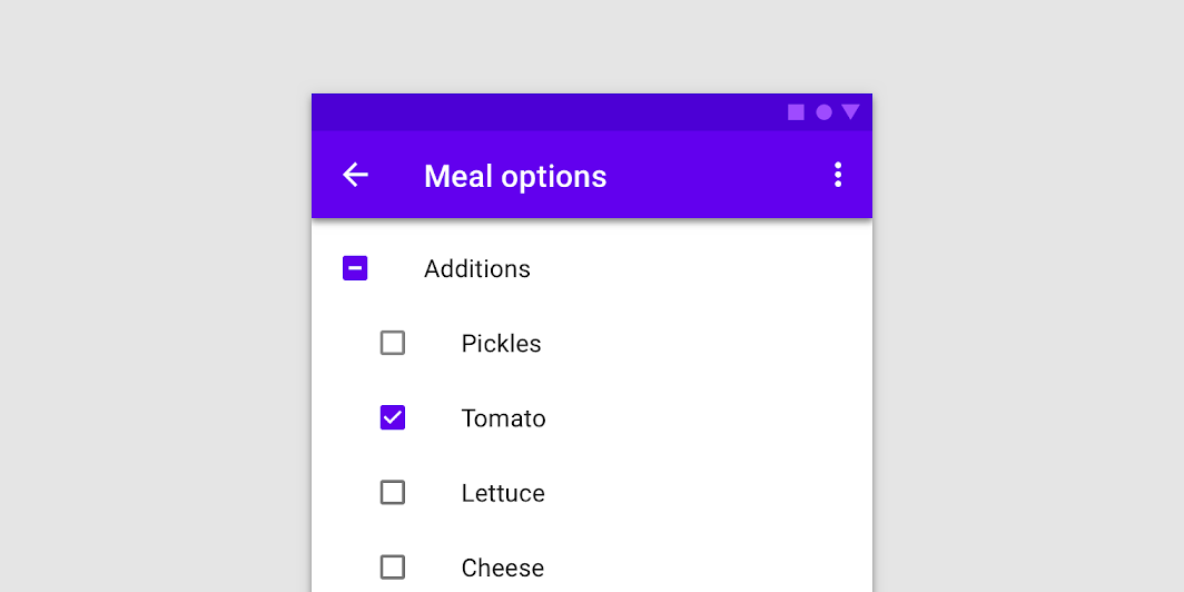
Overview
Code Examples
<a href="https://material.io/components/checkboxes" class="external" target="_blank">Material Design checkbox</a>.
Checkboxes allow users to select one or more items from a set. Checkboxes can turn an option on or off.
!Checkboxes image(https://developer.android.com/images/reference/androidx/compose/material/checkboxes.png)
Overloads
Checkbox
@Composable
fun Checkbox(
    checked: Boolean,
    onCheckedChange: ((Boolean) -> Unit)?,
    modifier: Modifier = Modifier,
    enabled: Boolean = true,
    interactionSource: MutableInteractionSource = remember { MutableInteractionSource() },
    colors: CheckboxColors = CheckboxDefaults.colors()
)
Parameters
| Name | Description |
|---|---|
checked | whether Checkbox is checked or unchecked |
onCheckedChange | callback to be invoked when checkbox is being clicked, therefore the change of checked state in requested. If null, then this is passive and relies entirely on a higher-level component to control the "checked" state. |
modifier | Modifier to be applied to the layout of the checkbox |
enabled | whether the component is enabled or grayed out |
interactionSource | the MutableInteractionSource representing the stream of Interactions for this Checkbox. You can create and pass in your own remembered MutableInteractionSource if you want to observe Interactions and customize the appearance / behavior of this Checkbox in different Interactions. |
colors | CheckboxColors that will be used to determine the color of the checkmark / box / border in different states. See CheckboxDefaults.colors |