
← Compose Multiplatform Component in Material Compose
BottomAppBar
Common
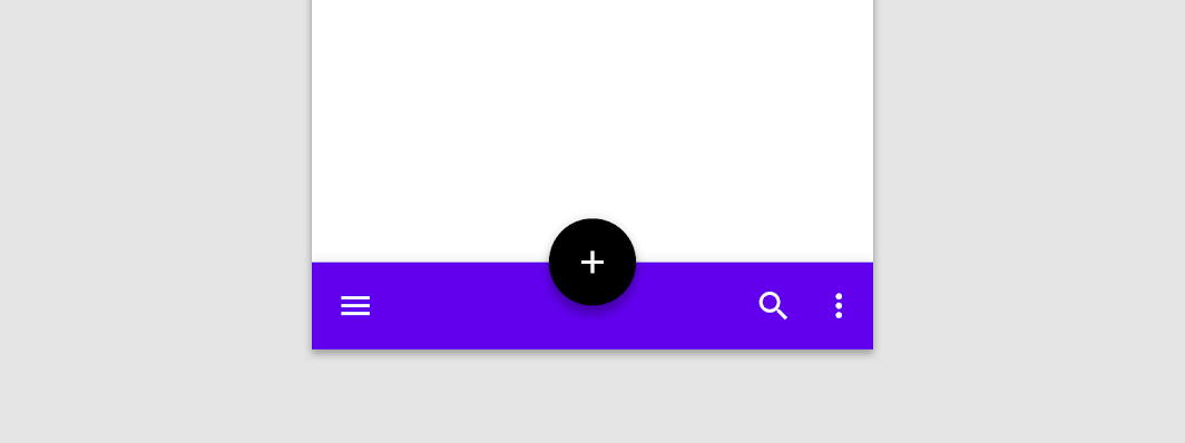
A bottom app bar displays navigation and key actions at the bottom of screens.
Last updated:
Installation
dependencies {
   implementation("androidx.compose.material:material:1.7.0-beta04")
}
Overloads
@Composable
fun BottomAppBar(
    windowInsets: WindowInsets,
    modifier: Modifier = Modifier,
    backgroundColor: Color = MaterialTheme.colors.primarySurface,
    contentColor: Color = contentColorFor(backgroundColor),
    cutoutShape: Shape? = null,
    elevation: Dp = AppBarDefaults.BottomAppBarElevation,
    contentPadding: PaddingValues = AppBarDefaults.ContentPadding,
    content: @Composable RowScope.() -> Unit
)
Parameters
| name | description |
|---|---|
windowInsets | a window insets that app bar will respect. |
modifier | The [Modifier] to be applied to this BottomAppBar |
backgroundColor | The background color for the BottomAppBar. Use [Color.Transparent] to have no color. |
contentColor | The preferred content color provided by this BottomAppBar to its children. Defaults to either the matching content color for [backgroundColor], or if [backgroundColor] is not a color from the theme, this will keep the same value set above this BottomAppBar. |
cutoutShape | the shape of the cutout that will be added to the BottomAppBar - this should typically be the same shape used inside the [FloatingActionButton], when [BottomAppBar] and [FloatingActionButton] are being used together in [Scaffold]. This shape will be drawn with an offset around all sides. If null, where will be no cutout. |
elevation | the elevation of this BottomAppBar. |
contentPadding | the padding applied to the content of this BottomAppBar |
content | the content of this BottomAppBar. The default layout here is a [Row], so content inside will be placed horizontally. |
@Composable
fun BottomAppBar(
    modifier: Modifier = Modifier,
    backgroundColor: Color = MaterialTheme.colors.primarySurface,
    contentColor: Color = contentColorFor(backgroundColor),
    cutoutShape: Shape? = null,
    elevation: Dp = AppBarDefaults.BottomAppBarElevation,
    contentPadding: PaddingValues = AppBarDefaults.ContentPadding,
    content: @Composable RowScope.() -> Unit
)
Parameters
| name | description |
|---|---|
modifier | The [Modifier] to be applied to this BottomAppBar |
backgroundColor | The background color for the BottomAppBar. Use [Color.Transparent] to have no color. |
contentColor | The preferred content color provided by this BottomAppBar to its children. Defaults to either the matching content color for [backgroundColor], or if [backgroundColor] is not a color from the theme, this will keep the same value set above this BottomAppBar. |
cutoutShape | the shape of the cutout that will be added to the BottomAppBar - this should typically be the same shape used inside the [FloatingActionButton], when [BottomAppBar] and [FloatingActionButton] are being used together in [Scaffold]. This shape will be drawn with an offset around all sides. If null, where will be no cutout. |
elevation | the elevation of this BottomAppBar. |
contentPadding | the padding applied to the content of this BottomAppBar |
content | the content of this BottomAppBar. The default layout here is a [Row], so content inside will be placed horizontally. |
Code Example
SimpleBottomAppBar
@Composable
@Sampled
fun SimpleBottomAppBar() {
    BottomAppBar(windowInsets = AppBarDefaults.bottomAppBarWindowInsets) {
        // Leading icons should typically have a high content alpha
        CompositionLocalProvider(LocalContentAlpha provides ContentAlpha.high) {
            IconButton(onClick = { /* doSomething() */ }) {
                Icon(Icons.Filled.Menu, contentDescription = "Localized description")
            }
        }
        // The actions should be at the end of the BottomAppBar. They use the default medium
        // content alpha provided by BottomAppBar
        Spacer(Modifier.weight(1f, true))
        IconButton(onClick = { /* doSomething() */ }) {
            Icon(Icons.Filled.Favorite, contentDescription = "Localized description")
        }
        IconButton(onClick = { /* doSomething() */ }) {
            Icon(Icons.Filled.Favorite, contentDescription = "Localized description")
        }
    }
}
