
← Compose Multiplatform Component in Material Compose
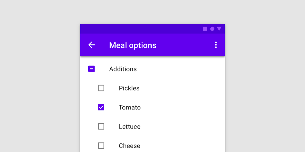
Checkbox
Common
Checkboxes allow users to select one or more items from a set. Checkboxes can turn an option on or off.
Last updated:
Installation
dependencies {
   implementation("androidx.compose.material:material:1.7.0-beta04")
}
Overloads
@Composable
fun Checkbox(
    checked: Boolean,
    onCheckedChange: ((Boolean) -> Unit)?,
    modifier: Modifier = Modifier,
    enabled: Boolean = true,
    interactionSource: MutableInteractionSource? = null,
    colors: CheckboxColors = CheckboxDefaults.colors()
)
Parameters
| name | description |
|---|---|
checked | whether Checkbox is checked or unchecked |
onCheckedChange | callback to be invoked when checkbox is being clicked, therefore the change of checked state in requested. If null, then this is passive and relies entirely on a higher-level component to control the "checked" state. |
modifier | Modifier to be applied to the layout of the checkbox |
enabled | whether the component is enabled or grayed out |
interactionSource | an optional hoisted [MutableInteractionSource] for observing and emitting [Interaction]s for this checkbox. You can use this to change the checkbox's appearance or preview the checkbox in different states. Note that if null is provided, interactions will still happen internally. |
colors | [CheckboxColors] that will be used to determine the color of the checkmark / box / border in different states. See [CheckboxDefaults.colors]. |
Code Example
CheckboxSample
@Composable
@Sampled
fun CheckboxSample() {
    val checkedState = remember { mutableStateOf(true) }
    Checkbox(
        checked = checkedState.value,
        onCheckedChange = { checkedState.value = it }
    )
}
