
← Compose Multiplatform Component in Material Compose
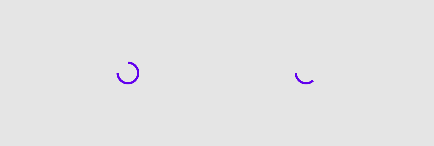
CircularProgressIndicator
Common
Progress indicators express an unspecified wait time or display the length of a process.
Last updated:
Installation
dependencies {
   implementation("androidx.compose.material:material:1.7.0-beta04")
}
Overloads
@Composable
fun CircularProgressIndicator(
    @FloatRange(from = 0.0, to = 1.0)
    progress: Float,
    modifier: Modifier = Modifier,
    color: Color = MaterialTheme.colors.primary,
    strokeWidth: Dp = ProgressIndicatorDefaults.StrokeWidth,
    backgroundColor: Color = Color.Transparent,
    strokeCap: StrokeCap = StrokeCap.Butt,
)
Parameters
| name | description |
|---|---|
progress | The progress of this progress indicator, where 0.0 represents no progress and 1.0 represents full progress. Values outside of this range are coerced into the range. |
modifier | the [Modifier] to be applied to this progress indicator |
color | The color of the progress indicator. |
strokeWidth | The stroke width for the progress indicator. |
backgroundColor | The color of the background behind the indicator, visible when the progress has not reached that area of the overall indicator yet. |
strokeCap | stroke cap to use for the ends of this progress indicator |
@Composable
fun CircularProgressIndicator(
    modifier: Modifier = Modifier,
    color: Color = MaterialTheme.colors.primary,
    strokeWidth: Dp = ProgressIndicatorDefaults.StrokeWidth,
    backgroundColor: Color = Color.Transparent,
    strokeCap: StrokeCap = StrokeCap.Square,
)
Parameters
| name | description |
|---|---|
modifier | the [Modifier] to be applied to this progress indicator |
color | The color of the progress indicator. |
strokeWidth | The stroke width for the progress indicator. |
backgroundColor | The color of the background behind the indicator, visible when the progress has not reached that area of the overall indicator yet. |
strokeCap | stroke cap to use for the ends of this progress indicator |
@Composable
@Deprecated("Maintained for binary compatibility", level = DeprecationLevel.HIDDEN
fun CircularProgressIndicator(
    modifier: Modifier = Modifier,
    color: Color = MaterialTheme.colors.primary,
    strokeWidth: Dp = ProgressIndicatorDefaults.StrokeWidth
)
@Composable
@Deprecated("Maintained for binary compatibility", level = DeprecationLevel.HIDDEN
fun CircularProgressIndicator(
    progress: Float,
    modifier: Modifier = Modifier,
    color: Color = MaterialTheme.colors.primary,
    strokeWidth: Dp = ProgressIndicatorDefaults.StrokeWidth
)
Code Example
CircularProgressIndicatorSample
@Composable
@Sampled
fun CircularProgressIndicatorSample() {
    var progress by remember { mutableStateOf(0.1f) }
    val animatedProgress by animateFloatAsState(
        targetValue = progress,
        animationSpec = ProgressIndicatorDefaults.ProgressAnimationSpec
    )

    Column(horizontalAlignment = Alignment.CenterHorizontally) {
        CircularProgressIndicator(progress = animatedProgress)
        Spacer(Modifier.requiredHeight(30.dp))
        OutlinedButton(
            onClick = {
                if (progress < 1f) progress += 0.1f
            }
        ) {
            Text("Increase")
        }
    }
}
