
← Compose Multiplatform Component in Material Compose
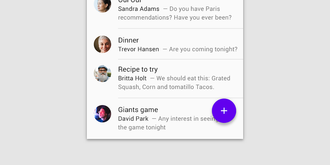
ListItem
Common
Lists are continuous, vertical indexes of text or images.
Last updated:
Installation
dependencies {
   implementation("androidx.compose.material:material:1.7.0-beta04")
}
Overloads
@ExperimentalMaterialApi
@Composable
fun ListItem(
    modifier: Modifier = Modifier,
    icon: @Composable (() -> Unit)? = null,
    secondaryText: @Composable (() -> Unit)? = null,
    singleLineSecondaryText: Boolean = true,
    overlineText: @Composable (() -> Unit)? = null,
    trailing: @Composable (() -> Unit)? = null,
    text: @Composable () -> Unit
)
Parameters
| name | description |
|---|---|
modifier | Modifier to be applied to the list item |
icon | The leading supporting visual of the list item |
secondaryText | The secondary text of the list item |
singleLineSecondaryText | Whether the secondary text is single line |
overlineText | The text displayed above the primary text |
trailing | The trailing meta text, icon, switch or checkbox |
text | The primary text of the list item |
Code Examples
OneLineListItems
@OptIn(ExperimentalMaterialApi::class
@Composable
@Sampled
fun OneLineListItems() {
    Column {
        ListItem(text = { Text("One line list item with no icon") })
        Divider()
        ListItem(
            text = { Text("One line list item with 24x24 icon") },
            icon = {
                Icon(
                    Icons.Filled.Favorite,
                    contentDescription = null
                )
            }
        )
        Divider()
        ListItem(
            text = { Text("One line list item with 40x40 icon") },
            icon = {
                Icon(
                    Icons.Filled.Favorite,
                    contentDescription = null,
                    modifier = Modifier.size(40.dp)
                )
            }
        )
        Divider()
        ListItem(
            text = { Text("One line list item with 56x56 icon") },
            icon = {
                Icon(
                    Icons.Filled.Favorite,
                    contentDescription = null,
                    modifier = Modifier.size(56.dp)
                )
            }
        )
        Divider()
        ListItem(
            text = { Text("One line clickable list item") },
            icon = {
                Icon(
                    Icons.Filled.Favorite,
                    contentDescription = null,
                    modifier = Modifier.size(56.dp)
                )
            },
            modifier = Modifier.clickable { }
        )
        Divider()
        ListItem(
            text = { Text("One line list item with trailing icon") },
            trailing = {
                Icon(
                    Icons.Filled.Favorite,
                    contentDescription = "Localized Description"
                )
            }
        )
        Divider()
        ListItem(
            text = { Text("One line list item") },
            icon = {
                Icon(
                    Icons.Filled.Favorite,
                    contentDescription = null,
                    modifier = Modifier.size(40.dp)
                )
            },
            trailing = {
                Icon(
                    Icons.Filled.Favorite,
                    contentDescription = "Localized description"
                )
            }
        )
        Divider()
    }
}
TwoLineListItems
@OptIn(ExperimentalMaterialApi::class
@Composable
@Sampled
fun TwoLineListItems() {
    Column {
        ListItem(
            text = { Text("Two line list item") },
            secondaryText = { Text("Secondary text") }
        )
        Divider()
        ListItem(
            text = { Text("Two line list item") },
            overlineText = { Text("OVERLINE") }
        )
        Divider()
        ListItem(
            text = { Text("Two line list item with 24x24 icon") },
            secondaryText = { Text("Secondary text") },
            icon = {
                Icon(
                    Icons.Filled.Favorite,
                    contentDescription = null
                )
            }
        )
        Divider()
        ListItem(
            text = { Text("Two line list item with 40x40 icon") },
            secondaryText = { Text("Secondary text") },
            icon = {
                Icon(
                    Icons.Filled.Favorite,
                    contentDescription = null,
                    modifier = Modifier.size(40.dp)
                )
            }
        )
        Divider()
        ListItem(
            text = { Text("Two line list item with 40x40 icon") },
            secondaryText = { Text("Secondary text") },
            trailing = { Text("meta") },
            icon = {
                Icon(
                    Icons.Filled.Favorite,
                    contentDescription = null,
                    modifier = Modifier.size(40.dp)
                )
            }
        )
        Divider()
    }
}
ThreeLineListItems
@OptIn(ExperimentalMaterialApi::class
@Composable
@Sampled
fun ThreeLineListItems() {
    Column {
        ListItem(
            text = { Text("Three line list item") },
            secondaryText = {
                Text(
                    "This is a long secondary text for the current list item, " +
                        "displayed on two lines"
                )
            },
            singleLineSecondaryText = false,
            trailing = { Text("meta") }
        )
        Divider()
        ListItem(
            text = { Text("Three line list item") },
            overlineText = { Text("OVERLINE") },
            secondaryText = { Text("Secondary text") }
        )
        Divider()
        ListItem(
            text = { Text("Three line list item with 24x24 icon") },
            secondaryText = {
                Text(
                    "This is a long secondary text for the current list item " +
                        "displayed on two lines"
                )
            },
            singleLineSecondaryText = false,
            icon = {
                Icon(
                    Icons.Filled.Favorite,
                    contentDescription = null
                )
            }
        )
        Divider()
        ListItem(
            text = { Text("Three line list item with trailing icon") },
            secondaryText = {
                Text(
                    "This is a long secondary text for the current list" +
                        " item, displayed on two lines"
                )
            },
            singleLineSecondaryText = false,
            trailing = {
                Icon(
                    Icons.Filled.Favorite,
                    contentDescription = "Localized description"
                )
            }
        )
        Divider()
        ListItem(
            text = { Text("Three line list item") },
            overlineText = { Text("OVERLINE") },
            secondaryText = { Text("Secondary text") },
            trailing = { Text("meta") }
        )
        Divider()
    }
}
ClickableListItems
@OptIn(ExperimentalMaterialApi::class
@Composable
@Sampled
fun ClickableListItems() {
    Column {
        var switched by remember { mutableStateOf(false) }
        val onSwitchedChange: (Boolean) -> Unit = { switched = it }
        ListItem(
            text = { Text("Switch ListItem") },
            trailing = {
                Switch(
                    checked = switched,
                    onCheckedChange = null // null recommended for accessibility with screenreaders
                )
            },
            modifier = Modifier.toggleable(
                role = Role.Switch,
                value = switched,
                onValueChange = onSwitchedChange
            )
        )
        Divider()
        var checked by remember { mutableStateOf(true) }
        val onCheckedChange: (Boolean) -> Unit = { checked = it }
        ListItem(
            text = { Text("Checkbox ListItem") },
            trailing = {
                Checkbox(
                    checked = checked,
                    onCheckedChange = null // null recommended for accessibility with screenreaders
                )
            },
            modifier = Modifier.toggleable(
                role = Role.Checkbox,
                value = checked,
                onValueChange = onCheckedChange
            )
        )
        Divider()
    }
}
