OutlinedTextField
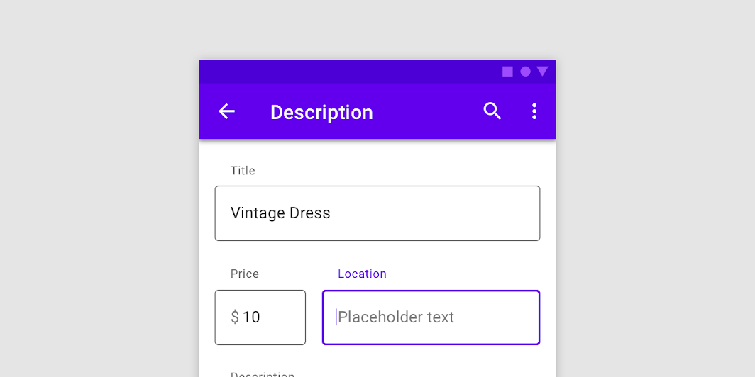
Outlined text fields have less visual emphasis than filled text fields. When they appear in
OutlinedTextField
Composable Component
Outlined text fields have less visual emphasis than filled text fields. When they appear in places like forms, where many text fields are placed together, their reduced emphasis helps simplify the layout.
Common
@Composable
fun OutlinedTextField(
    state: TextFieldState,
    modifier: Modifier = Modifier,
    enabled: Boolean = true,
    readOnly: Boolean = false,
    textStyle: TextStyle = LocalTextStyle.current,
    label: @Composable (() -> Unit)? = null,
    placeholder: @Composable (() -> Unit)? = null,
    leadingIcon: @Composable (() -> Unit)? = null,
    trailingIcon: @Composable (() -> Unit)? = null,
    isError: Boolean = false,
    inputTransformation: InputTransformation? = null,
    outputTransformation: OutputTransformation? = null,
    keyboardOptions: KeyboardOptions = KeyboardOptions.Default,
    onKeyboardAction: KeyboardActionHandler? = null,
    lineLimits: TextFieldLineLimits = TextFieldLineLimits.Default,
    scrollState: ScrollState = rememberScrollState(),
    shape: Shape = TextFieldDefaults.OutlinedTextFieldShape,
    colors: TextFieldColors = TextFieldDefaults.outlinedTextFieldColors(),
    interactionSource: MutableInteractionSource? = null,
)
Parameters
| state | TextFieldState object that holds the internal editing state of this text field. |
| modifier | a Modifier for this text field |
| enabled | controls the enabled state of the OutlinedTextField. When false, the text field will be neither editable nor focusable, the input of the text field will not be selectable, visually text field will appear in the disabled UI state |
| readOnly | controls the editable state of the OutlinedTextField. When true, the text field can not be modified, however, a user can focus it and copy text from it. Read-only text fields are usually used to display pre-filled forms that user can not edit |
| textStyle | the style to be applied to the input text. The default textStyle uses the LocalTextStyle defined by the theme |
| label | the optional label to be displayed inside the text field container. The default text style for internal Text is Typography.caption when the text field is in focus and Typography.subtitle1 when the text field is not in focus |
| placeholder | the optional placeholder to be displayed when the text field is in focus and the input text is empty. The default text style for internal Text is Typography.subtitle1 |
| leadingIcon | the optional leading icon to be displayed at the beginning of the text field container |
| trailingIcon | the optional trailing icon to be displayed at the end of the text field container |
| isError | indicates if the text field's current value is in error. If set to true, the label, bottom indicator and trailing icon by default will be displayed in error color |
| inputTransformation | Optional InputTransformation that will be used to transform changes to the TextFieldState made by the user. The transformation will be applied to changes made by hardware and software keyboard events, pasting or dropping text, accessibility services, and tests. The transformation will not be applied when changing the state programmatically, or when the transformation is changed. If the transformation is changed on an existing text field, it will be applied to the next user edit. the transformation will not immediately affect the current state. |
| outputTransformation | An OutputTransformation that transforms how the contents of the text field are presented. |
| keyboardOptions | software keyboard options that contains configuration such as KeyboardType and ImeAction |
| onKeyboardAction | Called when the user presses the action button in the input method editor (IME), or by pressing the enter key on a hardware keyboard. By default this parameter is null, and would execute the default behavior for a received IME Action e.g., ImeAction.Done would close the keyboard, ImeAction.Next would switch the focus to the next focusable item on the screen. |
| lineLimits | Whether the text field should be SingleLine, scroll horizontally, and ignore newlines; or MultiLine and grow and scroll vertically. If SingleLine is passed, all newline characters ('\n') within the text will be replaced with regular whitespace (' '), ensuring that the contents of the text field are presented in a single line. |
| scrollState | Scroll state that manages either horizontal or vertical scroll of the text field. If lineLimits is SingleLine, this text field is treated as single line with horizontal scroll behavior. In other cases the text field becomes vertically scrollable. |
| shape | the shape of the text field's border |
| colors | TextFieldColors that will be used to resolve color of the text and content (including label, placeholder, leading and trailing icons, border) for this text field in different states. See TextFieldDefaults.outlinedTextFieldColors |
| interactionSource | an optional hoisted MutableInteractionSource for observing and emitting Interactions for this text field. You can use this to change the text field's appearance or preview the text field in different states. Note that if null is provided, interactions will still happen internally. |
Common
@Composable
fun OutlinedTextField(
    value: String,
    onValueChange: (String) -> Unit,
    modifier: Modifier = Modifier,
    enabled: Boolean = true,
    readOnly: Boolean = false,
    textStyle: TextStyle = LocalTextStyle.current,
    label: @Composable (() -> Unit)? = null,
    placeholder: @Composable (() -> Unit)? = null,
    leadingIcon: @Composable (() -> Unit)? = null,
    trailingIcon: @Composable (() -> Unit)? = null,
    isError: Boolean = false,
    visualTransformation: VisualTransformation = VisualTransformation.None,
    keyboardOptions: KeyboardOptions = KeyboardOptions.Default,
    keyboardActions: KeyboardActions = KeyboardActions.Default,
    singleLine: Boolean = false,
    maxLines: Int = if (singleLine) 1 else Int.MAX_VALUE,
    minLines: Int = 1,
    interactionSource: MutableInteractionSource? = null,
    shape: Shape = TextFieldDefaults.OutlinedTextFieldShape,
    colors: TextFieldColors = TextFieldDefaults.outlinedTextFieldColors(),
)
Parameters
| value | the input text to be shown in the text field |
| onValueChange | the callback that is triggered when the input service updates the text. An updated text comes as a parameter of the callback |
| modifier | a Modifier for this text field |
| enabled | controls the enabled state of the OutlinedTextField. When false, the text field will be neither editable nor focusable, the input of the text field will not be selectable, visually text field will appear in the disabled UI state |
| readOnly | controls the editable state of the OutlinedTextField. When true, the text field can not be modified, however, a user can focus it and copy text from it. Read-only text fields are usually used to display pre-filled forms that user can not edit |
| textStyle | the style to be applied to the input text. The default textStyle uses the LocalTextStyle defined by the theme |
| label | the optional label to be displayed inside the text field container. The default text style for internal Text is Typography.caption when the text field is in focus and Typography.subtitle1 when the text field is not in focus |
| placeholder | the optional placeholder to be displayed when the text field is in focus and the input text is empty. The default text style for internal Text is Typography.subtitle1 |
| leadingIcon | the optional leading icon to be displayed at the beginning of the text field container |
| trailingIcon | the optional trailing icon to be displayed at the end of the text field container |
| isError | indicates if the text field's current value is in error. If set to true, the label, bottom indicator and trailing icon by default will be displayed in error color |
| visualTransformation | transforms the visual representation of the input value For example, you can use PasswordVisualTransformation to create a password text field. By default no visual transformation is applied |
| keyboardOptions | software keyboard options that contains configuration such as KeyboardType and ImeAction |
| keyboardActions | when the input service emits an IME action, the corresponding callback is called. Note that this IME action may be different from what you specified in KeyboardOptions.imeAction |
| singleLine | when set to true, this text field becomes a single horizontally scrolling text field instead of wrapping onto multiple lines. The keyboard will be informed to not show the return key as the ImeAction. Note that maxLines parameter will be ignored as the maxLines attribute will be automatically set to 1 |
| maxLines | the maximum height in terms of maximum number of visible lines. It is required that 1 <= minLines <= maxLines. This parameter is ignored when singleLine is true. |
| minLines | the minimum height in terms of minimum number of visible lines. It is required that 1 <= minLines <= maxLines. This parameter is ignored when singleLine is true. |
| interactionSource | an optional hoisted MutableInteractionSource for observing and emitting Interactions for this text field. You can use this to change the text field's appearance or preview the text field in different states. Note that if null is provided, interactions will still happen internally. |
| shape | the shape of the text field's border |
| colors | TextFieldColors that will be used to resolve color of the text and content (including label, placeholder, leading and trailing icons, border) for this text field in different states. See TextFieldDefaults.outlinedTextFieldColors |
Common
Deprecated Maintained for binary compatibility. Use version with minLines instead
@Composable
fun OutlinedTextField(
    value: String,
    onValueChange: (String) -> Unit,
    modifier: Modifier = Modifier,
    enabled: Boolean = true,
    readOnly: Boolean = false,
    textStyle: TextStyle = LocalTextStyle.current,
    label: @Composable (() -> Unit)? = null,
    placeholder: @Composable (() -> Unit)? = null,
    leadingIcon: @Composable (() -> Unit)? = null,
    trailingIcon: @Composable (() -> Unit)? = null,
    isError: Boolean = false,
    visualTransformation: VisualTransformation = VisualTransformation.None,
    keyboardOptions: KeyboardOptions = KeyboardOptions.Default,
    keyboardActions: KeyboardActions = KeyboardActions.Default,
    singleLine: Boolean = false,
    maxLines: Int = Int.MAX_VALUE,
    interactionSource: MutableInteractionSource = remember { MutableInteractionSource() },
    shape: Shape = TextFieldDefaults.OutlinedTextFieldShape,
    colors: TextFieldColors = TextFieldDefaults.outlinedTextFieldColors(),
)
Common
@Composable
fun OutlinedTextField(
    value: TextFieldValue,
    onValueChange: (TextFieldValue) -> Unit,
    modifier: Modifier = Modifier,
    enabled: Boolean = true,
    readOnly: Boolean = false,
    textStyle: TextStyle = LocalTextStyle.current,
    label: @Composable (() -> Unit)? = null,
    placeholder: @Composable (() -> Unit)? = null,
    leadingIcon: @Composable (() -> Unit)? = null,
    trailingIcon: @Composable (() -> Unit)? = null,
    isError: Boolean = false,
    visualTransformation: VisualTransformation = VisualTransformation.None,
    keyboardOptions: KeyboardOptions = KeyboardOptions.Default,
    keyboardActions: KeyboardActions = KeyboardActions(),
    singleLine: Boolean = false,
    maxLines: Int = if (singleLine) 1 else Int.MAX_VALUE,
    minLines: Int = 1,
    interactionSource: MutableInteractionSource? = null,
    shape: Shape = TextFieldDefaults.OutlinedTextFieldShape,
    colors: TextFieldColors = TextFieldDefaults.outlinedTextFieldColors(),
)
Parameters
| value | the input TextFieldValue to be shown in the text field |
| onValueChange | the callback that is triggered when the input service updates values in TextFieldValue. An updated TextFieldValue comes as a parameter of the callback |
| modifier | a Modifier for this text field |
| enabled | controls the enabled state of the OutlinedTextField. When false, the text field will be neither editable nor focusable, the input of the text field will not be selectable, visually text field will appear in the disabled UI state |
| readOnly | controls the editable state of the OutlinedTextField. When true, the text field can not be modified, however, a user can focus it and copy text from it. Read-only text fields are usually used to display pre-filled forms that user can not edit |
| textStyle | the style to be applied to the input text. The default textStyle uses the LocalTextStyle defined by the theme |
| label | the optional label to be displayed inside the text field container. The default text style for internal Text is Typography.caption when the text field is in focus and Typography.subtitle1 when the text field is not in focus |
| placeholder | the optional placeholder to be displayed when the text field is in focus and the input text is empty. The default text style for internal Text is Typography.subtitle1 |
| leadingIcon | the optional leading icon to be displayed at the beginning of the text field container |
| trailingIcon | the optional trailing icon to be displayed at the end of the text field container |
| isError | indicates if the text field's current value is in error state. If set to true, the label, bottom indicator and trailing icon by default will be displayed in error color |
| visualTransformation | transforms the visual representation of the input value For example, you can use PasswordVisualTransformation to create a password text field. By default no visual transformation is applied |
| keyboardOptions | software keyboard options that contains configuration such as KeyboardType and ImeAction |
| keyboardActions | when the input service emits an IME action, the corresponding callback is called. Note that this IME action may be different from what you specified in KeyboardOptions.imeAction |
| singleLine | when set to true, this text field becomes a single horizontally scrolling text field instead of wrapping onto multiple lines. The keyboard will be informed to not show the return key as the ImeAction. Note that maxLines parameter will be ignored as the maxLines attribute will be automatically set to 1 |
| maxLines | the maximum height in terms of maximum number of visible lines. It is required that 1 <= minLines <= maxLines. This parameter is ignored when singleLine is true. |
| minLines | the minimum height in terms of minimum number of visible lines. It is required that 1 <= minLines <= maxLines. This parameter is ignored when singleLine is true. |
| interactionSource | an optional hoisted MutableInteractionSource for observing and emitting Interactions for this text field. You can use this to change the text field's appearance or preview the text field in different states. Note that if null is provided, interactions will still happen internally. |
| shape | the shape of the text field's border |
| colors | TextFieldColors that will be used to resolve color of the text and content (including label, placeholder, leading and trailing icons, border) for this text field in different states. See TextFieldDefaults.outlinedTextFieldColors |
Common
Deprecated Maintained for binary compatibility. Use version with minLines instead
@Composable
fun OutlinedTextField(
    value: TextFieldValue,
    onValueChange: (TextFieldValue) -> Unit,
    modifier: Modifier = Modifier,
    enabled: Boolean = true,
    readOnly: Boolean = false,
    textStyle: TextStyle = LocalTextStyle.current,
    label: @Composable (() -> Unit)? = null,
    placeholder: @Composable (() -> Unit)? = null,
    leadingIcon: @Composable (() -> Unit)? = null,
    trailingIcon: @Composable (() -> Unit)? = null,
    isError: Boolean = false,
    visualTransformation: VisualTransformation = VisualTransformation.None,
    keyboardOptions: KeyboardOptions = KeyboardOptions.Default,
    keyboardActions: KeyboardActions = KeyboardActions(),
    singleLine: Boolean = false,
    maxLines: Int = Int.MAX_VALUE,
    interactionSource: MutableInteractionSource = remember { MutableInteractionSource() },
    shape: Shape = TextFieldDefaults.OutlinedTextFieldShape,
    colors: TextFieldColors = TextFieldDefaults.outlinedTextFieldColors(),
)
Code Examples
OutlinedTextFieldWithInitialValueAndSelection
@Composable
fun OutlinedTextFieldWithInitialValueAndSelection() {
    val state = rememberTextFieldState("Initial text", TextRange(0, 12))
    OutlinedTextField(
        state = state,
        label = { Text("Label") },
        lineLimits = TextFieldLineLimits.SingleLine,
    )
}
SimpleOutlinedTextFieldSample
@Composable
fun SimpleOutlinedTextFieldSample() {
    OutlinedTextField(
        state = rememberTextFieldState(),
        label = { Text("Label") },
        lineLimits = TextFieldLineLimits.SingleLine,
    )
}
Create your own Component Library
Material Components are meant to be used as is and they do not allow customizations. To build your own Jetpack Compose component library use Compose Unstyled


