
← Compose Multiplatform Component in Material Compose
RadioButton
Common
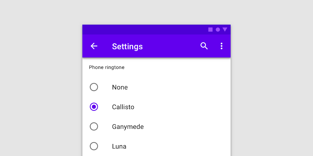
Radio buttons allow users to select one option from a set.
Last updated:
Installation
dependencies {
   implementation("androidx.compose.material:material:1.7.0-beta04")
}
Overloads
@Composable
fun RadioButton(
    selected: Boolean,
    onClick: (() -> Unit)?,
    modifier: Modifier = Modifier,
    enabled: Boolean = true,
    interactionSource: MutableInteractionSource? = null,
    colors: RadioButtonColors = RadioButtonDefaults.colors()
)
Parameters
| name | description |
|---|---|
selected | whether this radio button is selected or not |
onClick | callback to be invoked when the RadioButton is clicked. If null, then this RadioButton will not handle input events, and only act as a visual indicator of [selected] state |
modifier | Modifier to be applied to the radio button |
enabled | Controls the enabled state of the [RadioButton]. When false, this button will not be selectable and appears disabled |
interactionSource | an optional hoisted [MutableInteractionSource] for observing and emitting [Interaction]s for this radio button. You can use this to change the radio button's appearance or preview the radio button in different states. Note that if null is provided, interactions will still happen internally. |
colors | [RadioButtonColors] that will be used to resolve the color used for this RadioButton in different states. See [RadioButtonDefaults.colors]. |
Code Examples
RadioButtonSample
@Composable
@Sampled
fun RadioButtonSample() {
    // We have two radio buttons and only one can be selected
    var state by remember { mutableStateOf(true) }
    // Note that Modifier.selectableGroup() is essential to ensure correct accessibility behavior
    Row(Modifier.selectableGroup()) {
        RadioButton(
            selected = state,
            onClick = { state = true }
        )
        RadioButton(
            selected = !state,
            onClick = { state = false }
        )
    }
}
RadioGroupSample
@Composable
@Sampled
fun RadioGroupSample() {
    val radioOptions = listOf("Calls", "Missed", "Friends")
    val (selectedOption, onOptionSelected) = remember { mutableStateOf(radioOptions[0]) }
    // Note that Modifier.selectableGroup() is essential to ensure correct accessibility behavior
    Column(Modifier.selectableGroup()) {
        radioOptions.forEach { text ->
            Row(
                Modifier
                    .fillMaxWidth()
                    .height(56.dp)
                    .selectable(
                        selected = (text == selectedOption),
                        onClick = { onOptionSelected(text) },
                        role = Role.RadioButton
                    )
                    .padding(horizontal = 16.dp),
                verticalAlignment = Alignment.CenterVertically
            ) {
                RadioButton(
                    selected = (text == selectedOption),
                    onClick = null // null recommended for accessibility with screenreaders
                )
                Text(
                    text = text,
                    style = MaterialTheme.typography.body1.merge(),
                    modifier = Modifier.padding(start = 16.dp)
                )
            }
        }
    }
}
