← Back to Material Compose
RadioGroup
Component
in
Material
. Since 0.1.0-dev15Overview
Code Examples
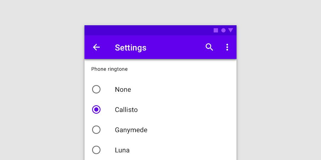
Components for creating mutually exclusive set of RadioButtons. Because of the nature of mutually exclusive set, when radio button is selected, it can't be unselected by being pressed again.
If you want a simplified version with Column of RadioGroupScope.RadioGroupTextItem, consider using version that accepts list of String options and doesn't require any children
@deprecated RadioGroup provides no layout and no additional logic. It is recommended to create such groups manually, to gain flexibility and full control over the state and the appearance
See example of a simple radio group-like layout
Overloads
RadioGroup
@Composable
@Suppress("DEPRECATION")
fun RadioGroup(content: @Composable RadioGroupScope.() -> Unit)
RadioGroup
@Deprecated(
    "RadioGroup provides hardcoded layout and no flexibility. It is recommended to create such " +
            "layouts manually, to gain flexibility and full control over the state and the " +
            "appearance",
    replaceWith = ReplaceWith(
        "Column(modifier) {\n" +
                "options.forEach { text ->\n" +
                "Row(Modifier\n" +
                ".fillMaxWidth()\n" +
                ".selectable(\n" +
                "selected = (text == selectedOption),\n" +
                "onClick = { onSelectedChange(text) }\n" +
                ")\n" +
                ".padding(horizontal = 16.dp)\n" +
                ") {\n" +
                "RadioButton(\n" +
                "selected = (text == selectedOption),\n" +
                "onClick = { onSelectedChange(text) },\n" +
                "selectedColor = radioColor\n" +
                ")\n" +
                "Text(\n" +
                "text = text,\n" +
                "style = MaterialTheme.typography.body1.merge(textStyle),\n" +
                "modifier = Modifier.padding(start = 16.dp)\n" +
                ")\n" +
                "}\n" +
                "}" +
                "}",
        "androidx.compose.material.RadioButton",
        "androidx.compose.foundation.Text",
        "androidx.compose.foundation.layout.Row",
        "androidx.compose.foundation.layout.Column",
        "androidx.compose.foundation.layout.fillMaxWidth",
        "androidx.compose.ui.Modifier",
        "androidx.compose.ui.unit.dp",
        "androidx.compose.foundation.selection.selectable"
    )
)
@Composable
fun RadioGroup(
    options: List<String>,
    selectedOption: String?,
    onSelectedChange: (String) -> Unit,
    modifier: Modifier = Modifier,
    radioColor: Color = MaterialTheme.colors.secondary,
    textStyle: TextStyle? = null
)
Parameters
| Name | Description |
|---|---|
options | list of String to provide RadioButtons label |
selectedOption | label which represents selected RadioButton, or null if nothing is selected |
onSelectedChange | callback to be invoked when RadioButton is clicked, therefore the selection of this item is requested |
modifier | Modifier to be applied to the radio group layout |
radioColor | color for RadioButtons when selected. |
textStyle | parameters for text customization @deprecated RadioGroup provides hardcoded layout and no flexibility. It is recommended to create such layouts manually, to gain flexibility and full control over the state and the appearance. See example of a simple radio group-like layout @sample androidx.compose.material.samples.RadioGroupSampl |