
← Compose Multiplatform Component in Material Compose
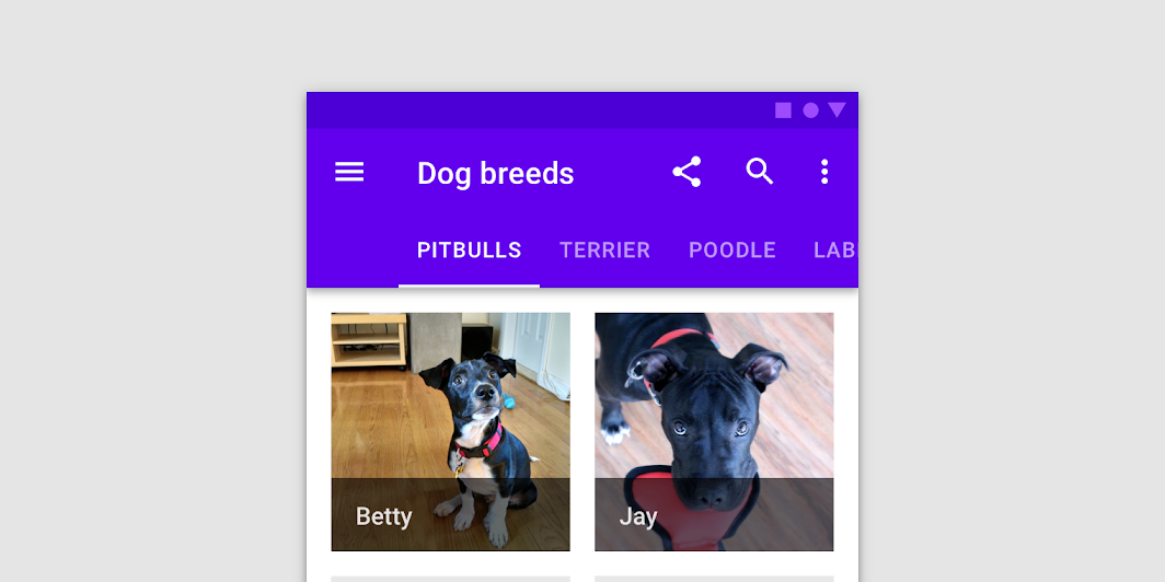
ScrollableTabRow
Common
When a set of tabs cannot fit on screen, use scrollable tabs. Scrollable tabs can use longer text labels and a larger number of tabs. They are best used for browsing on touch interfaces.
Last updated:
Installation
dependencies {
   implementation("androidx.compose.material:material:1.7.0-beta04")
}
Overloads
@UiComposable
@Composable
fun ScrollableTabRow(
    selectedTabIndex: Int,
    modifier: Modifier = Modifier,
    backgroundColor: Color = MaterialTheme.colors.primarySurface,
    contentColor: Color = contentColorFor(backgroundColor),
    edgePadding: Dp = TabRowDefaults.ScrollableTabRowPadding,
    indicator: @Composable @UiComposable
        (tabPositions: List<TabPosition>) -> Unit = @Composable { tabPositions ->
        TabRowDefaults.Indicator(
            Modifier.tabIndicatorOffset(tabPositions[selectedTabIndex])
        )
    },
    divider: @Composable @UiComposable () -> Unit =
        @Composable {
            TabRowDefaults.Divider()
        },
    tabs: @Composable @UiComposable () -> Unit
)
Parameters
| name | description |
|---|---|
selectedTabIndex | the index of the currently selected tab |
modifier | optional [Modifier] for this ScrollableTabRow |
backgroundColor | The background color for the ScrollableTabRow. Use [Color.Transparent] to have no color. |
contentColor | The preferred content color provided by this ScrollableTabRow to its children. Defaults to either the matching content color for [backgroundColor], or if [backgroundColor] is not a color from the theme, this will keep the same value set above this ScrollableTabRow. |
edgePadding | the padding between the starting and ending edge of ScrollableTabRow, and the tabs inside the ScrollableTabRow. This padding helps inform the user that this tab row can be scrolled, unlike a [TabRow]. |
indicator | the indicator that represents which tab is currently selected. By default this will be a [TabRowDefaults.Indicator], using a [TabRowDefaults.tabIndicatorOffset] modifier to animate its position. Note that this indicator will be forced to fill up the entire ScrollableTabRow, so you should use [TabRowDefaults.tabIndicatorOffset] or similar to animate the actual drawn indicator inside this space, and provide an offset from the start. |
divider | the divider displayed at the bottom of the ScrollableTabRow. This provides a layer of separation between the ScrollableTabRow and the content displayed underneath. |
tabs | the tabs inside this ScrollableTabRow. Typically this will be multiple [Tab]s. Each element inside this lambda will be measured and placed evenly across the TabRow, each taking up equal space. |
