
← Compose Multiplatform Component in Material Compose
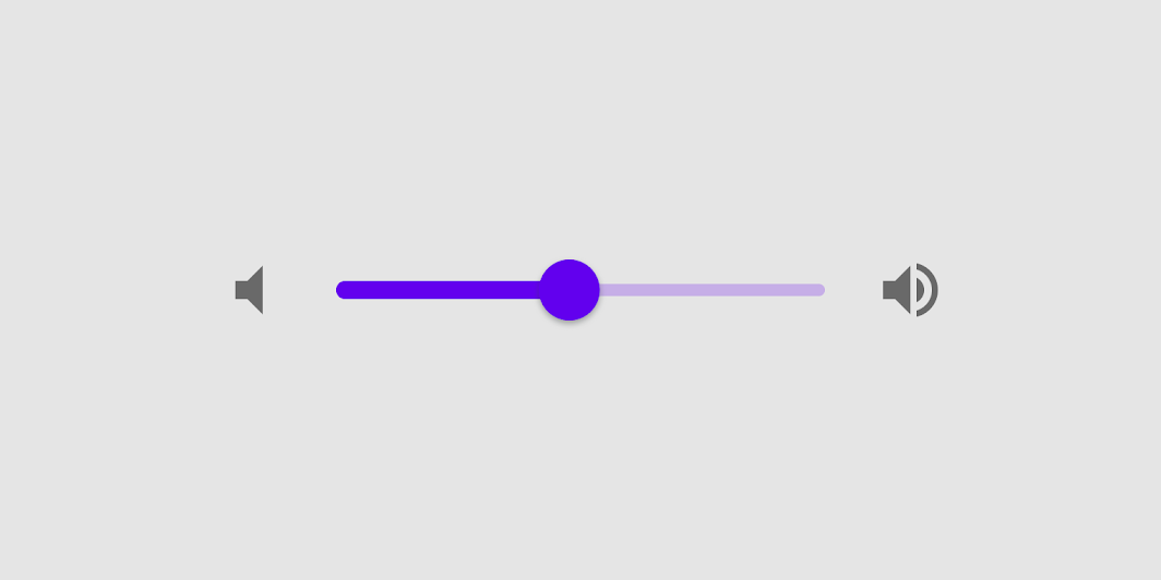
Slider
Common
Sliders allow users to make selections from a range of values.
Sliders reflect a range of values along a bar, from which users may select a single value. They are ideal for adjusting settings such as volume, brightness, or applying image filters.
Last updated:
Installation
dependencies {
   implementation("androidx.compose.material:material:1.7.0-beta04")
}
Overloads
@Composable
fun Slider(
    value: Float,
    onValueChange: (Float) -> Unit,
    modifier: Modifier = Modifier,
    enabled: Boolean = true,
    valueRange: ClosedFloatingPointRange<Float> = 0f..1f,
    @IntRange(from = 0)
    steps: Int = 0,
    onValueChangeFinished: (() -> Unit)? = null,
    interactionSource: MutableInteractionSource? = null,
    colors: SliderColors = SliderDefaults.colors()
)
Parameters
| name | description |
|---|---|
value | current value of the Slider. If outside of [valueRange] provided, value will be coerced to this range. |
onValueChange | lambda in which value should be updated |
modifier | modifiers for the Slider layout |
enabled | whether or not component is enabled and can be interacted with or not |
valueRange | range of values that Slider value can take. Passed [value] will be coerced to this range |
steps | if positive, specifies the amount of discrete allowable values (in addition to the endpoints of the value range). Step values are evenly distributed across the range. If 0, the slider will behave continuously and allow any value from the range. Must not be negative. |
onValueChangeFinished | lambda to be invoked when value change has ended. This callback shouldn't be used to update the slider value (use [onValueChange] for that), but rather to know when the user has completed selecting a new value by ending a drag or a click. |
interactionSource | an optional hoisted [MutableInteractionSource] for observing and emitting [Interaction]s for this slider. You can use this to change the slider's appearance or preview the slider in different states. Note that if null is provided, interactions will still happen internally. |
colors | [SliderColors] that will be used to determine the color of the Slider parts in different state. See [SliderDefaults.colors] to customize. |
Code Examples
SliderSample
@Composable
@Sampled
fun SliderSample() {
    var sliderPosition by remember { mutableStateOf(0f) }
    Column(modifier = Modifier.padding(horizontal = 16.dp)) {
        Text(text = "%.2f".format(sliderPosition))
        Slider(value = sliderPosition, onValueChange = { sliderPosition = it })
    }
}
StepsSliderSample
@Composable
@Sampled
fun StepsSliderSample() {
    var sliderPosition by remember { mutableStateOf(0f) }
    Column(modifier = Modifier.padding(horizontal = 16.dp)) {
        Text(text = sliderPosition.roundToInt().toString())
        Slider(
            value = sliderPosition,
            onValueChange = { sliderPosition = it },
            valueRange = 0f..100f,
            onValueChangeFinished = {
                // launch some business logic update with the state you hold
                // viewModel.updateSelectedSliderValue(sliderPosition)
            },
            // Only allow multiples of 10. Excluding the endpoints of `valueRange`,
            // there are 9 steps (10, 20, ..., 90).
            steps = 9,
            colors = SliderDefaults.colors(
                thumbColor = MaterialTheme.colors.secondary,
                activeTrackColor = MaterialTheme.colors.secondary
            )
        )
    }
}
