← Compose Multiplatform Component in Material Compose
Tab
Common
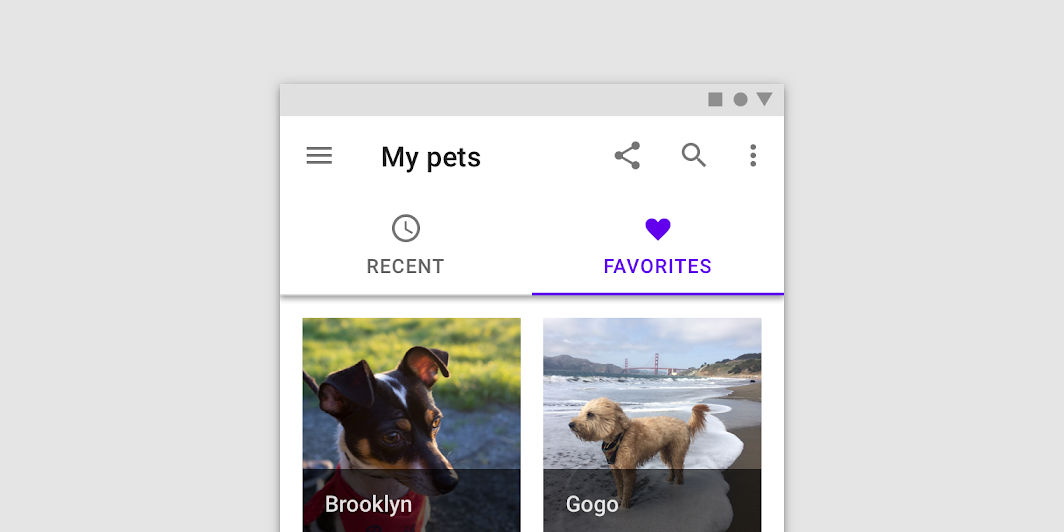
Tabs organize content across different screens, data sets, and other interactions.

Last updated:
Installation
dependencies {
   implementation("androidx.compose.material:material:1.7.0-beta04")
}
Overloads
@Composable
fun Tab(
    selected: Boolean,
    onClick: () -> Unit,
    modifier: Modifier = Modifier,
    enabled: Boolean = true,
    text: @Composable (() -> Unit)? = null,
    icon: @Composable (() -> Unit)? = null,
    interactionSource: MutableInteractionSource? = null,
    selectedContentColor: Color = LocalContentColor.current,
    unselectedContentColor: Color = selectedContentColor.copy(alpha = ContentAlpha.medium)
)
Parameters
| name | description |
|---|---|
selected | whether this tab is selected or not |
onClick | the callback to be invoked when this tab is selected |
modifier | optional [Modifier] for this tab |
enabled | controls the enabled state of this tab. When false, this tab will not be clickable and will appear disabled to accessibility services. |
text | the text label displayed in this tab |
icon | the icon displayed in this tab |
interactionSource | an optional hoisted [MutableInteractionSource] for observing and emitting [Interaction]s for this tab. You can use this to change the tab's appearance or preview the tab in different states. Note that if null is provided, interactions will still happen internally. |
selectedContentColor | the color for the content of this tab when selected, and the color of the ripple. |
unselectedContentColor | the color for the content of this tab when not selected |
@Composable
fun Tab(
    selected: Boolean,
    onClick: () -> Unit,
    modifier: Modifier = Modifier,
    enabled: Boolean = true,
    interactionSource: MutableInteractionSource? = null,
    selectedContentColor: Color = LocalContentColor.current,
    unselectedContentColor: Color = selectedContentColor.copy(alpha = ContentAlpha.medium),
    content: @Composable ColumnScope.() -> Unit
)
Parameters
| name | description |
|---|---|
selected | whether this tab is selected or not |
onClick | the callback to be invoked when this tab is selected |
modifier | optional [Modifier] for this tab |
enabled | controls the enabled state of this tab. When false, this tab will not be clickable and will appear disabled to accessibility services. |
interactionSource | an optional hoisted [MutableInteractionSource] for observing and emitting [Interaction]s for this tab. You can use this to change the tab's appearance or preview the tab in different states. Note that if null is provided, interactions will still happen internally. |
selectedContentColor | the color for the content of this tab when selected, and the color of the ripple. |
unselectedContentColor | the color for the content of this tab when not selected |
content | the content of this tab |
Code Example
FancyTab
@Composable
@Sampled
fun FancyTab(title: String, onClick: () -> Unit, selected: Boolean) {
    Tab(selected, onClick) {
        Column(
            Modifier.padding(10.dp).height(50.dp).fillMaxWidth(),
            verticalArrangement = Arrangement.SpaceBetween
        ) {
            Box(
                Modifier.size(10.dp)
                    .align(Alignment.CenterHorizontally)
                    .background(color = if (selected) Color.Red else Color.White)
            )
            Text(
                text = title,
                style = MaterialTheme.typography.body1,
                modifier = Modifier.align(Alignment.CenterHorizontally)
            )
        }
    }
}
